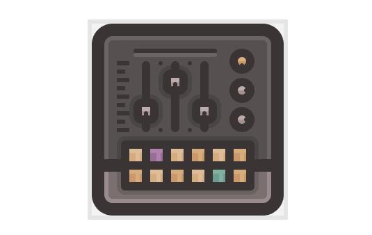
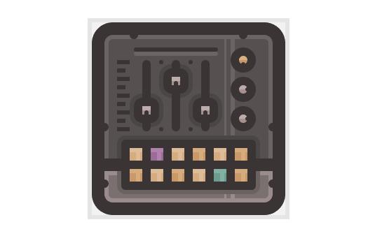
How to Create Flat Icons in Illustrator
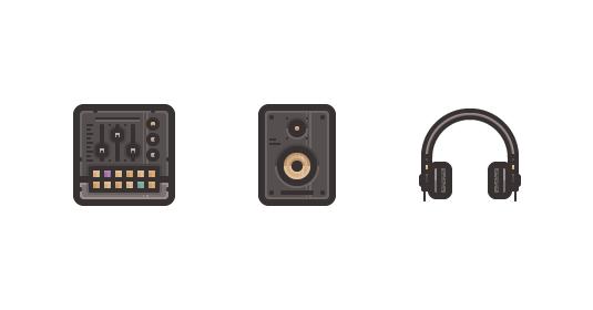
So lately I’ve been looking a lot at the different tools that DJs and music producers use, and I have to be honest, since I’m pretty much a gearhead myself, that gave me the idea for a cool icon tutorial that I’m hoping you guys will find helpful.
That being said, in the following lines, I’m going to walk you through the process, my process of creating a neat looking DJ Essentials Icon Pack using some of Adobe Illustrator’s most basic tools such as the basic shapes, Pathfinder and the Direct Selection Tool.
1. Setting Up Our Document
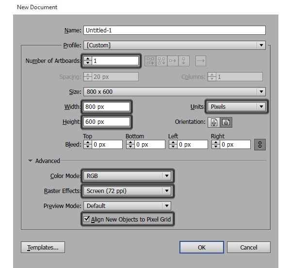
With every new project, the first step that you will always take will involve setting up a new document, and believe me you should pay attention to it since you’ll always want to setup a strong foundation for any project that you take. Now, assuming you already have Illustrator running in the background, bring it up and then go to File > New (or use the Control-N keyboard shortcut) and let’s go through some of the settings for this particular tutorial.
Number of Artboards: 1
Width: 800 px
Height: 600 px
Units: Pixels
And from the Advanced tab:
Color Mode: RGB
Raster Effects: Screen (72 ppi)
Align New Objects to Pixel Grid: checked.
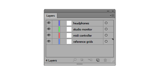
2. Layering Our Document
Once we have our document, we need to make sure that we create a couple of layers so that we can foolproof our workflow so that we won’t accidentally move or edit some parts of the icons by mistake. Now, you wouldn’t normally separate each icon on its own layer since in a larger project that would be hard to track, but since this here is a tutorial, we will do our best to isolate each of the assets so that we can focus on just one at a time.
So, assuming you know how to use the Layers panel, create four layers and name them as follows:
reference grids | midi controller | studio monitor | headphones
3. Setting Up a Custom Grid
Once we’ve created our layers, it’s time to set up a custom Grid since we will want our icons to be as crisp as possible.
To do that, go to Edit > Preferences > Guides & Grid and adjust the Gridline Every and Subdivisions values to 1.
By setting these two options to the lowest possible values, we will be able to snap all of our shapes to the Pixel Grid since we will achieve a 1:1 ratio allowing us to work with the highest level of accuracy.
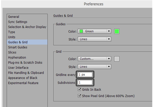
Once you’ve adjusted these settings, you’ll have to go to the View menu and enable the Snap to Grid option which will make the Custom Grid active.
Also, if you’re used to moving things around using your keyboard’s directional arrow keys, you might want to took a look at the Keyboard Increment settings and adjust the default value to 1 px which will make things move with super high precision.
4. Setting Up the Reference Grids
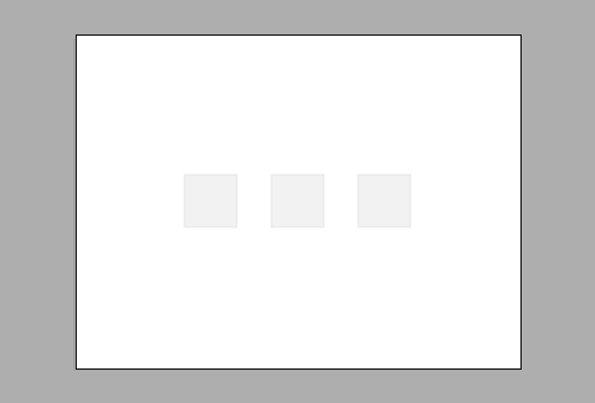
If you’ve never used Reference Grids before, you should know that they are super helpful when it comes to creating icons, since they allow you to design a coherent icon pack by delimiting the surface that you will be using in order to design within a specific selected icon size. The way they work is really simple, first you decide on the size of your icons, which in this case will be 96 x 96 px, and then you draw a square that has the exact same Width and Height values as your icon.
So, let’s create three grids of our own.
First, make sure that you’re on the “reference grids” layer, and using the Rectangle Tool (M) create a 96 x 96 px square (#E6E6E6) which will act as the main reference grid.
Next, create a smaller 92 x 92 px one (#F2F2F2) which will allow you to add a little 2 px padding all around your design, which is meant to help your foolproof the exporting process, since sometimes some users might experience hard cuts (clippings) on some sides of the assets.
Once you have both reference grids, group them together using the Control-G keyboard shortcut, and then create two more copies on each side, distanced at about 60 px from one middle one.
Finally, use the Layers panel to lock the layer, so that we can start working on our first icon.
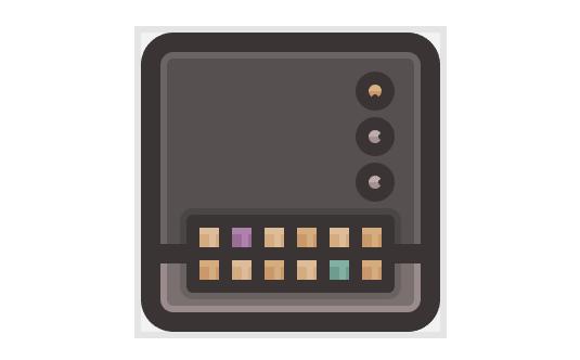
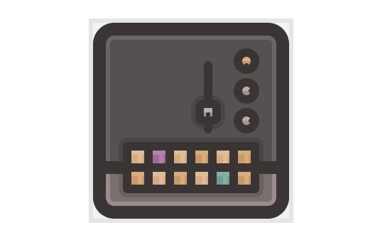
5. Creating the Midi Controller Icon
Since at this point we’re pretty much done with all the technical stuff, we can start working on the first icon from the set which is the little Midi Controller.
First make sure that you’ve positioned yourself onto the correct layer, and then lock all the other ones to gain a better focus at the subject at hand. We will want to use this “security measure” each time we start working on a new icon, since as I’ve already pointed out, it will allow us to create a workflow where things are created gradually, in a manner where we don’t have to worry about misplacing some of the different composing elements.
Step 1
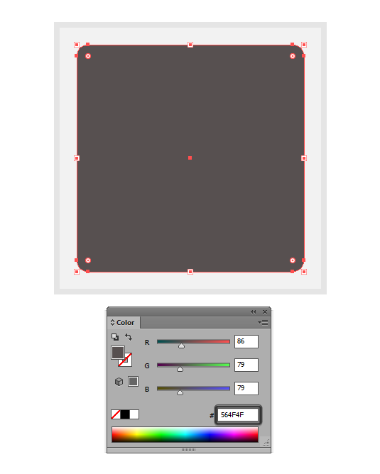
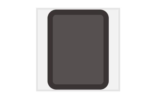
Start by creating the main body of the controller, by drawing a 80 x 80 px rounded rectangle with a 4 px Corner Radius. Color the shape using #564F4F and then position it to the center of the first reference grid.
Quick Tip: For those who have never used the Rounded Rectangle Tool before, you should know that it’s located underneath the default Rectangle Tool, and can be accessed by clicking on the little down facing arrow found on the lower right corner of the icon itself.
Step 2
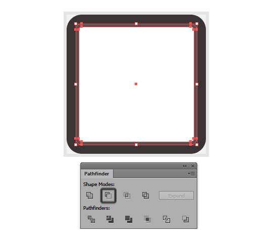
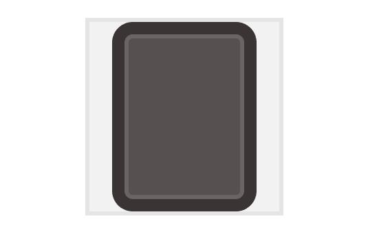
Next, we need to give the body a nice thick outline, and we will do so by using the Offset Path tool.
First select the shape, and then go to Object > Path > Offset Path and enter 6 into the Offset value field leaving all the other settings as they are.
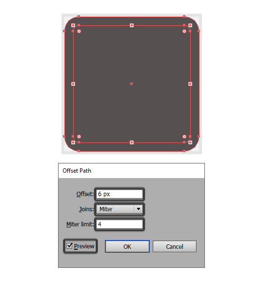
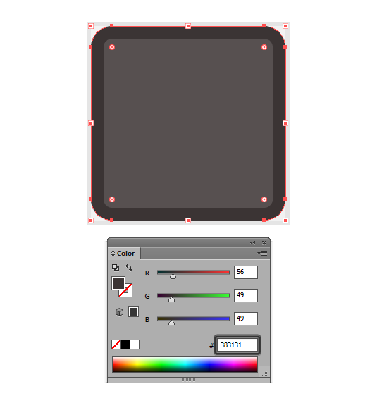
As soon as you click on OK, Illustrator will use the shape to create a slightly larger copy by adding 6 px to each of its sides, resulting in larger 92 x 92 px rounded rectangle that will act as our outline. Now, by default the offset is positioned underneath our main shape, but as you can see it uses the exact same color value, which is something that we will want to change since we need the outline to standout from all the other elements. To change this, simply select the shape and then set its color to #383131.
Quick Tip: We will be creating most if not all of the outlines using the Offset Path method, so I will only reference the steps a couple of times, since I’m hoping that you will manage to learn them by heart after a couple of clicks. As for the thickness of the outlines, we will be using heavy 6 px offsets which will be colored using the same #383131 hex color value.
Step 3
Now that we have our main shape and the outline, we can start focusing on the little details that make up the actual controller, and we will do so by creating the all-around ring highlight.
First, create a copy (Control-C) of the controller’s main body and paste it over (Control-F) it. Then, using the Rounded Rectangle Tool create a smaller 76 x 76 px white shape with a 2 px Corner Radius and position it over the copy. Select both the copy and the smaller shape, and then using Pathfinder’s Minus Front option create a cutout which will act as the actual highlight.
Step 4
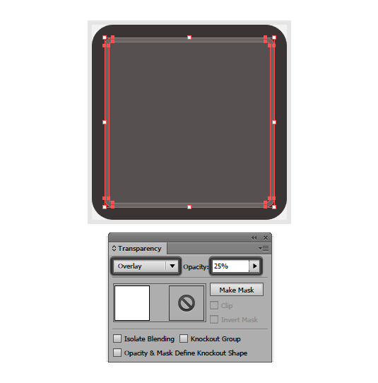
Adjust the shape a bit by selecting it and then going over to the Transparency panel and setting its Blending Mode to Overlay while lowering its Opacity level to just 25%.
Step 5
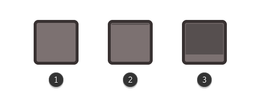
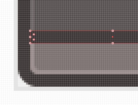
Once we have our main highlight, let’s add a lower section to the controller, by creating a copy of its body (Control-C), and then pasting it over (Control-F) (1). Select the copy and start adjusting it by changing its color to #7C7171 and then adjusting its height by removing its top centered anchor points (2). To do that, use Direct Selection Tool (A) to select them and then press Delete in order to remove them. Once you’ve gotten rid of the anchors, you’ll have to close the shape by pressing Control-J otherwise it will act as an open path.
Then, you’ll need to select the new top anchor points and use the Move Tool to push them towards the bottom vertically by 61 px (right click > Transform > Move > leave the Horizontal value field to 0 and set the Vertical one to 61).
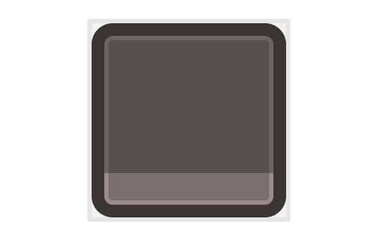
Step 6
Finally you’ll have to position the resulting shape underneath the highlight by selecting it, the main body and the outline and then right click > Arrange > Send to Back.
Quick Tip: I know we could have just created the lower section of the controller before adding the actual highlight, but I wanted to show you the process of reestablishing a hierarchy by re-positioning certain shapes under others. This is something that I think will help you in the long run, since in a real case scenario, you are likely to encounter situations where you will be adding certain details later on, which will require you to rebuild your entire object stacking order.
Step 7
Create a horizontal divider by adding an 80 x 6 px rectangle (#383131) and positioning it towards the top section of the controller’s section that we’ve just created a step ago.
Quick Tip: I recommend you switch back and forward into Pixel Preview mode since it allows you to take total control over your shapes and the way they’re positioned onto the underlying pixel grid.
To activate the mode, simply go to View > Pixel Preview or use the Alt-Control-Y keyboard shortcut.
Step 8
Once we’ve created the lower segment of the controller, we can start adding the little colored pad buttons.
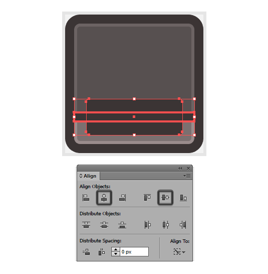
First, create a 64 x 24 rounded rectangle with a 2 px Corner Radius which will act as the main holder/outline. Color the shape using #383131 and then position it towards the lower center of the icon so that it is horizontally aligned to the divider that we’ve just created.
You can do this by selecting both the divider and the new shape and then using the Align’s panel Horizontal Align Center and Vertical Align Center options, making sure to set the divider as the key object by clicking on it once the selection is made.
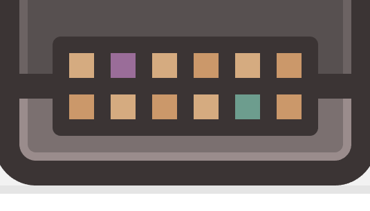
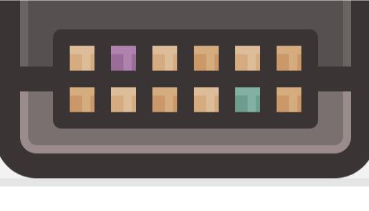
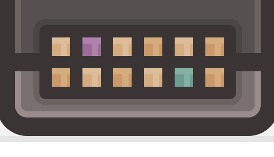
Step 9
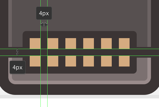
Once you have the main outline, create two rows of six 6 x 6 px squares, distanced at 4 px from one another and color all of them using #D6AC81. Group them all using the Control-G keyboard shortcut and position them to the center of the outline.
Step 10
Double click on the pad buttons in order to enter Isolation Mode (or right click > Isolate Selected Group) and start changing the colors of some of the buttons, by adding a darker orange tint (#CC996A) to the top row’s fourth and last square, and to the bottom one’s first, third and last as well.
Then, color the second square from the first row using #9B6D9A and the fifth one from the bottom row using #6D9E8F.
Step 11
Add some details to the pad buttons by drawing a 6 x 2 px rectangle towards their top side which will act as the top highlight, and another 2 x 4 px vertical one positioned slightly towards the right. Set the color to white (#FFFFFF) and then adjust their Blending Mode to Overlay while lowering their Opacity to just 20%.
Once you have all the buttons and highlights in place, you can exit Isolation Mode by pressing Escape.
Quick Tip: You can easily add the highlights by creating the first batch of details for the top row’s first button, grouping them together (Control-G) and then creating a copy by dragging towards the right by 4 px while holding down Alt-Shift. Once you have your first copy you can create the rest by pressing Control-D four times to replicate the action.
Then with all six instances of the highlights selected, simply create another copy using the same old dragging method, but this time make sure you aim for the bottom.
Step 12
Once you have all the buttons and their details, we can add a subtle shadow ring to their main outline. To do this, simply select the rounded rectangle outline, and apply an offset of 2 px by going to Object > Path > Offset Path and entering the indicated value into the Offset value field.
Then, you will have to change the resulting shape’s color to black (#000000) and lower its Opacity to 14%.
Also, you’ll want to make sure that the shadow itself is positioned underneath the horizontal divider that we created for the lower section of the controller.
Step 13
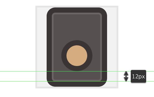
Now that we have our pad buttons, we can start working on our gain knobs.
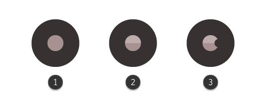
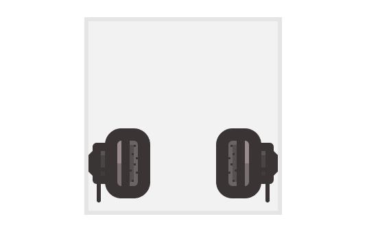
Start by creating a 4 x 4 px circle (#A89191), then give it a 4 px outline (#383131) and position it by aligning it towards the top right side of the pad’s outline, leaving a gap of 4 px between the two.
Step 14
Add a little highlight to the top half of the knobs main body, by creating a duplicate and then removing its bottom anchor point using the Direct Selection Tool (A) (1). Then, color the resulting shape using white (#FFFFFF) and change its Blending Mode to Overlay while lowering its Opacity level to just 25% (2).
Add a gain indicator point to the knob by creating a 2 x 2 px circle (#383131) and positioning it over the main shape, towards its right side (3).
Once you’ve added these details to the knob, select all of its elements and group them together using the Control-G keyboard shortcut.
Step 15
Create two duplicates of the knob by selecting the one that we already have, and then dragging towards the top while holding down Alt-Shift and then pressing Control-D once. Make sure that you leave a gap of 2 px between all three knobs, and then adjust the top one by changing its color to orange (#CC996A) and positioning its gain indicator towards the bottom.
Step 16
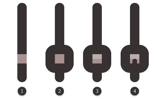
Once we’re done with the gain knobs, we can start working on the sliders.
First create a 34 x 2 px rounded rectangle with a 2 px Corner Radius, color it using #383131 and then align it to the bottom section of the lower gain knob making sure to distance the two at 10 px from one another.
Step 17
Start working on the actual slider button by creating a 4 x 4 px square (#A89191) (1) and giving it a 4 px outline (#383131) (2) but this time make sure to set the Offset’s Joins to Round.
Once you’ve added the outline, use the Rectangle Tool (M) to create a 4 x 2 px highlight (color: white, Blending Mode: Overlay, Opacity: 25%) (3), and the Rounded Rectangle Tool to add a 2 x 6 px shape with a 1 px Corner Radius as a bottom indicator (4).
Group all of the slider button’s elements together using Control-G and then position it towards the bottom section of the slider at a distance of 4 px from its tip.
Step 18
Give the slider button a subtle shadow by selecting its outline and creating an offset of 2 px which we will then color black (#000000) and set its Opacity to 14%.
Then group (Control-G) both the slider button and the slider track together so that we can easily create a copy after it in the next step.
Step 19
Create two slider copies and position them to the left side of the one that we already have, making sure to adjust the position of the middle one’s button so that it is now distanced at 4 px from its top.
Step 20
Next, add a little detail element towards the top section of the sliders by creating a 40 x 2 px rounded rectangle with a 1 px Corner Radius (#383131) distanced at exactly 4 px from the top section of the slider tips. Then create a duplicate (Control-C > Control-F) and position it just under the original, making sure to change its Blending Mode to Overlay while lowering its Opacity to 25% since it will act as a subtle highlight.
Step 21
Add a couple of detail screws to this part of the icon, by creating four 2 x 2 px circles (#383131) and positioning two towards to the top of the sliders, and the other two towards the bottom, making sure that they are exactly at the center of the empty gap created by a pair of sliders.
Step 22
Continue adding details to the midi controller, by creating the gain scale indicator that you would normally find near the sliders. Using the Rectangle Tool (M) create nine segments (lines), that are slightly different in terms of length. Start with a 6 x 2 px rectangle (#383131), then add a smaller 4 x 2 px one (#383131) and continue adding the rest of the lines following the same pattern – one long segment, then one short one and another long one until you have all nine of them.
Once you added the scale, don’t forget to select all of its elements and group them together using the Control- keyboard shortcut so they won’t start flying around by accident. Then simply position the scale towards the left side of the first slider, right next to its shadow, making sure to vertically center it to the sliders.
Step 23
Since at this point, we’re pretty much done with the basic composing elements of the actual controller, we can now start adding the final touches to the little icon.
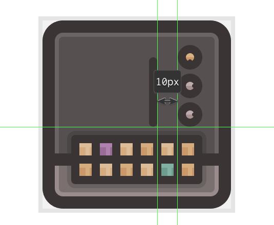
We will start by creating two pairs of vertical highlights which will go over the right side of the controller’s body. To do that, well, you already know we’re going to use the Rectangle Tool (M) so just create one 1 x 46 px shape and another 2 x 46 px one stacked next to one another at a distance of 2 px. Make sure to set their color to white (#FFFFFF), and then change their Blending Mode to Overlay while lowering their Opacity to 25%.
Then simply group (Control-G) and position them to the controller’s right side, leaving a gap of 18 px between them and the icon’s outline.
As you’ve probably noticed, you’ll have to bring the three gain knobs towards the front (select them > right click > Arrange > Bring to Front) since we’ll want the highlights to go under them.
Once you have the first pair of highlights in place, simply create a copy after it, and then shrink their height to just 2 px and position it towards the bottom section of the controller, just under the pad buttons’ shadow.
Step 24
Once we’ve added the vertical highlights, we need to add two more horizontal ones positioned just underneath the divider that separates the lower section of the controller from the top one.
So, grab the Rectangle Tool (M) and create two 4 x 2 px white shapes (#FFFFFF), position one on each side, and then set their Blending Mode to Overlay while lowering their Opacity to 25%.
Step 25
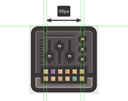
Once we’re done adding the highlights, we can finish the icon by adding a couple of inner projection pockets (didn’t exactly knew what to call them) by creating a couple of rounded rectangles.
Start from the top and draw a pair of two 4 x 8 px rounded rectangles with a 2 px Corner Radius, distanced at 48 px from one another, and then center vertical align them to the icon, so that they overlap and touch the top section of the outline.
Step 26
Add two more pairs of projection pockets towards the lower part of the controller, but this time, make sure that you invert the Width and Height values so that your rounded rectangles will be 8 x 4 px now. Finally, select all of the controller’s components and group them together using the Control-G keyboard shortcut and you should be done with the first icon.
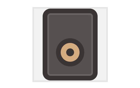
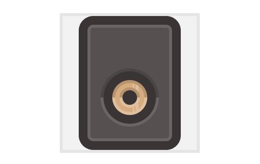
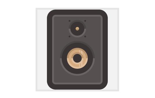
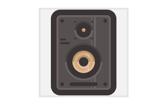
6. Creating the Studio Monitor Icon
Since we’ve managed to create our first icon, the midi controller, we can now start focusing on the second one, the studio monitor.
For those who haven’t heard the term before, a studio monitor is a speaker specifically designed for audio production, where accurate sound reproduction is a must.
Now, as we did with the previous icon, prep your document by locking the previous layer and unlocking the one that we’re going to be building our monitor on, and positioning yourself over its reference grid, so that we can focus just on it.
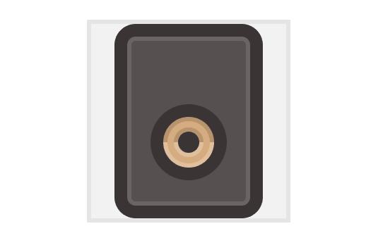
Step 1
Start by creating a 58 x 80 px rounded rectangle with a 4 px Corner Radius (#564F4F) which will act as the monitor’s main body. Then using the Offset Path tool, give it an outline of 6 px (#383131) so that we can select and position the two shapes towards the center of our reference grid.
Step 2
As we did with the midi controller, we need to give our monitor an all-around ring-like highlight, by creating a copy of its main body, and then adding a smaller 54 x 76 px rounded rectangle with a 2 px Corner Radius which we will use to create a cutout.
Once we have the new shape, change its color to white (#FFFFFF) and set its Blending Mode to Overlay and its Opacity level to 25%.
Step 3
Next, we need to start working on the actual cone, by creating a 24 x 24 px circle (#D6AC81) to which we’re going to add a 6 px offset (#383131), which of course will be our outline.
Then with both shapes selected, vertical center align them making sure to position them a little towards the bottom section of the monitor, so that you end up with a gap of 12 px between the cone’s outline and the one of the icon.
Step 4
Next, add the center dust cap to the cone, by creating a 10 x 10 px circle (#383131) and positioning it right at the heart of the larger two shapes that we’ve just created.
Step 5
At this point, we can start adding some depth to the cone, by creating two top half circular ring shadows and another bottom half pair that will act as highlights.
Start by creating a duplicate of the yellow cone (Control-C > Control-F) (2) and then adding a 20 x 20 px circle on top (3 – highlighted with red) which we will use in combination with Pathfinder’s Minus Front option to create a cutout (4 – highlighted with green).
Once you have the ring-like shape, you will need to add another rectangle over its bottom half, and use the Minus Front option one more time to remove it (5 – highlighted with green). Then, create a copy of the resulting top half ring, flip it horizontally (right click > Transform > Reflect > Horizontal) and position it right under the original (6 – highlighted with a darker green).
Adjust the top half by changing its color to black (#000000) (7) and then lowering its Opacity to 14% (8).
Then select the bottom circular half, color it white (#FFFFFF) (7) and change its Blending Mode to Overlay while lowering its Opacity to 24% (8).
Step 6
Apply the same ring styled shadow/highlight combo to the cone’s dust cap, by using the cap itself to create a 2 px offset, which you will then cut in half, duplicate and adjust in a similar manner to what we did in the previous step.
Step 7
Add two vertical highlights to the cone by creating a narrower 1 x 36 px rectangle and a slightly wider 2 x 36 px one, and distance the two at 1 px from one another. Set their color to white (#FFFFFF), their Blending Mode to Overlay and make sure to lower their Opacity to 24%.
Finally group the two, and position them over the yellow cone, a little towards its right side.
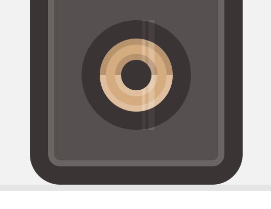
Now, as you’ve probably noticed, the highlights are overlapping both the cone’s outline, and its other highlights and shadows, which is something that we are going to correct in the next step, using a Clipping Mask.
Step 8
For those who are new to Clipping Masks you should know that they are essentially “little windows” that allow you to show just a specific part of an object or illustration. The way they work is quite simple: you first decide on what exactly you want to mask (hide) from the viewer’s eye, and then you create an overlapping surface (mask) by either drawing it using the Pen Tool or by using some of Illustrator’s basic shapes.
In our case, we will need to create the ring like shape, that is visible within the surface created by the cone’s actual highlights and shadows and then use that to mask the vertical highlights.
First, create a 20 x 20 px circle and position it to the center of the cone (2 – highlighted with green). Then add another smaller 14 x 14 px one (3 – highlighted with red) and use Pathfinder’s Minus Front option to create a cutout (4 – highlighted with green).
Once you have the ring like shape, simply select both it and the vertical highlights, right click > Make Clipping Mask (5).
Step 9
Once we’ve added the inner cone highlights and shadows, we need to add some to its actual outline following a similar process.
Take your time, and when you have them all, don’t forget to select and group them (Control-G) so that they won’t get misplaced.
Step 10
As soon as we’ve finished creating and shaping the main cone, we can start working on the treble.
First, create a 4 x 4 px circle (#D6AC81), give it a 6 px outline (#383131) and then position them towards the top section of the studio monitor, so that you have a gap of 8 px between the treble’s outline and the one of the icon.
Step 11
Give the treble’s bubble some depth by adding a subtle bottom half shadow, and then add a top shadow and bottom highlight to its outline.
Step 12
Continue working on the details by adding four 2 x 2 px decorative screws to each side of the treble bubble.
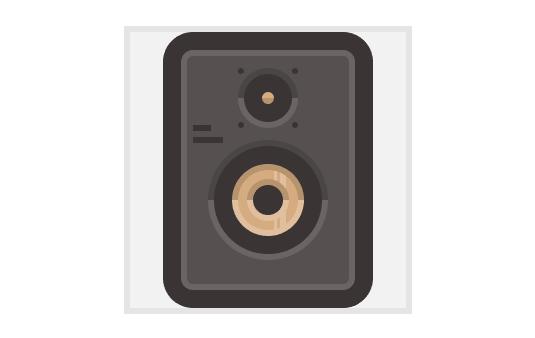
Step 13
Add a little company description-wannabe-detail piece, by creating two horizontal lines and positioning them towards the left side of the monitor, in between the treble and the cone.
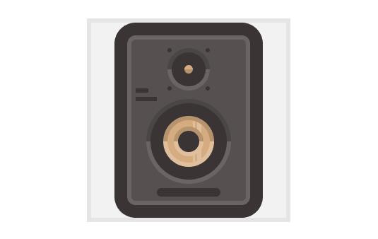
Step 14
Move a little towards the bottom section of the studio monitor, and add the front facing bass port by creating a 30 x 4 px rounded rectangle (#383131) with a 2 px Corner Radius which we will position just underneath to cone’s outline, at a distance of 4 px from it.
Step 15
Next, add a couple of slightly larger screws by creating four 4 x 4 px circles (#383131) and positioning them towards each corner of the icon, making sure to leave a 4 px gap on each side facing the monitor’s outline.
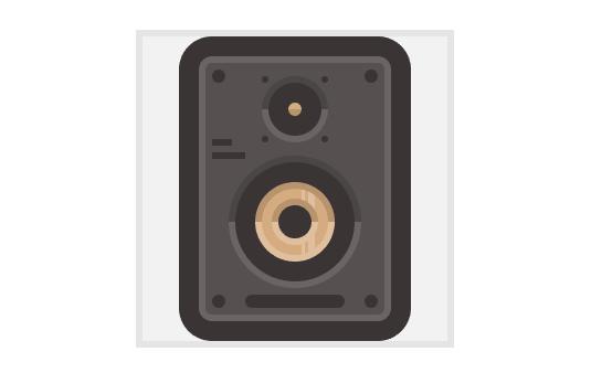
Step 16
Finish off the icon by adding the two vertical highlights, making sure to mask them so that they won’t overlap the cone and treble’s shadows/highlights.
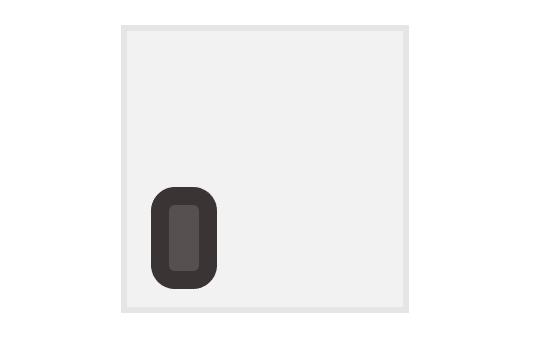
7. Creating the Headphones Icon
With a lot of patience, we are now down to our third and last icon, the headphones one, which should be pretty simple to create.
As usual, before we begin make sure that you’ve locked all but the last layer, and then position yourself over the third reference grid.
Step 1
Since the left and right headphone cups are identical, we will start by working on the first one and then create the second one by duplicating it.
First, grab the Rounded Rectangle Tool and create a 10 x 22 px shape with a Corner Radius of 2 px. Color it using #564F4F and then give it a nice 6 px outline (#383131) positioning it somewhere over the left bottom corner of the reference grid.
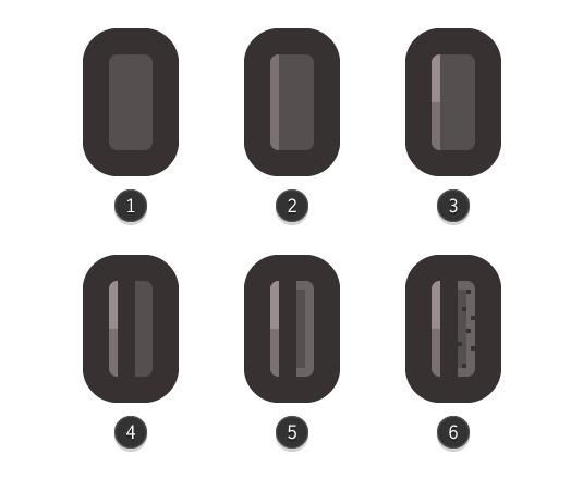
Step 2
Once we have the cup’s main shape, start adding some details to it, and start by adding a slightly brighter section to the left section of the main fill. Do this by creating a copy of the grey shape
(Control-C > Control-F) and then adjusting it by setting its color to (#7C7171) and shortening its Width it to just 2 px (2).
Then create a copy after the new shape, and using a rectangle cut it in half. Change the resulting shape’s color to white (#FFFFFF) and set its Blending Mode to Overlay and its Opacity to 25% (3). Next, draw a 4 x 22 px divider (#383131) and position it to its right side (4). Add a subtle highlight to the cup’s cushion pillow (5) and a bunch of little squares to make it pop a little (6).
Finally, select all of the cup’s elements and group them together using Control-G.
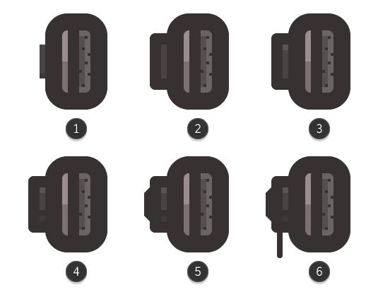
Step 3
Once we’ve created the cup, we can start working on its left section where the cables and headband go through.
Start by creating a 2 x 12 px rectangle (#494343) (1) to which we will give a 4 px outline (#383131), but this time we will set the Offset Path’s Joins to Round (2). Add a 2 x 2 px highlight towards the top (color: white, Blending Mode: Overlay, Opacity: 25%) (3) and a 2 x 2 px divider towards the bottom (#383131) (4).
Finish the left headphone piece by adding a 2 x 12 px rectangle to its left side, and adjusting its left anchor points by moving them towards the center of the object by a couple of pixels by selecting them using the Direct Selection Tool (A) and then pushing them using the keyboards directional arrow keys (5).
Also, don’t forget to add a small 2 x 14 px rounded rectangle (#383131) with a 2 px Corner Radius towards the bottom side (6), since this will be part of the adjustable headband system arm.
Once we have all the elements, group them together (Control-G) so that we can make sure they won’t get misplaced by accident and break the composition.
Step 4
Since we now have the left headphone piece, we can create the right one by creating a copy after it, and then position it towards the right side of the reference grid, making sure to reflect it vertically (right click > Transform > Reflect > Vertical).
Step 5
For the last part of the icon, I’m going to let you get a little creative and bling your headphones after your heart’s desire. So, take your time and create something that has a little of you in it, so that in the end you’ll have something with a personal flavor to it.

As we did with all the other icons, start with basic steps and then gradually add details to make it more appealing. When it comes to colors, use #383131 for the outlines, and for the rest you could reuse the values that we’ve set to the different parts of the other icons, or come up with values of your own. Also, once you’re done group all of the icon’s parts together (Control-G) and center it to the reference grid.
Quick Tip: Don’t forget, while it’s fun education to closely follow the steps of a tutorial, it’s always helpful to try and see how you can come up with a different way of looking at the same problem, and solving it with a little bit of trial and error, since you’ll learn new stuff this way.
My goal is to show you the path, but also make you shape and follow one of your own, since there’s where all the magic happens.
Conclusion
I really hope that you’ve managed to follow the steps explained in this fairly extensive tutorial and learned something new and helpful along the way. I’ve also attached the resource file so that if you happen to get stuck, you can open it and try and see how things were built, which is something that I encourage you to do a lot not just with this tutorial, but with freebies in general since this way you’ll learn a lot.
That being said, I’ll talk to you in the next one!