Tutorial: How to Create a Children’s Book Cover with Justin Will’s Hand Drawn Sci-Fi Vector Pack (*Freebies Inside)
How to Create a Children’s Book Cover
Hello, dear Arsenal Fan! It’s Simon on this end of the keyboard for a new tutorial.
This time, we’ll have a close look at how to use Justin Will’s hand drawn Sci-Fi vector pack.
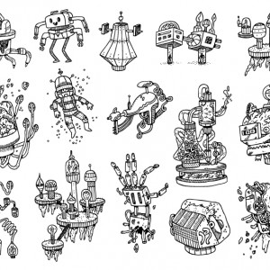
The pack features a lot of the typical elements of a good Sci-Fi story: robots, crazy laboratory contraptions, a ray gun, a spaceman, and more! Each of the vectors has been given extra care in its execution to be unique, yet quickly recognizable.The assets all feature this clean, detailed, yet almost child-like treatment to them.

DOWNLOAD JUSTIN’S SCI-FI VECTOR PACK NOW!
Arsenal Members, you get this pack at no extra charge! (Feels like your birthday, doesn’t it?)
Technical notes
We’ll be using mostly Photoshop CC for the tutorial, but any version of Photoshop past CS3 should be fine. Note also that I’m working on a Windows-based system, but other than visual appearance and slightly different keyboard shortcuts, that will not have any impact on the process we’ll go through. We’ll use Illustrator only to open the vector asset, and to paste it in our Photoshop document.

We are going to work extensively with textures. It’s a good time to remind you guys of a few base rules, and processes:
- Don’t know what a clipped layer is? Glad you asked! This means that the layer is only visible/applies to the layer directly below it. You can very quickly do this by holding ALT down on your keyboard and clicking between the two layers. Here’s a quick demonstration.
- Every time we’ll work with textures, we’ll follow this simple process: place as smart object, sharpen1, desaturate, enhance contrast with levels, and modify the blending mode.
- Placing the textures as smart objects, and using adjustment layers to tweak them, allows us to stick to a non-destructive workflow. We’ve explored in depth the numerous pros and few cons of such a workflow in this past tutorial: “How to Use Textures The Right Way.”
Notes: 1 – accessed through the Filter > Sharpen > Sharpen menu
So, what are we going to build?
Given the comic book/children’s book illustration style of the assets, we wanted the final output to fit these realms. After some experimentation, and a dozen thumbnail sketches, here are the two main ideas that came to life: a NASA recruitment poster, and a book cover for a (fake) children’s book called “The gentle robot.” I worked with color pencils to establish a color palette right away.
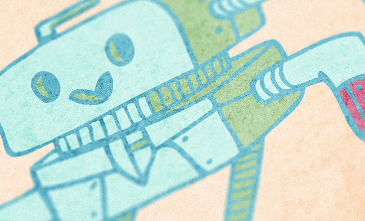
The slightly colder blue and green hues of the robot’s body contrast nicely with the warmer orange background.

In this concept, the orange space suit of the astronaut contrasts with the colder dark blue and magenta of the deep space behind him.

After discussion, we decided to focus on the children’s book cover: it felt truer to the asset, and to the desired target audience.
We’ll need to grab a few things before we start
Good news! Aside from the vector asset, all the things you’ll need for the tutorial are free resources. We also decided to make two textures from the Arsenal available as freebies, so you wouldn’t be hindered in the completion of the piece. The assets you’ll need to get are textures, available from the Lost and Taken archives, as well as from the Lost and Taken Flickr stream.
The first texture is Grey_Grunge4.jpg, from Lost and Taken’s five grey texture pack. Pro tip: grab the whole set, all of these are great.
The next texture is LT_Microscopic35mmFilm_02.JPG, from the seven microscopic film textures pack.
Next, is Vintage_Paper_7.jpg, from the early 20th century paper textures set.
The following asset is DigitalNoise_05.jpg, from the digital noise textures pack.
Next, brown16, from Lost and Taken’s Flickr stream. Pro tip: remember to always download the highest possible size, or better yet, the original size, when grabbing textures from Flickr.
Next, free_high_res_texture_455, also from Lost and Taken’s Flickr stream.
The last two textures that interest us have generously been made available as freebies by Go Media’s Arsenal. Pro tip: become a member today, for access to thousands of design assets, for only $15 a month.
The first texture is vintage-paper-textures-volume-01-sbh-005.jpg, from the Vintage Paper Textures, Volume 1 set.
The second freebie is metal-dumpster-textures-021-sbh.jpg, from the metal dumpster texture pack.
Document setup
Since we are working on a book cover, we are going to work within a document with different measurements from our typical 18″x24″. One of the most popular book cover sizes is 6″x9″, which is an aspect ratio of 2:3.
Our document will have a one inch bleed/safe zone around it, to account for trimming and other production constraints. This means that instead of being 6″x9″ on the nose, it’ll be 8″x11″.

The next step is to add a few guides. We’ll use them to mark the actual cover’s size, as well as the center of our canvas. I’m using Photoshop CC’s New Guide Layout feature to generate these rapidly.

Note: if you don’t have the CC version of Photoshop, you can leverage the power of GuideGuide to accomplish the grid-related tasks quickly. The current version isn’t free, but older versions are.

Additionally, we can also add guides to mark a half inch zone within the safe zone. These will help us not to stick our content too close to the edges of the cover.

With that done, we can get started with the real thing.
Building up the background
The first step is to fill the background layer with a pale orange, #fde2c6.

The first texture we’ll use is brown16 (5025205871_cab14db56b_o.jpg).

It needs to be placed as a smart object, centered in the canvas, and scaled down to 52%. That way, it will fit well within the final format of the cover (6″x9″).

After sharpening the texture (Filter > Sharpen > Sharpen), we need to desaturate the texture using a clipped hue/saturation adjustment layer.

Next, we need to use a clipped levels adjustment layer to adjust the texture’s details.

Finally, we need to change the blending mode of the texture to soft light @ 85% opacity.

The next texture is LT_Microscopic35mmFilm_02.JPG.

It needs to be centered in the canvas, rotated 90° clockwise, and scaled down to 17%.

After sharpening, and desaturating, we need to use a clipped curves adjustment layer to invert the texture.

The trick to invert the texture is to use the negative preset in the drop down menu.

Then, a clipped levels adjustment layer to tweak the texture.

Finally, we need to change the blending mode to soft light @ 85% opacity.

Our background is set. Now, we need to organize our layers better.

The robot
As we want to build the book cover for a story about a robot, we need to bring the said robot in our piece. Let’s open the vector set in Illustrator.

Our robot is second from the left in the first row.

It needs to be placed in our document as a smart object, scaled up to 225%, and located precisely at X: 4″, and Y: 7″.

The next step is to give the robot a bright blue color overlay (#78c8d8).


Now, we need to give some additional colors to the robot. Let’s start by giving it its main color fill. The robot will be a light blue color, #d6f6f1. We need to create a new layer below the robot’s smart object, and to paint the color in carefully, without going over the lines. Given the scale we are working at, a hard, round 100 pixels brush will do just fine. Pro tip: you can use your magic wand (W) to create a selection if you don’t trust the precision of your brush strokes.


The next step is to add a secondary color to the robot. We’ll fill its “hands” and “sleeves” with a pink hue, #dd86a5. Note that we’re filling the area inside the sleeves.

Now, we need to give the robot some depth. We’ll do this by painting a green hue (#bad9ab) in select places, where there would be shadows. The exact positions of the shadows don’t matter, as long as they are consistent.

Also, a small hard brush (between 12 and 18 pixels), and zooming in at 100%, will both be paramount to paint precisely the small details.

The last thing we need to give the robot is a grounding shadow, otherwise it will look like it’s floating in space. We are going to use the ellipse tool (U) for that. The ellipse is 3.75″x0.5″, and located at X: 4″, and Y: 4.35″. Its color is #dd86a5, the same pink hue used for the sleeve and pincers.

With that done, we can organize our layers some more.

Type
A book cover without a title and author name appearing is not often heard of. Our story is called “The gentle robot,” and was written by Cassia Ovami (internet high five if you find the real author name hidden behind this anagram).
The two typefaces we’ll use for the cover are part of free font families from the Google Fonts project: Open Sans, and Droid Serif. Pro tip: download the whole Open Sans family (Open Sans, Open Sans Condensed), as well as the whole Droid family (Droid Sans, Droid Sans Mono, and Droid Serif).
Once the fonts have been downloaded, we need to generate three separate text blocks:
- “THE” – set in Droid Serif Bold Italic, that is 24 points tall, with kerning set to metrics, and colored in blue #78c8d8
- “GENTLE ROBOT” – set in Open Sans Extrabold, that is 48 points tall, with kerning set to optical, and also colored in blue #78c8d8
- “CASSIA OVAMI” – set in Droid Serif Bold Italic, that is 24 points tall, with kerning set to metrics, and colored in #dd86a5

Here are the position coordinates for each block:
- THE – X: 4″, and Y: 1.65″
- GENTLE ROBOT – X: 4″, and Y: 2.30″
- CASSIA OVAMI – X: 4″, and Y: 3.125″

There is an obvious gap between the title, and the author name. We’ll use this space to add a blue rectangular divider. We’ll create it using the rectangle tool (U). The shape is colored in our blue (#78c8d8), and measures 5″x0.1″. It’s placed at X: 4“, and Y: 2.7″.

With that, our text block is complete. A bit of layer organization, and we can move on to the finishing touches!

Textures! Textures everywhere!
We’ll approach adding textures to the piece in two phases: first, we need to add some textures to the robot, so it doesn’t clash too much with the background. Then, we’ll add texture that will impact the piece as a whole, visually linking everything together. The process we’ll follow is the same as before (place as smart object, sharpen, desaturate, enhance contrast with levels, and modify the blending mode).
The robot
The first texture we’ll add to the robot is the first of the Arsenal freebie set: vintage-paper-textures-volume-01-sbh-005.jpg.

It needs to be placed centered in the frame, rotated 90° clockwise, and scaled up 160%. The layer should be located right above the robot smart object in the layer stack, which is why the title block is still visible. Pro tip: the title block layer group can be turned off for a better view of the texture work.


Clipped levels adjustment layer.

Blending mode: soft light @ 100% opacity.

The next texture is the second Arsenal freebie, metal-dumpster-textures-021-sbh.jpg.

It’s placed at X: 3″, and Y: 7.15″, scaled down to 16%. We also need to rotate it from 180°.


Blending mode: soft light @ 85% opacity.

The last of the three robot texture is Vintage_Paper_7.jpg.

It’s placed at X: 4″, and Y: 6″, scale untouched.


Blending mode: color burn @ 10% opacity.

Now, we need to limit the impact of these three textures to the robot and its supporting shadow. First, let’s give the textures and their adjustment layers their own layer sub-group.

Next, using the magic wand (W), and with the robot smart object highlighted in the layer palette, we are going to select the empty space around the robot.

Next, we are going to invert the selection (CTRL/CMD+SHIFT+I or Select > Inverse), to select only the robot.

Now, to add the pink supporting shape to our selection, we need to CTRL/CMD+SHIFT+CLICK its thumbnail in the layer palette. CTRL/CMD+CLICK loads a layer’s content as a selection. Using SHIFT as the shortcut modifier tells Photoshop to add that to the currently active selection, rather than create a new one instead.

Finally, we can highlight the robot textures layer sub-group at the bottom of the layer palette, and click on the add layer mask button of the layer palette for a layer mask that limits the textures’ visibility to the robot. Alternatively, we can use the Layer > Layer Mask > Reveal selection menu.


And with that done, we can move on to the global textures.
Texturing the whole piece
There are three textures in our list that we haven’t used yet, and these are the last three we need to add to the piece.
The first of these textures is free_high_res_texture_455.

We’ll use it placed centered in the canvas, rotated of 90° clockwise, and scaled down to 52%.


Blending mode: soft light @ 100% opacity.

The next texture is Grey_Grunge4.

It’s placed centered in the canvas, and scaled down to 27%.


Blending mode: soft light @ 35% opacity.

Finally, the last texture! It’s DigitalNoise_05.jpg.

It’s centered in the canvas, rotated of 90° clockwise, and scaled down to 18%.

The only adjustment needed here is a clipped curves adjustment layer, set to negative.

Blending mode: soft light @ 65% opacity.

The piece is now complete. We can organize the layer stack better.

With that done, it’s time to save a copy of our document, cropped to the final dimensions of the cover (6″x9″).


After that, we can mock it up, to get a sense of what it would look like once printed.

Wrapping things up
Phew, we’re done! I hope that you enjoyed the ride, and that you have learned a few tips here and there to reuse in your own work. If you’ve already grabbed Justin’s Sci-Fi vector pack, I hope that thus tutorial gave you a sense of what you can accomplish with it. If you haven’t, I wonder why you still haven’t!
DOWNLOAD JUSTIN WILL’S SCI-FI VECTOR PACK

Do you have questions? Suggestions? Ideas on how to improve the workflow presented here? Please do reach out in the comments below!

You should also share your outcome with us, either in the comments below, on our Facebook page, or by tweeting it to us at @go_media.
And on that note, that’s all for me today. Until next time!


Comments are closed.