Category Archives: Tutorials

Hey Arsenal Friends! Today, we’ll be going over how to create food typography. This tutorial is for beginners by someone who is relatively new to the world of food typography. Let’s explore together!
What you need for this tutorial:
- Adobe Photoshop and Illustrator
- A piece of white paper
- A camera (preferably a DSLR)
- Our Coffee Vector Pack
- Our Flourishes 4 Vector Pack
- Sortdecai font from our library (*Or, receive all of these Arsenal products with our Membership!)
- This photo from our friends at Unsplash
Step One: Create a Photoshop document sized 8 x 6 inches. Download Sortdecai font from our library. Type out the word COFE in your document using Sortdeci, filling the doc. Bring the opacity down to about 10%. Print this page out to use as a template. If you’re a Pro and can be assured your F and E will look identical, go ahead and print out a full COFFEE template. If you’re sticking with me, we’ll be using Photoshop to duplicate our F and E letters in step three.

Step Two: Step away from your computer. Here comes the fun part! Pour some coffee grounds out and get ready to make some magic. Using a small paintbrush in combination with an exacto knife to start creating your custom coffee typography. Once you’re finished, use a DSLR to take a sharp macro photo of your piece.

Step Three: Using your magic wand tool in Photoshop, duplicate your F and E to create a full COFFEE lettered piece.

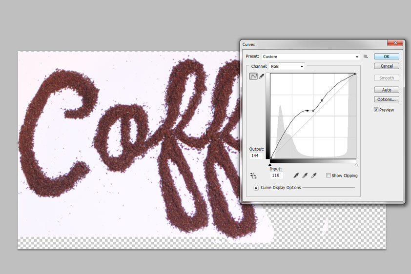
Step Four: Head to Image > Adjustments > Curves. Play with your curves until you achieve the look you’re after, with the coffee grounds appearing as realistic as possible.
Step Five: Delete your background layer. Next, double-click on your coffee art layer to reveal the layer styles box. Under blending options, head down to the slider that reads: This layer under “Blend if Grey.” Slide the white slider down like so until your background disappears. Save this file as a PNG.

Step Six. Open up the photo you downloaded from Unsplash in Photoshop. Place your Coffee PNG into the document, on the right-hand side. Place it where you think it looks best.

Step Seven. I think our work needs a little extra pizazz. So, let’s pull some of our vector elements into the document. Open the Coffee Vector Pack and Flourish 4 Vector Packs up in AI. Place these vectors above the mug, so that your flourish vectors represent steam and the coffee vectors playfully rise above the mug as well. By double clicking on each layer to pull up the layer style menu, I’ve set all of my vectors to divide with a drop shadow of 6%.

And you’re done!


My niece and nephew are obsessed with Jib Jab! They spend hours creating silly videos with our family playing the role of ice skating stars, hula dancers and Justin Bieber.
Read More ›
Is your dog a super hero? Then follow along with our quick 10 step tutorial to turn the little guy or gal into a super pup! All you need is Photoshop and about 5 to 7 minutes – or, you can just download our free layer style and call it a day! Read More ›

Hey Arsenal Fans! Today we’ll be creating a repeating pattern using Vector Set 25, just released on our Arsenal. Read More ›

How to Make Watercolor Brushes in Illustrator
If you’re like us, you’ve got art laying all around the studio just begging to be used in unique and wonderful ways.
Today, we’ll show you how to transform that art – specifically our watercolors – into AI brushes. Follow along to create your own and make sure to pick up our brand new Watercolor Illustrator Brush Pack while you’re at it!

Watercolor Vector Brushes for AI
What you’ll need:
- Adobe Illustrator
- watercolor, paint brush strokes or the like
And away we go!
Step 1
File > Place your watercolor into Adobe Illustrator

Step 2
Next, head to
Object > Live Trace > Tracing Options

Step 3
Under these options, choose Color 16 from the drop-down, then “Set Default”

Step 4
Ensuring your watercolor is selected, choose “Live Trace” from the top menu.

Step 5
Then, “Expand”

Step 6
Click on the white area surrounding your watercolor art.

Step 7
Next, Select > Same Fill and Stroke. Press Delete to delete this white area.

Step 8
Make sure your brushes palette is open.

Step 9
With your art selected, head to the small arrow to the right of the palette. From the drop-down, choose “New Brush.”

Step 10
Choose New Art Brush, OK

Step 11
Make sure the following are selected:
- Scale Proportionately
- –> Right Direction Arrow
- Flip Along
- Flip Across

Step 12
Repeat this process for all of your art until you’re finished with your pack.
Step 13
Once you’ve completed your pack, shift and select all of the brushes. From the drop-down, choose “Save Brush Library,” saving it where you’d like. (AI will automatically place your file in the Adobe Brush folder for convenience.)

All done! To access your new brushes:
– Go to Window Brush Libraries Other Library and then locate the brush library you want to install.
– On your brush library panel go to the top right menu and check “Persistent,” and your brush library should be accessible every time you open Illustrator.
Congratulations! You’ve created your own vector art brushes. Make sure to share your results with us in the comments section below and purchase our Watercolor Vector Brush Set!

Introducing the cosmic fractal storm texture pack
Hello everyone! It’s Simon again on this end of the keyboard. I’m returning for another tutorial, and boy, do we have a treat this week. Dustin Schmieding gifted us with yet another fantastic texture pack, the cosmic fractal storm texture collection.
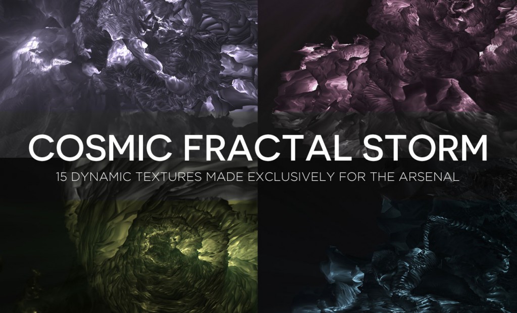
The set is composed of three-dimensional scenes, resembling cloud formations, or landscapes. Each texture is 4,000×2,700 pixels @ 150 ppi. This gives us plenty of pixels to work with, even for big size print applications (posters, flyers, and more).


DOWNLOAD THE COSMIC FRACTAL STORM TEXTURE COLLECTION
Arsenal Members, you get this pack at no extra charge! (Feels like your birthday, doesn’t it?)
Using the pack: let’s play!
These assets are at home in a variety of contexts. They can be used as stand-alone assets, as background elements, as textures… We will explore some of these uses while we embark on the creation of a poster for a (fake) EDM event called Magnetic Fields.

The tutorial will have us explore tips and tricks to recreate a “VHS-like” effect, for all that analog glitch goodness.

We’ll use primarily Photoshop for this tutorial, as manipulating textures is easier with it, and because we won’t engage in complex type manipulation.

We are going to work extensively with textures. It’s a good time to remind you guys of a few base rules, and processes:
- Don’t know what a clipped layer is? Glad you asked! This means that the layer is only visible/applies to the layer directly below it. You can very quickly do this by holding ALT down on your keyboard and clicking between the two layers. Here’s a quick demonstration.
- Every time we’ll work with textures, we’ll follow this simple process: place as smart object, sharpen1, desaturate, enhance contrast with levels, and modify the blending mode.
- Placing the textures as smart objects, and using adjustment layers to tweak them, allows us to stick to a non-destructive workflow. We’ve explored in depth the numerous pros and few cons of such a workflow in this past tutorial: “How to Use Textures The Right Way.”
Notes: 1 – accessed through the Filter > Sharpen > Sharpen menu.
With this in place, it’s time to get started!
The concept
As hinted at during our walk-through of the product, these textures feature digital “landscapes” that make no mysteries about how they have been generated. In order to stick to the theme, we are going to give this poster a “Lo-Fi,” CRT-like screen effect. Think of VHS artifacts: scan lines, slight warps, etc.
The concert is being branded as Magnetic Fields, and will take place at the Tate Modern gallery in London, and more specifically in the Turbine Hall. It’s a beautiful industrial space, and hosted a Kraftwerk performance in the past. It’s perfectly fitting.


(Images via Tate.org/Marcus Leith/Tate Photography – © all rights reserved)
We’ll split our document in two columns to fit all the text (one side main event announcements, one side for the band names). The copy will read “Magnetic Field – 02.06.16 – Tate Modern – Turbine Hall – London, UK,” “Performances by chp_tnes – nu_drds – cbalt – qwerty – & lw_ram,” and “Tickets & information at www.magneticfields.com.”
The two typefaces we’ll use for the poster are League Gothic, and Droid Serif. They are both free for commercial use, so grabbing them is a no-brainer. They even feature an extended set of weights, for even more flexibility.


All of our band names are inspired by electronics/robotics/computer science jargon:
- chp_tnes (chiptunes)
- nu_drds (new droids)
- cbalt (cobalt)
- qwerty (look at your keyboard)
- lw_ram (low RAM)
The event is to take place on February 06th, 2016.
Photoshop Abstract Texture Tutorial
Document setup
Even though our event will take place in the United Kingdom, we will use an 18″x24″ canvas. Designers in the UK would typically use ISO paper sizes, like pretty much the rest of the world. Let’s just say that the performing acts all come from the USA, and that the poster is put together by an American concert promoter.

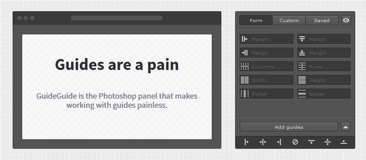
As mentioned before, we’ll split our canvas in columns, three to be exact. We’ll also mark a one inch security margin around the edges of our poster. Photoshop CC’s New Guide Layout feature is priceless to generate these rapidly (View > New guide layout).

Note: if you don’t have the CC version of Photoshop, you can leverage the power of GuideGuide to accomplish the grid-related tasks quickly. The current version isn’t free, but older versions are.


With the preparation work done, we can finally start to tackle the real thing.
The background
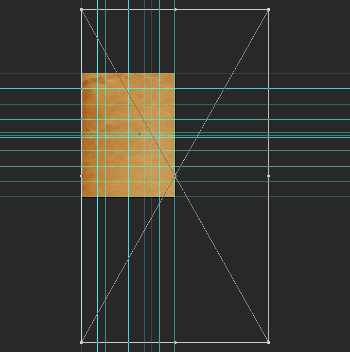
The background will be the base for our VHS effect. The first asset we need is GoMediaArsenal-CosmicFractalStorm-03.jpg, from Dustin’s texture pack.

It needs to be placed as a smart object at X: 0.5″, and Y:12″, scaled up to 135%, and sharpened (Filters > Sharpen > Sharpen).

Once in place, it looks like this.

Starting the magic
The VHS-like effect that we will create in a few steps rests on the power of levels, and of blending modes. First, we need three copies of our texture smart object.

Using clipped levels adjustment layers, we are going to “kill” the output of selective color ranges for each of the copies. Let’s start with GoMediaArsenal-CosmicFractalStorm-03 copy. Using the clipped levels adjustment layer, we are going to change the output of blue hues to zero. This will result in a layer turning to yellow hues. Pro tip: note that the additional copies have been hidden for clarity each time.

Using the same technique, the second copy GoMediaArsenal-CosmicFractalStorm-03 copy 2 will see its greens disappear, leaving us with a set of saturated purples.

Finally, we’ll get rid of the reds on GoMediaArsenal-CosmicFractalStorm-03 copy 3.

With that done, here’s our layer stack so far.

Next, we are going to create a few layer groups: one is for the copies and their adjustment layers, the other one for the background elements in general.

Now, we are going to change the blending mode of each copies to exclusion @ 100% opacity (the copies only – not their adjustment layers!).

The result is slightly underwhelming at the moment, but we are going to address that shortly.

Out-of-synchronization frames, part one
Next, we need to carefully offset each of the copies from the original smart object. For instance, instead of GoMediaArsenal-CosmicFractalStorm-03 copy being positioned at X: 0.5″, and Y:12″, it should be positioned at X: 0.55″, and Y:12.1″.

GoMediaArsenal-CosmicFractalStorm-03 copy 2 can go from its original spot to X: 0.495″, and Y:11.95″.

Finally, GoMediaArsenal-CosmicFractalStorm-03 copy 3 can migrate to X: 0.485″, and Y:11.97″.

The effect is taking shape: we just established the basis for out-of-synchronization frames, or tape damage. To make things more legible, we are going to lower the opacity of the copies to 50%.

Out-of-synchronization frames, part two
To make the effect more believable, we are going to alter a portion of it. Let’s start by creating a merged copy of everything so far (CTRL/CMD+ALT/OPTION+SHIFT+E), at the top of our layer stack. The generated layer should be called Shear.

We are now going to apply a shear filter to it (Filter > Distort > Shear). The effect is controlled through the small curve in the effect window. Clicking on the grid adds controls points (but no handles). Holding ALT/OPTIONS allows you to reset the manipulation. Wrap around loops disappearing image parts on the opposite side of the canvas. Repeat edge pixels stretches the pixels at the limit of the canvas to the image’s edges.

After creating a curve directed to the bottom right corner of the canvas, our result is pretty dramatic.

Using our guides, we are going to create selections that we’ll use to mask parts of the sheared layer.

With the selections active, we can head to Layer > Layer Mask > Reveal selection.


With that done, we can change the blending mode of the Shear layer to color dodge @ 35% opacity.

Additional touches
To complement the effect, we are going to add some thin horizontal lines at the edges of our selections. These lines will each be 1 point thick, run the full width of the poster, be colored in 50% gray (#808080), and perfectly aligned with the edges of the visible parts of the Shear layer. These lines should be created with either the pen tool (P), or with the line tool (U).

The settings options offered by Photoshop CC 2016 allows to customize the stroke. It should be noted that aligning the stroke to the outside produces the best result.
![]()

Once one of the lines is created, it can be duplicated and positioned to the appropriate locations.

Once in place, the lines’ blending mode can be changed to screen @ 25% opacity.

And after some layer organization, our background layers start resembling something.

Icing on the cake
Because our background needs to not compete with our type elements later, we are going to darken it. We’ll use a levels adjustment layer for that.

After one last look at the layer stack, we’re ready to move onto type!

Type
The foundations
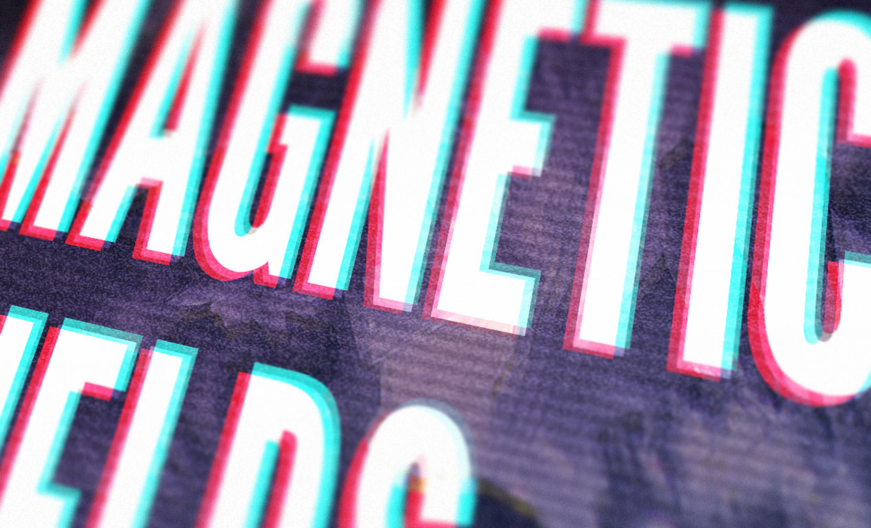
Now that our background is in place, we can start shaping our text blocks. The first one is the main one: “MAGNETIC FIELDS / 02.06.16 / TATE MODERN / TURBINE HALL / LONDON, UK.”
The type is set in League Gothic Condensed, that is 300 points tall, with a line spacing of 272 points, colored in white, and with kerning set to optical. These settings make the copy fit the two left columns of the grid, leaving the right column for the additional information blocks.


The next block is “Performances by // chp_tnes / nu_drds / cbalt / qwerty / & lw_ram.” The type is set in Droid Serif Bold, that is 54 points tall, aligned to the right, colored in white, and with kerning set to metric. These settings make the text block fit snugly in the top right corner of the poster.


The third and last text block is for the miscellaneous information: “Tickets & information at www.magneticfields.com.” It is set in Droid Serif Bold, that is 30 points tall, aligned to the right, colored in white, and with kerning set to metric. These settings make the text block fit snugly in the bottom right corner of the poster.


The result is interesting, but it lacks depth.

In order to address that, we are going to replicate the VHS effect we gave the background to the main type block. Let’s start by creating three copies of the type element.

Instead of using levels adjustment layers, we are going to assign hues directly to each type elements. This works because the type is a solid color object, as opposed to the visually complex texture we applied the effect to earlier.
The bottom copy, MAGNETIC FIELDS 02.06.16 TATE MODERN TURBINE HALL LONDON, UK copy 3, should be assigned the base blue color #0000ff.


The middle copy, MAGNETIC FIELDS 02.06.16 TATE MODERN TURBINE HALL LONDON, UK copy 2, should be assigned the base red color #ff0000.


The top copy, MAGNETIC FIELDS 02.06.16 TATE MODERN TURBINE HALL LONDON, UK copy, should be assigned the base green color #00ff00.


The top text element (the original one) should stay white.

From there, we can change the blending mode of the three copies to exclusion @ 100% opacity, and of the original element to overlay @ 100% opacity.


Now, in order to complete the effect, we simply have to offset the three copies in separate directions, using the arrow keys on our keyboard.
And with that done, we can move on to the last step: textures. Below is a look at our layer stack so far.

Textures!
Things to grab
Before we get moving, here are three assets to grab. They are all free. The first one is photocopy by clarisaponcedeleon, via DeviantArt.

The second is Film texture – grain explosion by JakezDaniel, on DeviantArt.

The third texture is vintage-paper-textures-volume-01-sbh-005, from the Vintage Paper Textures, Volume 1 set. It was made available through the “cute robot” book cover tutorial freebies.

DOWNLOAD THE CUTE ROBOT TUTORIAL FREEBIE ARCHIVE
The last asset is this pattern tile, that we’ll use for scan lines. You should download it by right-clicking on it, and using the Save image at menu.

Putting things in place
The first texture we’ll use is the film noise texture, film_texture___grain_explosion_by_jakezdaniel-d37pwfa.jpg.
It needs to be placed centered in the canvas, rotated of 90° clockwise, and scaled down to 80% so it covers the whole piece.

From there, we can change its blending mode to color dodge @ 15% opacity.

The next texture is the scanline pattern. Let’s open the file.
With the file open, we need to head to Edit > Define pattern. This will ask us to name it, and to validate. Once that is done, our pattern will be ready to use in our piece. Let’s close the pattern, and head back to our main file.

Back in the main file, let’s create a new, empty layer at the top of our layer stack.

We are going to apply the pattern using a layer style. First, we need to fill our layer with a solid color. Which one won’t matter, it is just to make sure the effect shows up. 50% gray is a good default choice in these cases (#808080).

Next, we can open up our layer style palette by double-clicking on the layer thumbnail in the layer panel.

Let’s navigate to the pattern overlay section. It’s a simple interface. We can control the pattern tile roughly the same way we can control a layer: blending mode, opacity, scale, etc.

Let’s use the drop-down menu to select our scanline pattern.

Finally, we can dramatically scale the pattern up to make sure the lines are visible (900%).

Our pattern is applied, but we need to give it an additional touch for more veracity. Let’s convert the layer to a smart object (Filters > Convert to smart filters).

Next, let’s assign a 2 pixels gaussian blur to the pattern layer/smart object (Filter > Blur > Gaussian blur).

Finally, let’s change the blending mode to overlay @ 10% opacity.

With the scanlines in place, we can move to a slight color alteration. We are going to use a gradient overlay for it. Just like before, we’ll need a layer filled with 50% gray (#808080).


Next, we are going to change the layer’s fill to 0%. This allows to hide the layer’s pixels (the gray), but to let any effects applied through the layer style panel to shine through.

Let’s open the gradient overlay side of the panel.

In the gradient drop down menu, let’s select the spectrum gradient.

Let’s change the blending mode of the gradient to overlay @ 15% opacity, and change the angle to -50°.

This gives us a nice added depth to the colors of the piece.

The next to last texture is vintage-paper-textures-volume-01-sbh-005.jpg, from the cute robot tutorial freebie archive.
It needs to be placed centered in the canvas, rotated of 90°, and scaled up to 440%.


Blending mode: soft light @ 25% opacity.

The last texture is photocopy_by_clarisaponcedeleon.jpg.
This one needs to be centered in the canvas, and slightly distorted (width: 212%, and height: 208%).

Levels adjustments.

Blending mode: soft light @ 75% opacity.

And with that, our piece is complete! After a last go at organizing our layers, here’s the full layer stack.

Wrapping things up!
Phew, that was a long one! I hope that you enjoyed following along the tutorial as much as I enjoyed creating it, and that your outcome matches the goals you set for yourself before diving in.

Did I leave anything unclear? Any suggestions? Don’t hesitate to reach out in the comments below! I’ll be happy to help out.

We’d love to see your tutorial outcomes! Please share them with us on the Go Media Facebook page, or on Twitter at @go_media.


And finally, I hope that this gave you a preview of the cool things you can achieve with the cosmic fractal storm texture pack, by Dustin Schmieding. The pack is available for download now!

On that note, that’s all for me today. Until next time, cheers!

TV Glitch Effects: Makin’ Em in PS (& Free TV Glitch Textures, Too!)
So guys, we’re kind of obsessed with these tv glitch textures we’ve been seeing around town lately. Read More ›
How to Create Flat Icons in Illustrator
So lately I’ve been looking a lot at the different tools that DJs and music producers use, and I have to be honest, since I’m pretty much a gearhead myself, that gave me the idea for a cool icon tutorial that I’m hoping you guys will find helpful. Read More ›
How to Create a Children’s Book Cover
Hello, dear Arsenal Fan! It’s Simon on this end of the keyboard for a new tutorial. Read More ›
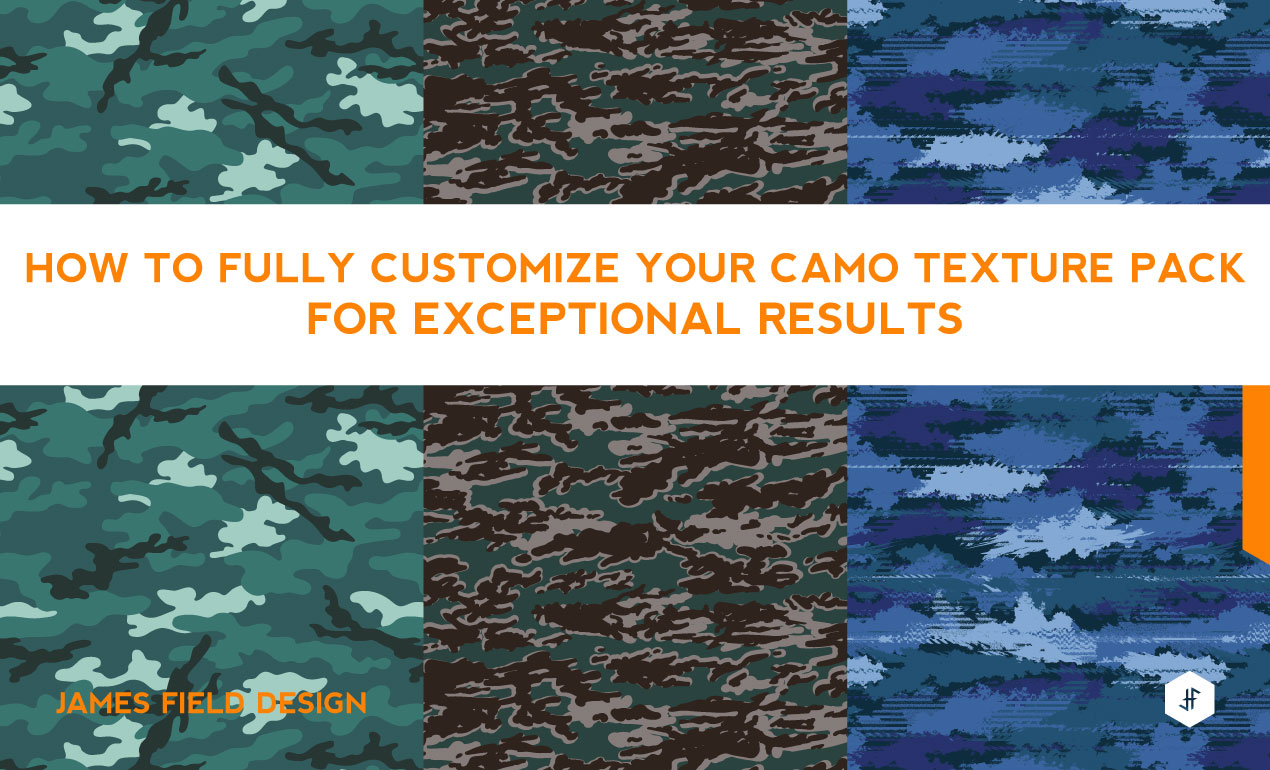
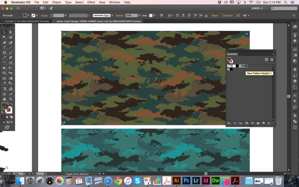
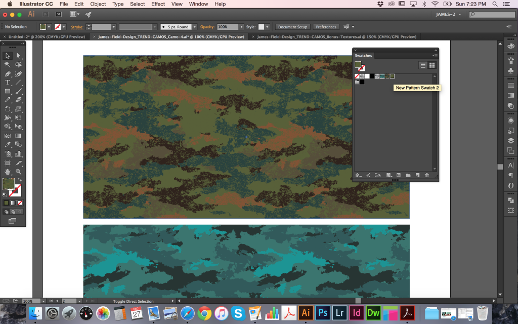
How to Use Camo Textures
Hi, I’m James Field, a freelance designer specializing in graphics for sports-fashion apparel. I have created a Trend Camos Texture Pack based on recent research into upcoming and current design
trends and increasing requests from clients. I’m going to show how they can be used and customized for your specific needs. I’m using Adobe Illustrator CC, but this technique has been
working in all versions since I started designing around eight years ago, so you should be OK with whatever release you have.
THE PRODUCT
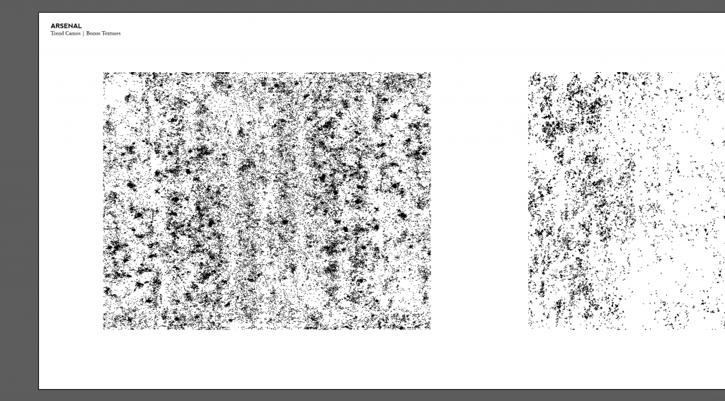
I’m referring to the Trend Camos Texture Pack that I put together for Arsenal. The pack contains x15 different fully repeating camouflage patterns inspired by the latest sports-fashion trends developing on the street. There’s something for guys and girls and many can work for both. All are already available as swatches for immediate use in the colors I have chosen but can be easily adjusted, combined, or altered to create something specific for your own needs. As a bonus, I have supplied three fully repeating textures that can be layered to create distressed versions or used in your other projects on their own. The final camo in the pack is provided as layered TIFF files that can be colored and used directly within illustrator as this works best for the more complicated distorted look.
Learn More about the Trend Camo Texture Pack
HOW TO USE : THE BASICS
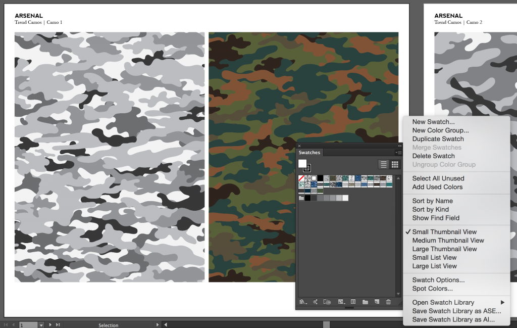
There are a number of files supplied and the easiest way to use the camos right out of the pack is to open the main document showcasing all of the designs together.

On each page you can see the individual camo patterns applied as both a grayscale and full color swatch. These can be found by name in your Swatches panel. To use these swatches directly in your work, you will need to save a library. This way, it can be opened in other documents whenever you need. Simply click the Panel Menu Icon in the top right corner of the Swatches panel and select Save Swatch Library as AI… to save them into your User Defined swatches library for later use.
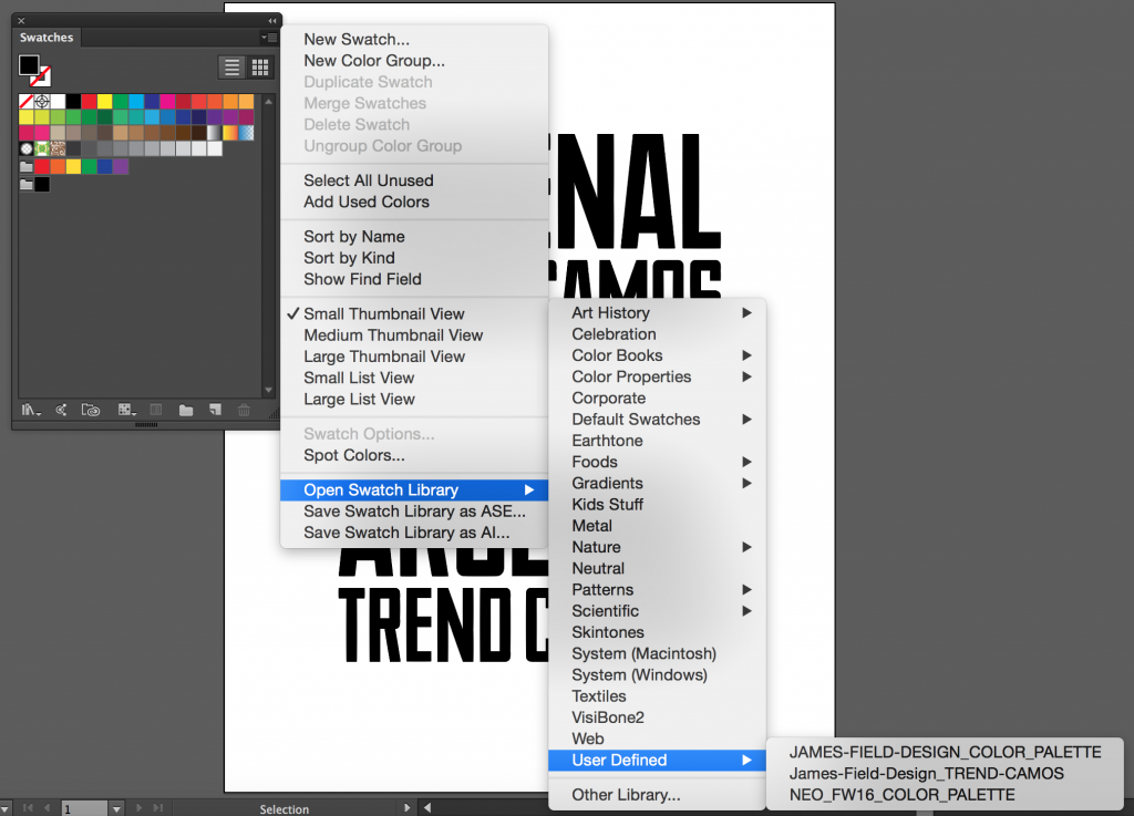
When working in a new document, you can open your Swatches panel, click the Panel Menu Icon in top-right corner, then follow Open Swatch Library > User Defined and select the
library you just saved. To apply them, you can now select an object and choose a camo pattern from the Swatches panel to fill it with.

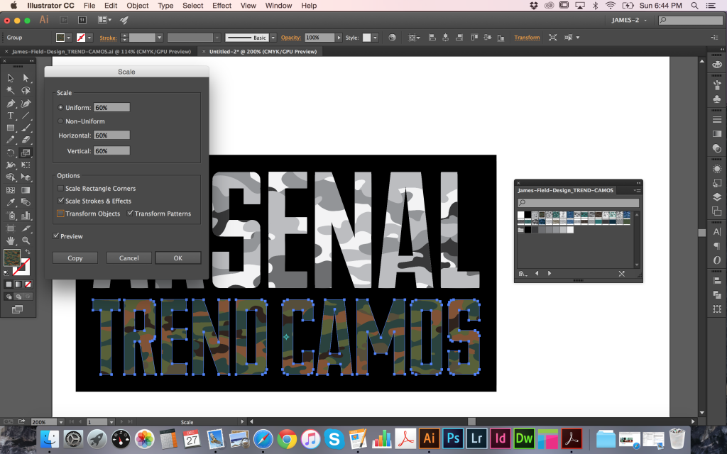
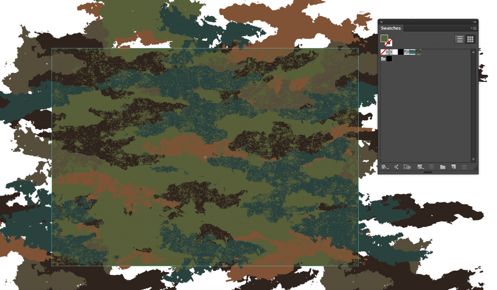
Often some quick adjustments are required to get things looking as you want them, so I’ll go through some of the most simple but important techniques. Firstly, the scale of the camo pattern filling the TREND CAMOS text in my example is a little too large to effectively see the extent of the pattern. To change it, select the object and double-click the Scale tool in the Tools Panel to bring up a number of Scale options. To adjust only the scale of the pattern and not the object itself, make sure to deselect the Transform Objects check box. In my example I have chosen to reduce uniformly to 60% and left the Preview check box selected to view the results.
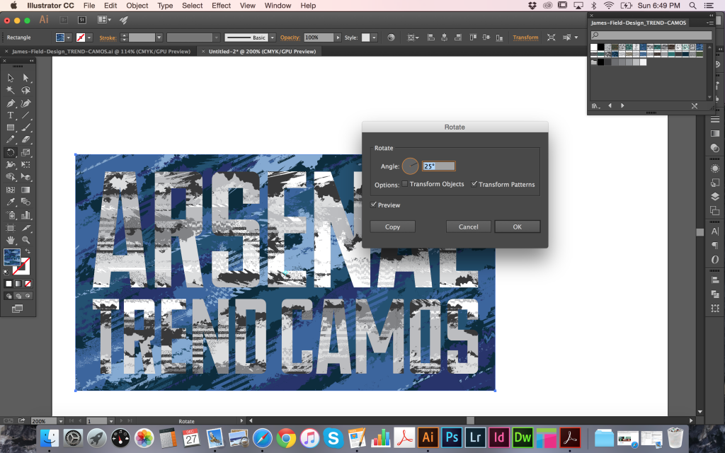
Next, I will show you how to rotate patterns. In my example, I have filled the outlined text and the background rectangle in the same camo pattern, but using different colors. To increase the
contrast between the two, I selected the rectangle object, then double-clicked the Rotate tool in the Tools panel to bring up the Rotate options. Again, deselecting Transform Objects allows
movement of only the pattern inside.
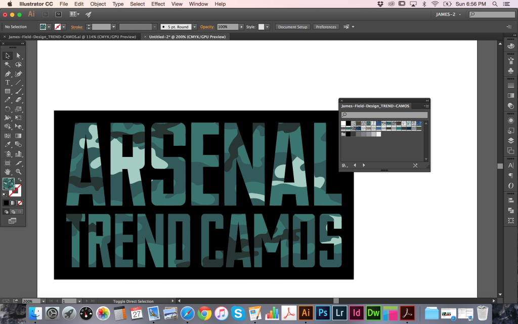
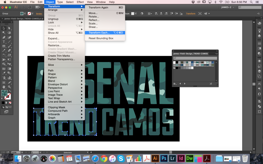
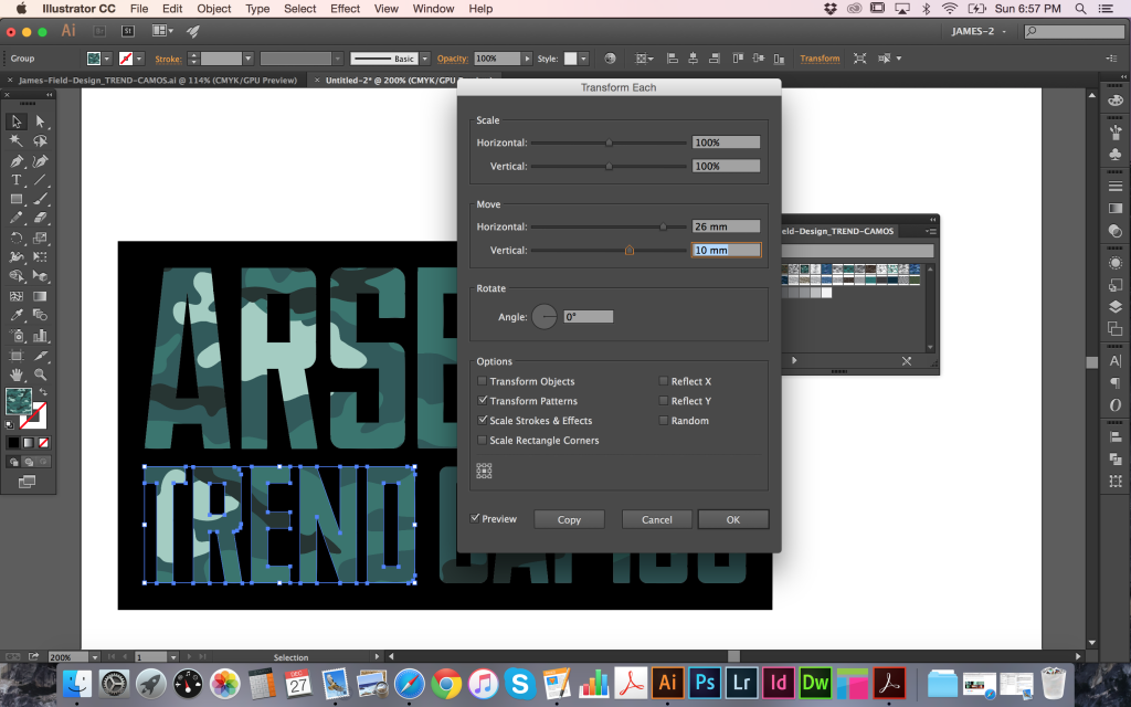
Finally, it can be very useful to move the position of the camo pattern to exactly where it is needed within an object. In my third example below, there are no light colored shapes on the
word TREND, but I would like there to be some. After selecting the outlined TREND text object, go to Object > Transform > Transform Each to bring up a more comprehensive set of Scale,
Rotation and Movement options. To move just the pattern, deselect the Transform Object check box as before and with the Preview box checked, go ahead and adjust the Horizontal and
Vertical sliders as required.
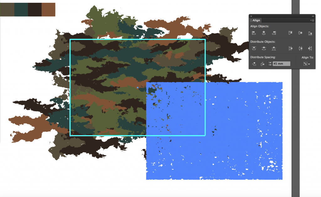
CUSTOMIZING YOUR CAMOS
If you’d like to go a step further and customize the individual camos to more exacting specifications, then you can find each of the patterns ready to work with in their own individual documents. Opening any of these files you will see an artboard on the left with the original elements used to make the pattern. The rectangular guidelines are provided to show the boundaries of the tile area. Below this are the camo pattern shapes that you can recolor and below those are a rectangular background that can also be colored. Importantly, there is a second clear (no fill, no outline) rectangle at the very back that is the exact same size/shape as the guidelines that are used to define the pattern tile area. This MUST be left as it is and not grouped together with the other elements. The key to updating the camo patterns for yourself is to leave that clear rectangle alone, and to make the same changes to elements on all sides.
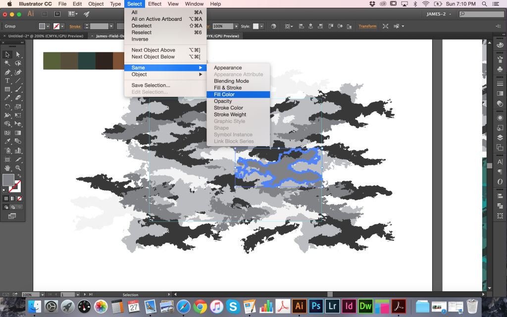
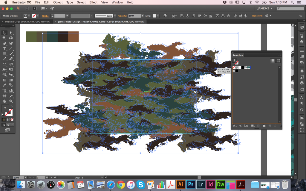
The most straightforward way to recolor the pattern is to select an individual element then follow Select > Same > Fill Color to collect all objects that same shade and apply your own new color. Continue to do this until you have your own color scheme created. In many cases, the camo shapes have been left intact so you can go in and change, add, or remove individual pieces to further adjust the look of the camo. However, always remember to make sure any elements overlapping the guidelines are also updated on their opposite sides in order to maintain the fully repeating visual. When you’re happy with the look of your pattern, select the entire camo (make sure to include that clear rectangle at the very back) and drag directly into your swatches panel. You should now see a new swatch created in the panel that can be applied to objects.
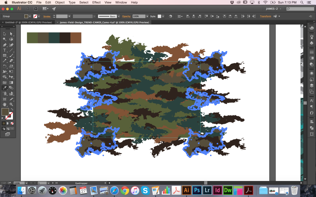
Provided with the Trend Camos are a set of three fully repeating bonus textures that can also be introduced into your camo patterns. Open that file and select the one (or more) that you want to use. Next, select and copy, then paste into your camo document. To make it repeat with your camo, you should resize and align to the guidelines and recolor to fit your scheme. To make an effective distressed look, use the same color as your background rectangle, then once again drag everything directly into your swatches panel.
NEXT STEPS
This is just the start of what can be achieved with the contents of the Trend Camos Pack. You can combine them, adjust them, resize, and recolor to fit your project as needed. As my first
ever tutorial, I hope everything was easy to follow and you found the info to be useful. If you have any questions or would like to see more, please get in touch and I’ll do my best to help out! I hope you enjoy using the Trend Camos Pack and I look forward to receiving your feedback.
Learn More about the Trend Camo Texture Pack
Learn more about James on his Official Site | Behance | LinkedIn | Twitter | Tumblr | Facebook

Introduction
Hello there! It’s Simon on this end of the keyboard. I’m very happy to make my return to the Zine with a poster design tutorial, that will explore the possibilities offered by Jason Carne’s Texture Lot One. The tutorial will have us explore texture use tips and tricks, but also customized black and white conversion, large scale sharpening, type pairing, layout building, and more.
I’ll be using Photoshop CC for the tutorial, but any version of Photoshop past CS3 should be fine. Note also that I’m working on a Windows-based system, but other than visual appearance and slightly different keyboard shortcuts, that will not have any impact on the process we’ll go through.
Introducing Jason Carne’s Texture Lot One
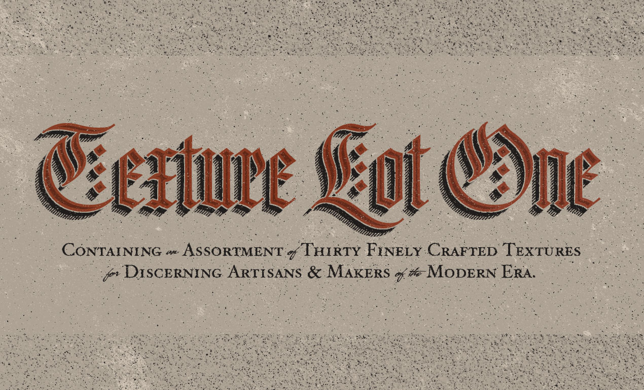
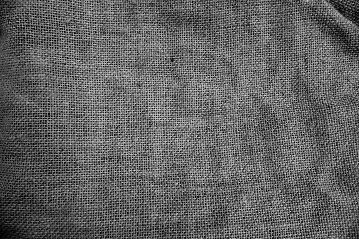
As the hero shot image tells us, the set contains 30 “finely crafted” textures, that will help us to give a wide array of artifacts to our flat, digital art. They come from a multitude of source material: burlap, cork board, a scratched cutting board, stone, and more.
The textures come in the form of high resolution, black and white textures.
The level of detail is superb, and gives us plenty to leverage to add substance to our compositions.
And one more for the road, just because we can.
Go pick Jason’s Texture Lot One up now at the Arsenal!
The brief
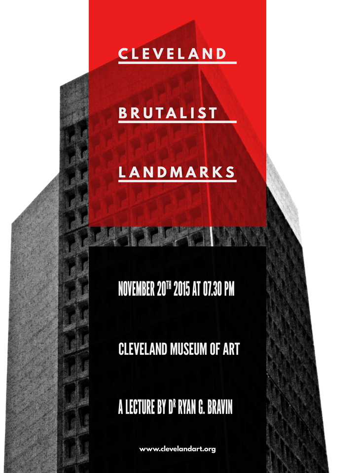
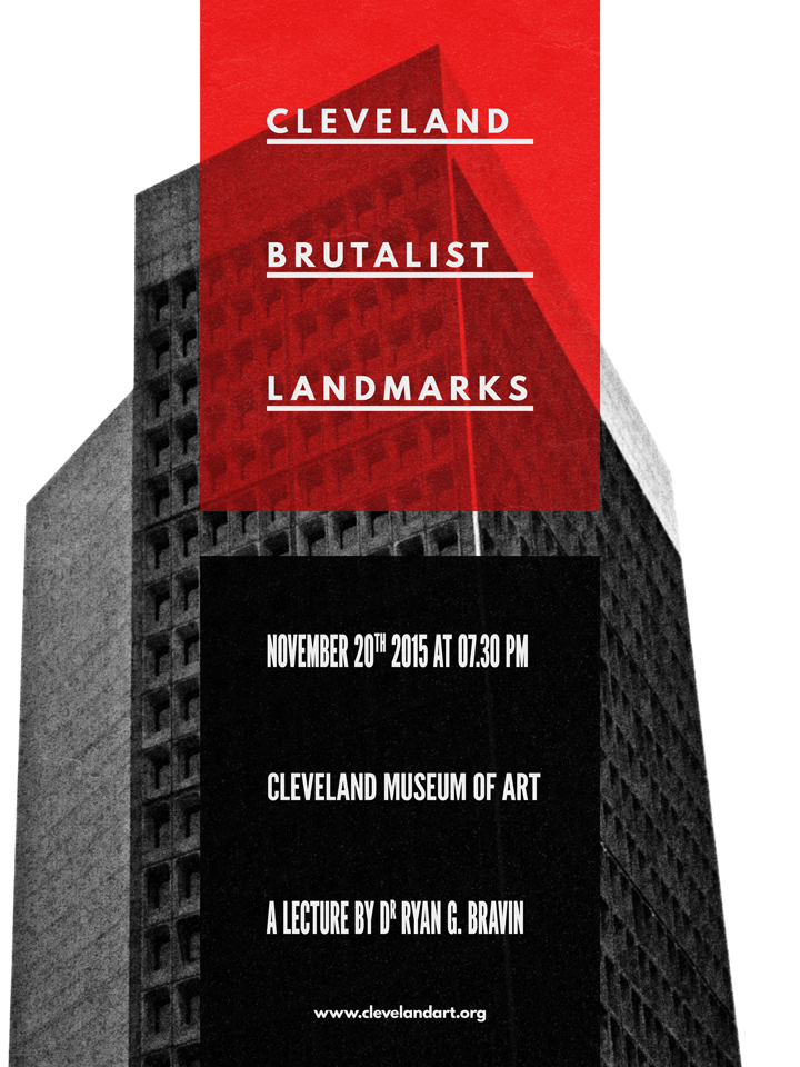
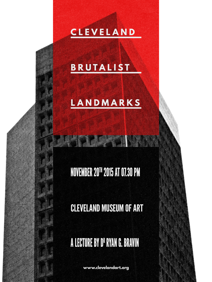
Let’s talk some more about the piece we’re putting together here. It’s a poster for a (fake) architecture lecture, focusing on Cleveland’s brutalist landmarks.
What is brutalism? Glad you asked:
Brutalist architecture is a movement in architecture that flourished from the 1950s to the mid-1970s, descending from the modernist architectural movement of the early 20th century. The term originates from the French word for “raw” in the term used by Le Corbusier to describe his choice of material béton brut (raw concrete). British architectural critic Reyner Banham adapted the term into “brutalism” (originally “New Brutalism”) to identify the emerging style.
So, what does a brutalist building look like? There’s this amazing Tumblr called F**k yeah brutalism out there, and it’ll help me to answer that question:
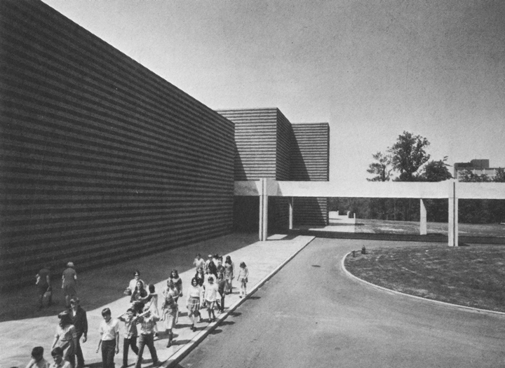
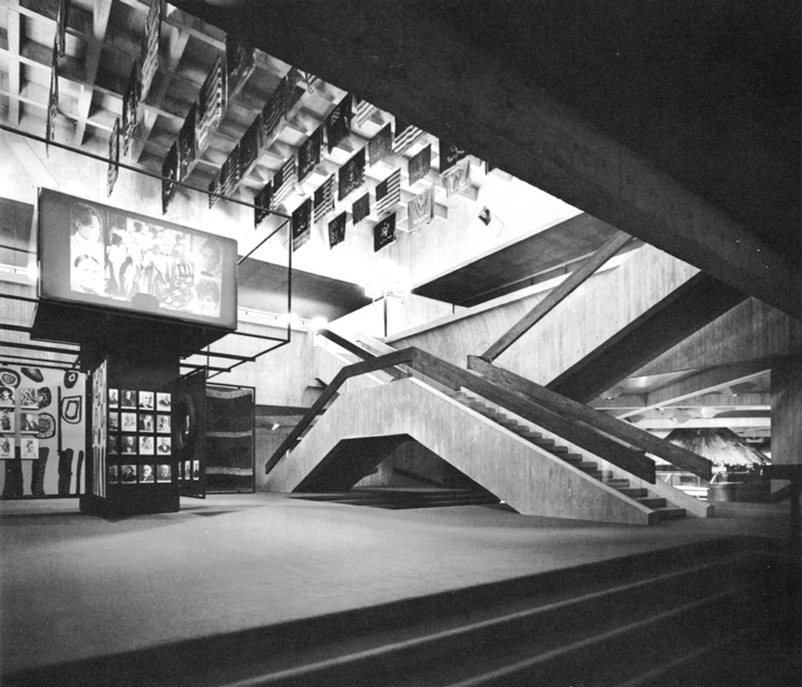
(Education Wing, Cleveland Museum of Art, Cleveland, Ohio, 1971 -Marcel Breuer & Associates – via)
(State Historical Center, Columbus, Ohio, 1970 – Ireland and Associates – via)

(State Historical Center, Columbus, Ohio, 1970 – Ireland and Associates – via)
There is something monolithic, synthetic, and minimalistic at times.
Now, why choose Cleveland as the focal point of the fake lecture? It happens that Cleveland has its share of brutalist buildings. A 2007 article from the Plain Dealer lists the major local representative landmarks of the movement: Cleveland State University, Cuyahoga Community College Metro Campus, Cleveland Justice Center Complex, Crawford Hall (Case Western Reserve University), and more.
Assembling the free assets needed
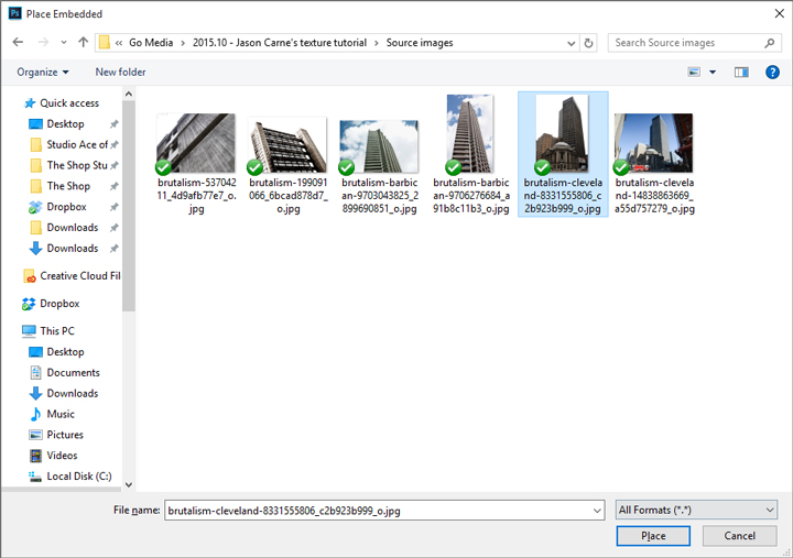
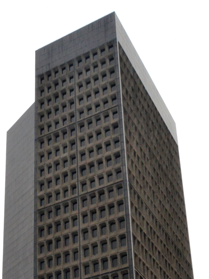
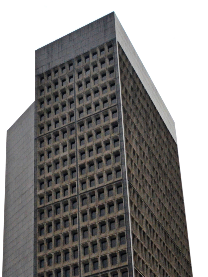
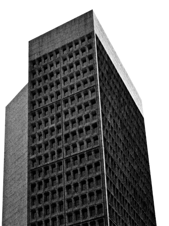
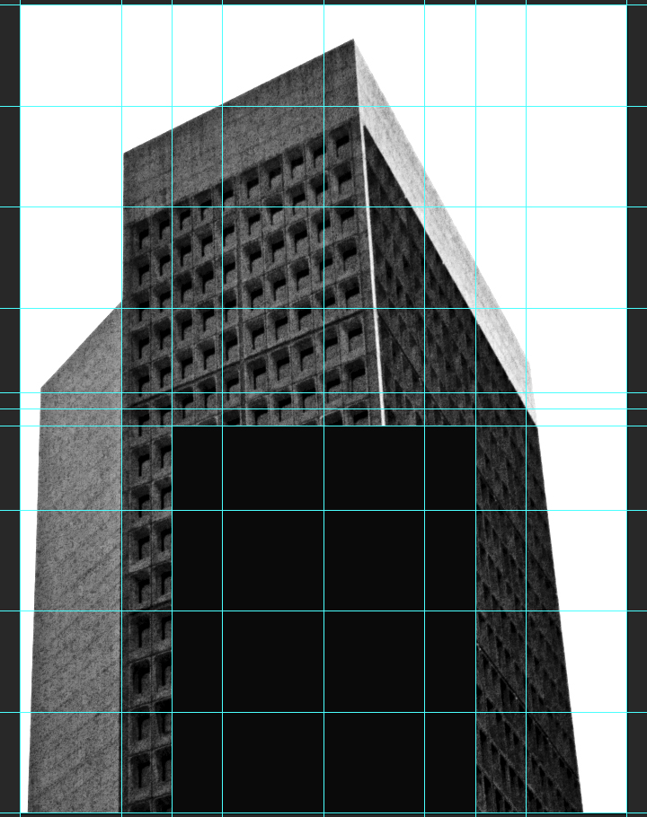
It happens that there is a CC-licensed image of the Cleveland Ameritrust Building, one of these major landmarks, available on Flickr for us to use as the base of our poster. We’ll need to grab the biggest size available (4028 x 2704 pixels), through the all sizes page.

Other than the high resolution version of the image, we’ll also need to have two (free) typefaces accessible to us: League Spartan Bold, and League Gothic.


The last asset we’ll need to have at hand is this beautiful, free aged paper texture, courtesy of our very own Dustin Schmieding:
Got it all? Then it’s time to get started!
Preparing our Photoshop document
We’ll use is a “standard” 18″x24″ canvas for our piece. For the readers outside of the USA, feel free to use an A3 format. Note the fact that we’re using an RGB document, as some of the filters we’ll use require that color space to function.
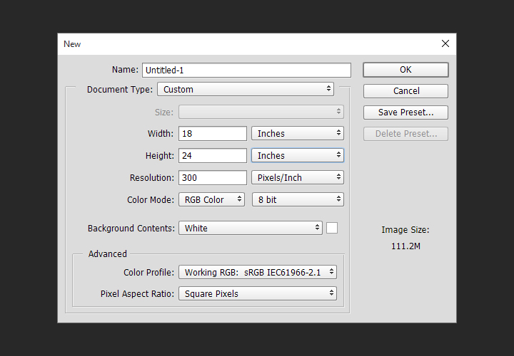
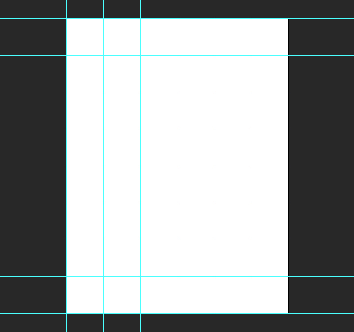
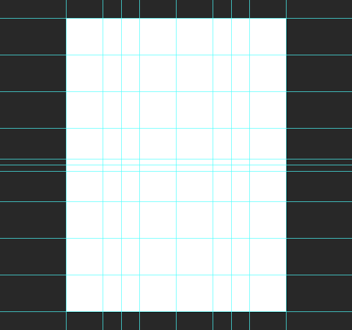
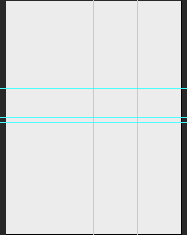
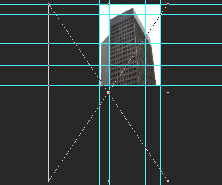
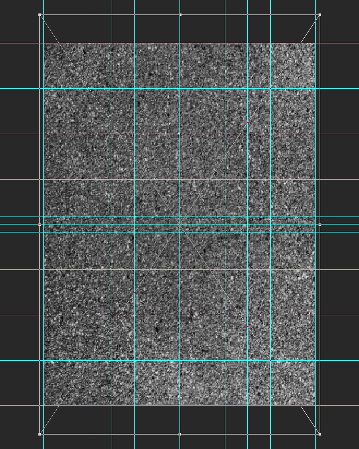
Next, we need to setup a grid. It’ll help us when building the composition. First, we’ll leverage Adobe CC’s New guide layoutfunctionality to build a six columns by 8 rows main grid (View > New guide layout).
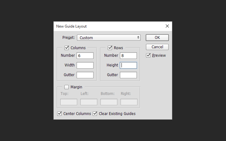
The result is a grid based on squares of 3″x3″.
Note: if you don’t have the CC version of Photoshop, you can leverage the power of GuideGuide to accomplish the grid-related tasks quickly. The current version isn’t free, but older versions are.
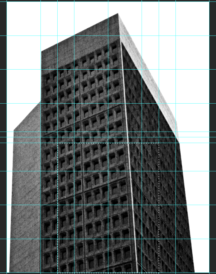
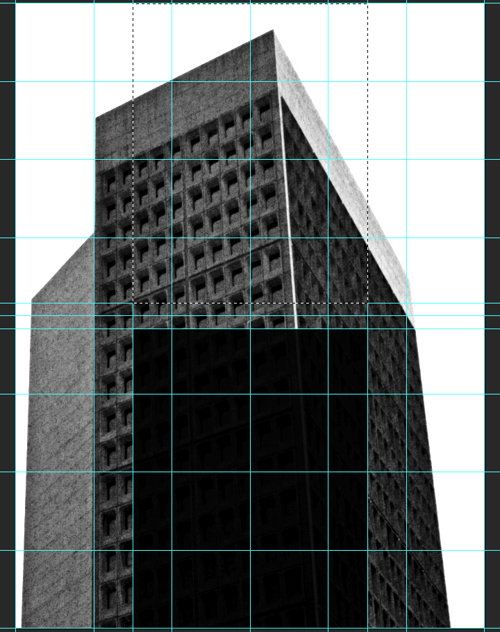
The next set of guides are going to help us establish the boundaries of the center column. We need vertical guides at4.5″, and at 13.5″.
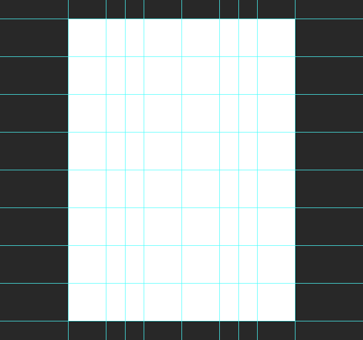
Finally, we need horizontal guides at 11.5″, and at 12.5″.
And with that, our document is ready to go. It’s time to get started for real.
The background
Background color
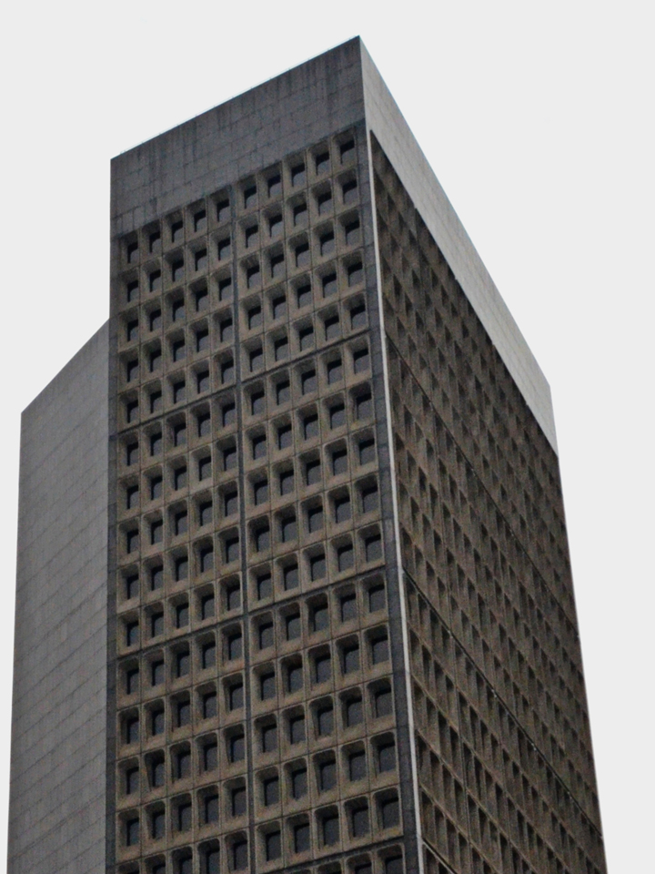
The first thing we need to do is give a solid color to our background layer. It’s going to be the base for the effects we’ll build up through the tutorial. We’ll be using a very light gray, #ededed. If we were using pure white, the contrasts would be too strong, and some of the texture effects we’ll apply later would be “washed out.”
Photographic manipulations
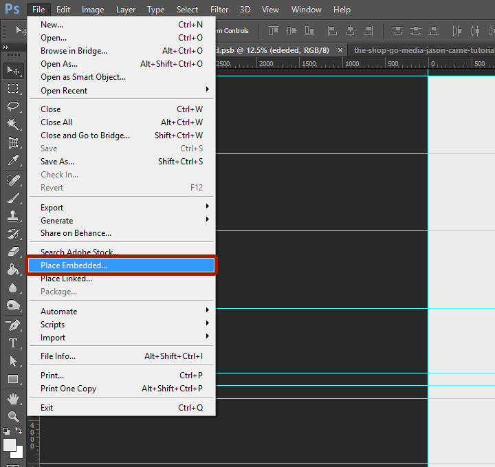
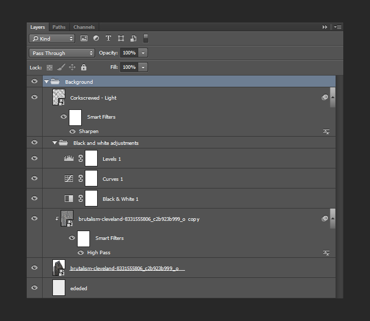
Next, we need to place the photo in our composition. We’ll place the photo as a smart object, in order to maintain a lossless workflow. It will also guarantee us access to the untouched original file. To do so, we have to use File > Place (or File >Place embedded in Photoshop CC), and navigate to the photo file.
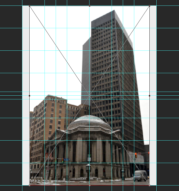
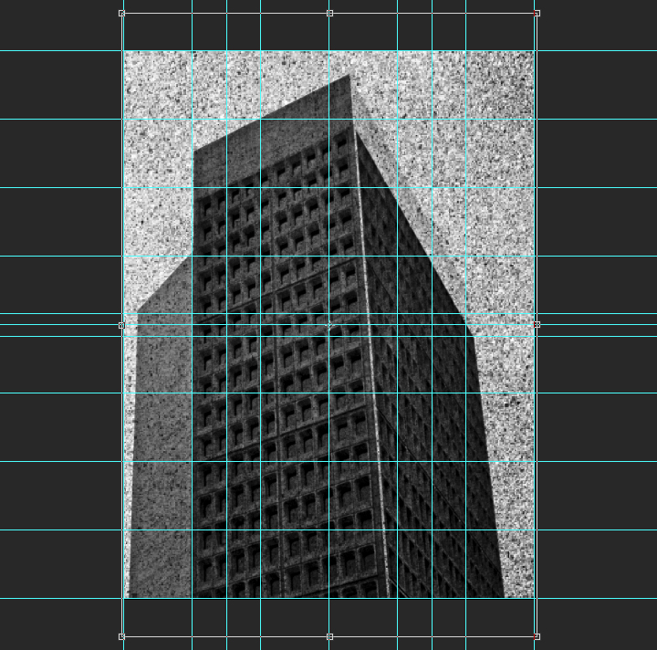
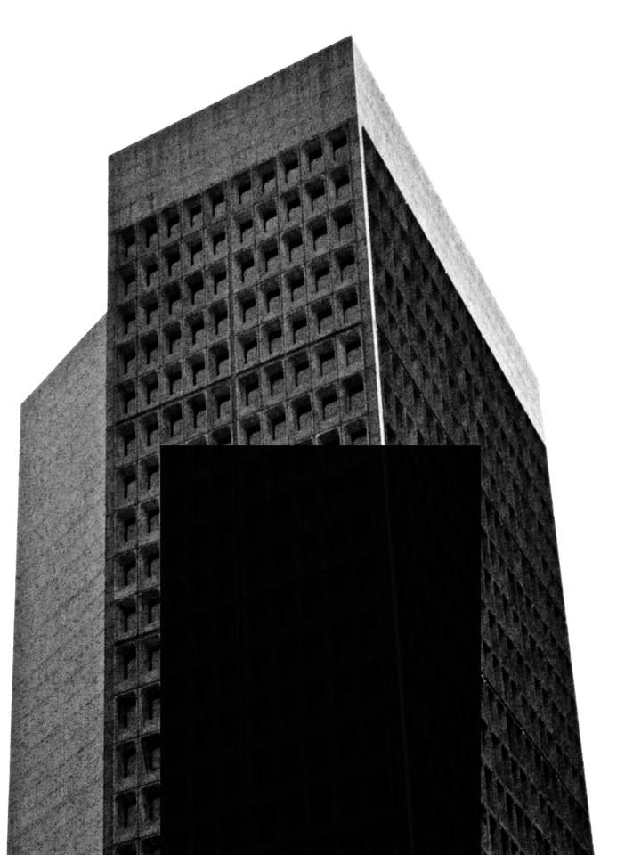
Once the image is included in our file, we will give it its final positioning and size using the absolute positioning tools at our disposal. The center point of the image should be at X: 2.55″, and Y: 26″. The image is scaled up to 125%.
![]()
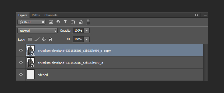
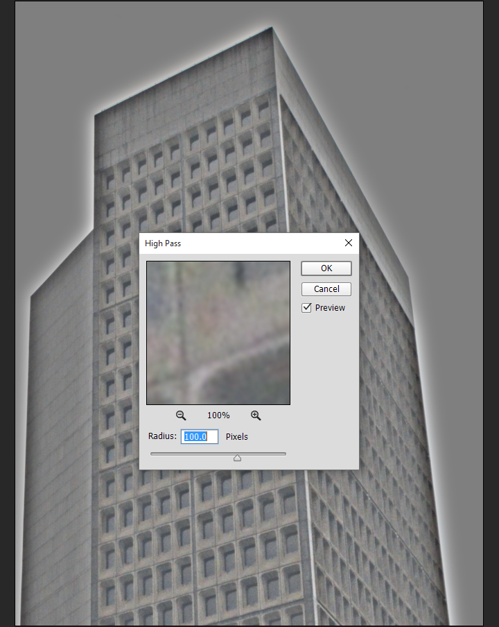
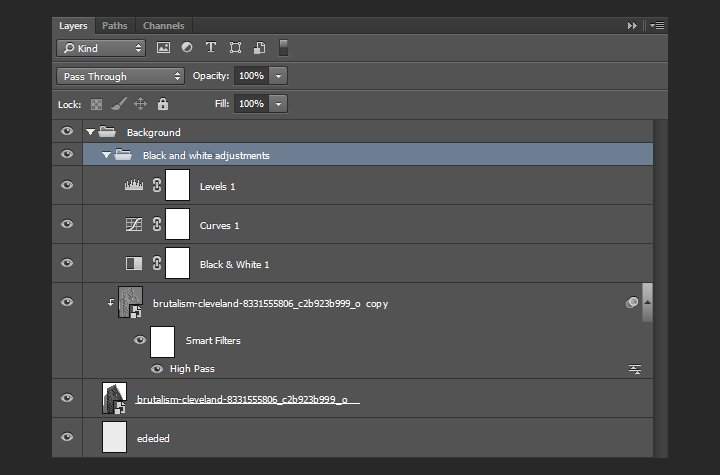
With that done, we need to sharpen the smart object, since we scaled it up. We’ll use the high pass filter for that. The Zine archive features a short article about the technique already. Let’s start by duplicating the smart object.
Next, we need to run the high pass filter (Filter > Other > High pass). We’ll use a radius of 100 pixels.
The result doesn’t look like much. To obtain the desired effect, we need to change the copy’s blending mode to soft light @ 100% opacity.
Next, we are going to clip the copy to the original layer (CTRL/CMD+ALT/OPTION+G). This contains the high pass effect to the layer it’s clipped on.
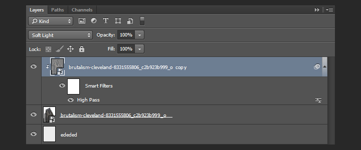
With that done, we can change the blending mode of the original layer to multiply @ 100% opacity. This will make the photo adopt the soft gray we’ve used as background color as its main color once we’ve converted it to black and white.
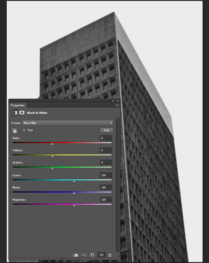
Black and white adjustments
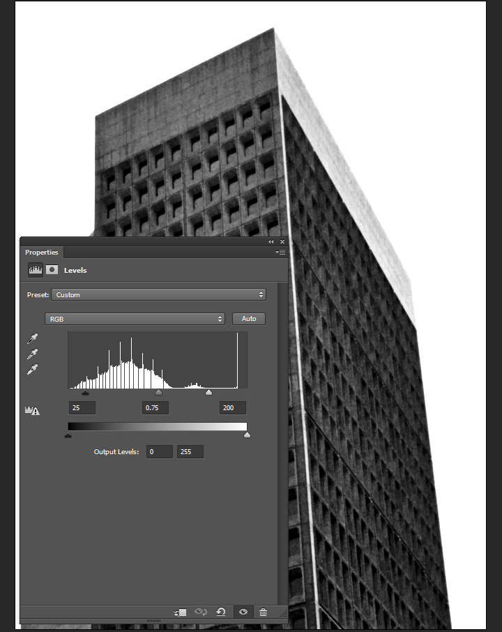
Desaturating a picture IS NOT a proper way to convert it to black and white. We are going to use a black and white adjustment layer for that. The preset we’ll use is called blue filter. Cyan, blue, and magenta hues in the original image will be light, while greens, yellows, and reds will be untouched or dark. For a higher contrast, the greens, yellows, and reds could be purposefully set to darker (using a negative value in the sliders).
The next step is a curve adjustment layer, set to the lighter preset. This allows us to soften the black and white conversion.
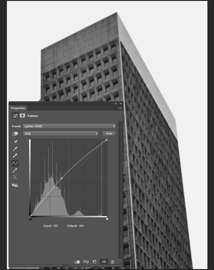
Finally, a levels adjustment layer allows us to push the contrast up.
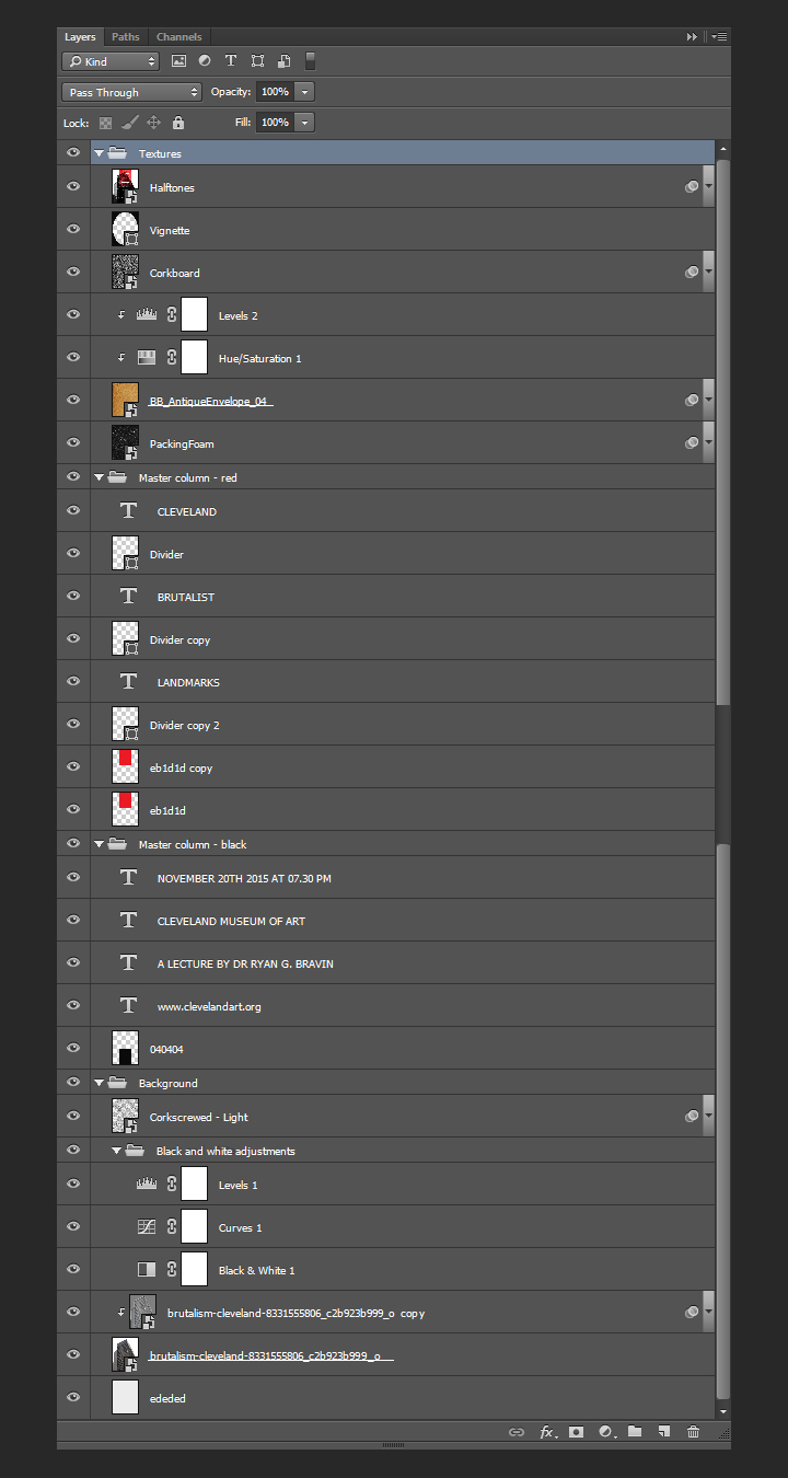
It’s time for some layer organization.
A hint of texture
We are going to add one of Jason’s textures above the background. It will help us to generate a subtle grain effect. The texture is Corkscrewed – Light.
Go pick Jason’s Texture Lot One up now at the Arsenal!
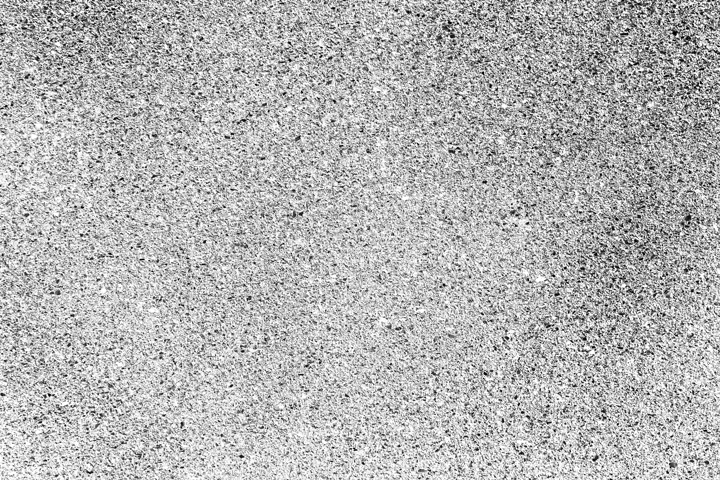
It’s placed centered in our canvas, rotated of 90°, and scaled up to 225%.
After converting the texture layer to a smart object (Filter > Convert for smart filters), and sharpening the texture (Filter > Sharpen > Sharpen), we can change its blending mode to soft light @ 75% opacity.
That texture concludes our work on the background. Before switching gears and attacking the content columns, here’s a look at our layers so far.
Content columns
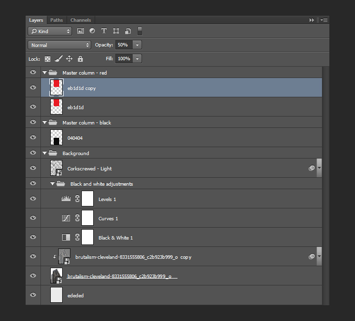
Setting up the columns backgrounds
Back when we set up the grid, we created a set of special guides that we’ll now use to delimit central column for our text. The column is split in two parts, one with a red background, and one with an almost-black background.
Let’s start with the almost black. It sits at the bottom half of the canvas. Here’s the area we have to delimit.
After creating a new layer, we need to fill it with a very dark gray, #040404.
Finally, the blending mode of that layer should be multiply @ 98% opacity. This will allow us to bring a hint of translucency in the shape.
The next shape will be its pendant at the top of the composition, and will be filled with a very bright red, #eb1d1d.
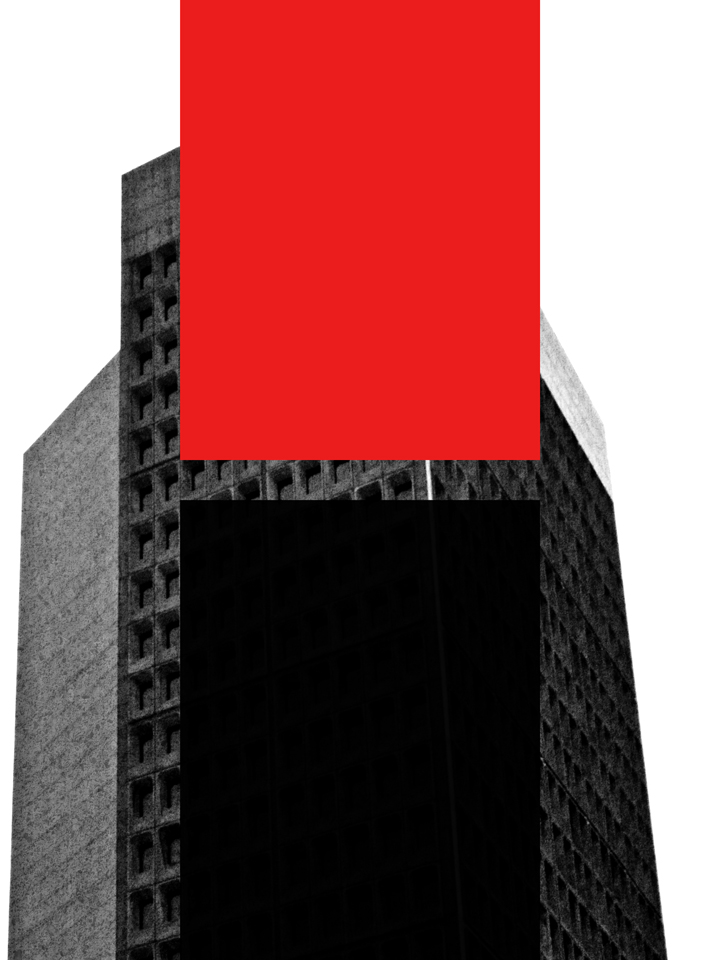
The blending mode of that layer should be multiply @ 50% opacity.
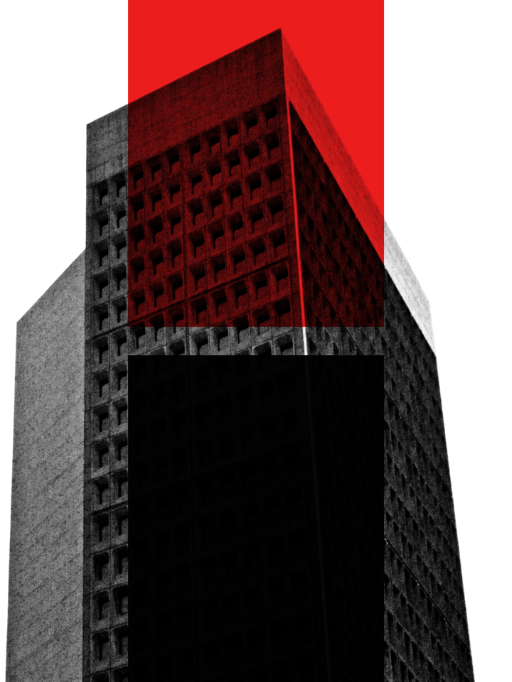
The shape’s translucency is too high (we need to remember that it will be the background to text later on). In order to address this, we’ll duplicate the layer, and change the blending mode of that copy to normal @ 50% opacity.
Layer organization
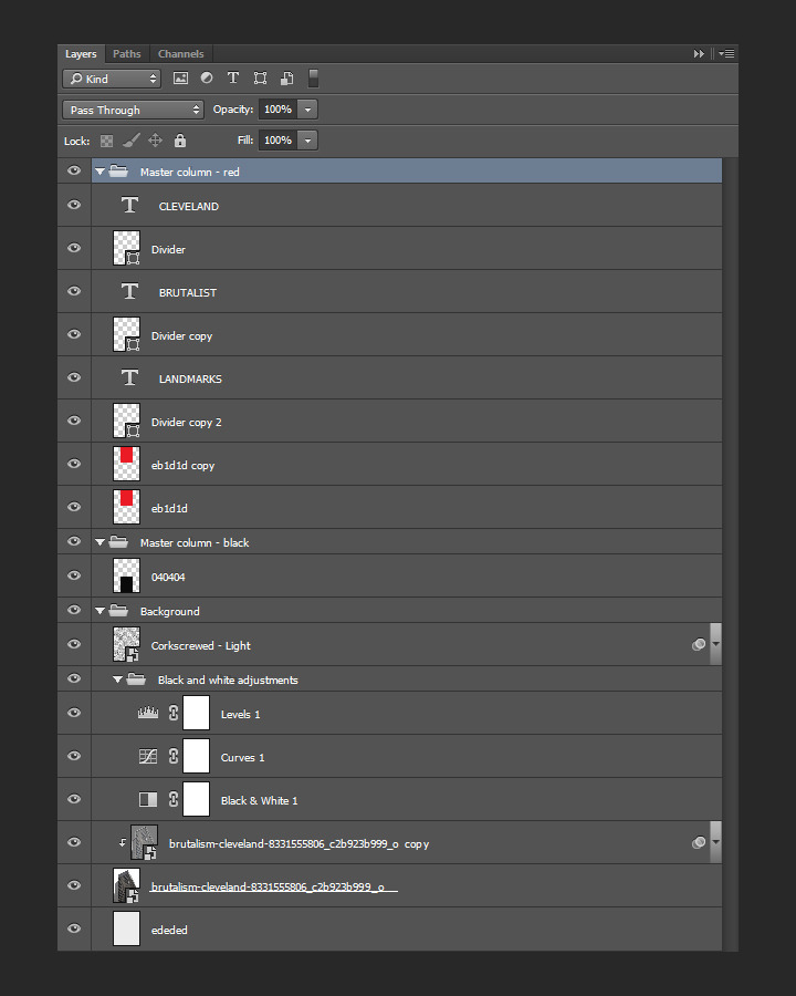
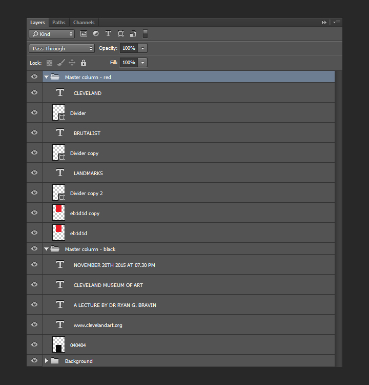
A quick note about layers, as we’re about to add type elements in there. Here’s what they should be organized into. The background elements have their layer group, and each half column elements have their dedicated layer group. From there, it’ll be easy to add the type in the proper group, so everything stays organized.
It’s time to talk about typography
As announced at the beginning, we’ll be using two type families: League Spartan Bold, and League Gothic.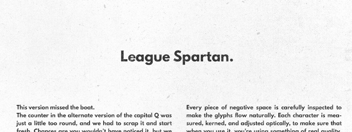

The main title
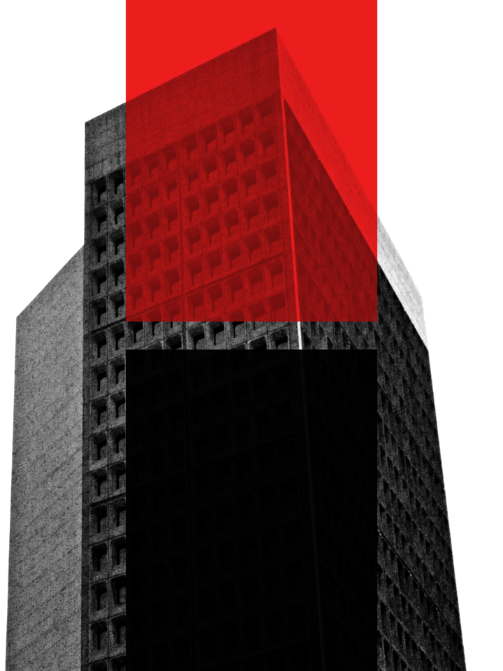
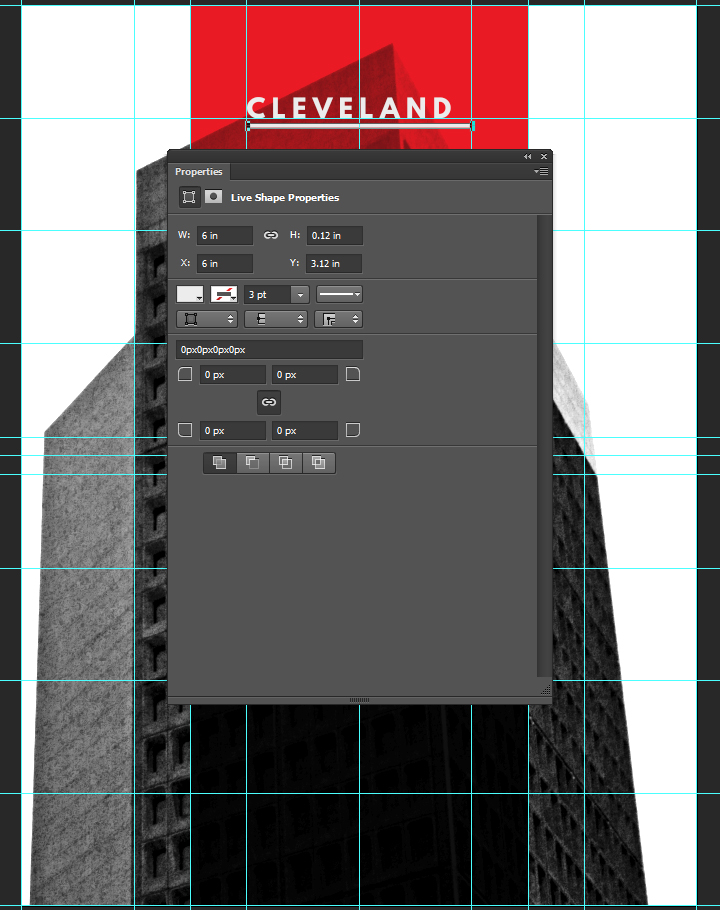
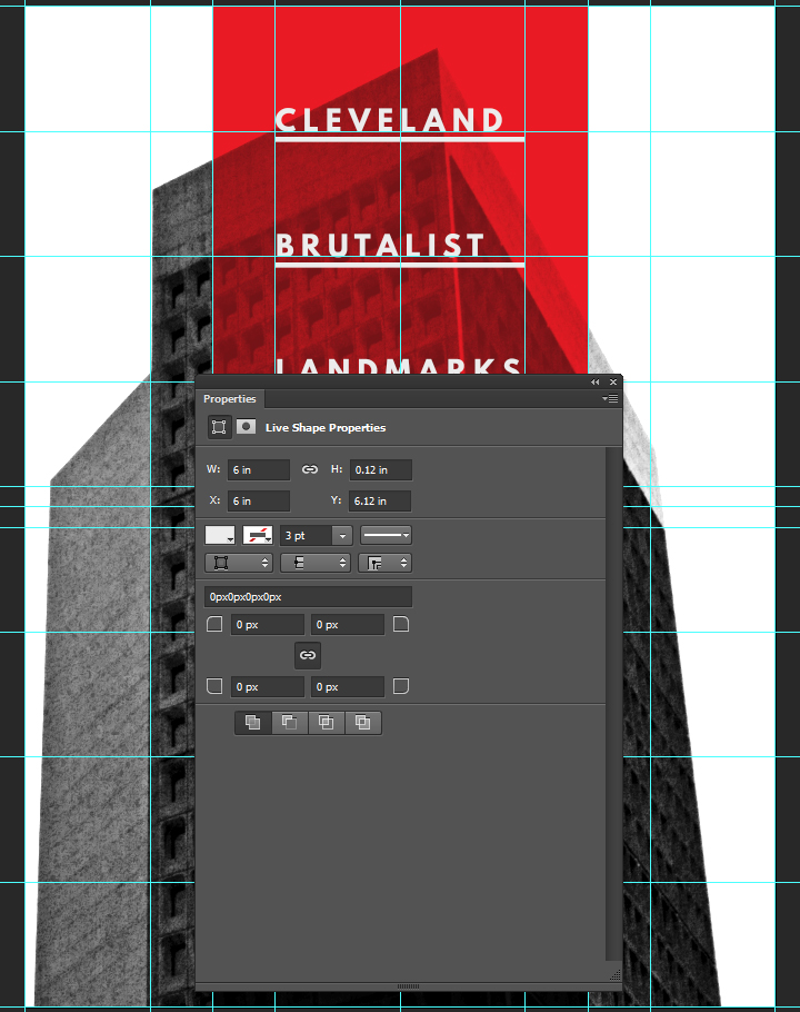
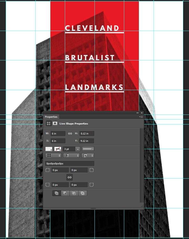
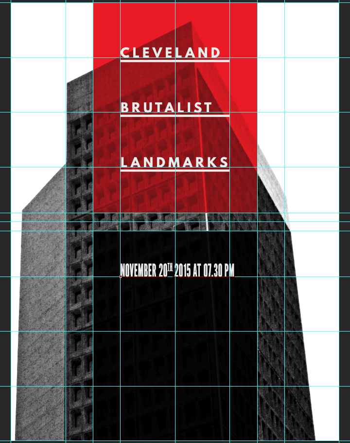
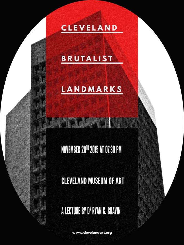
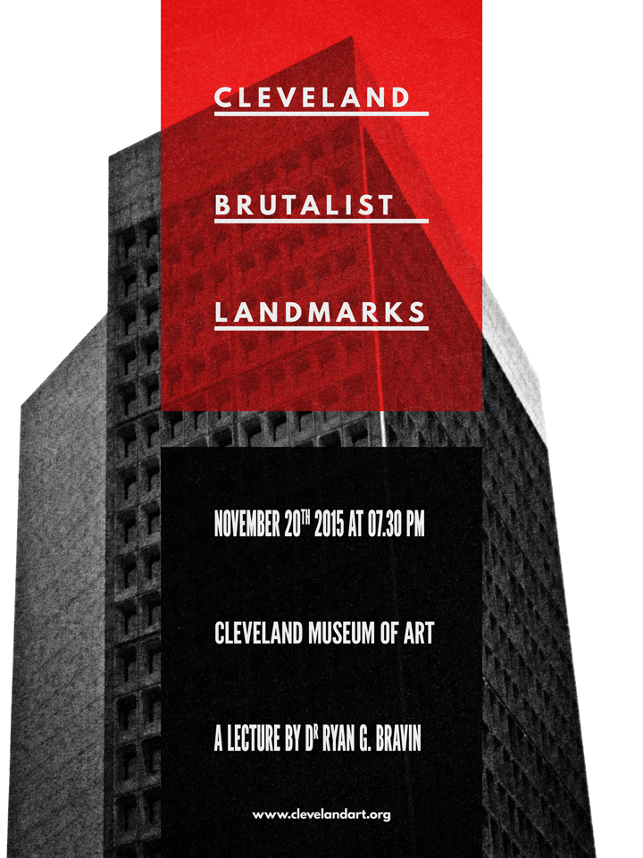
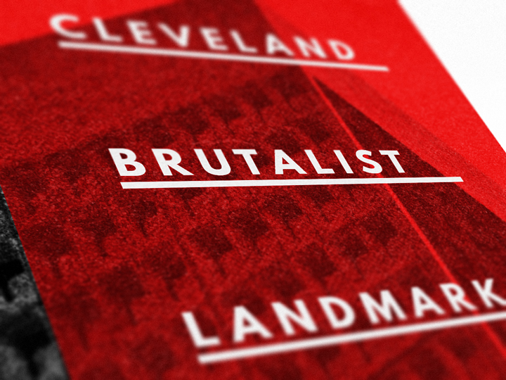
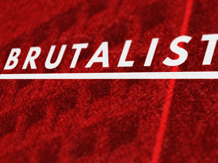
The main title reads “CLEVELAND / BRUTALIST / LANDMARKS,” and is set in all caps League Spartan Bold, colored in #ededed, that is 48 points tall, and with tracking set to 250. Each line is its own text object, and they are aligned to the grid lines within the column.

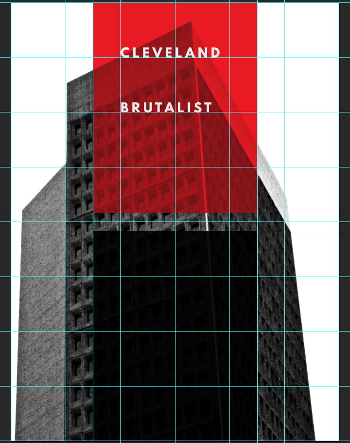
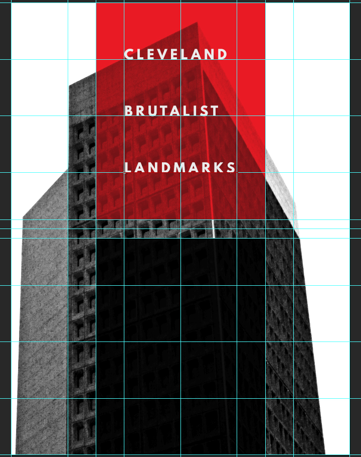
In order to further ground the title element, we are going to add horizontal dividers underneath each line of text. The dividers will be colored in #ededed, and measure 6″x0.125″. The dividers are positioned underneath each text line, 0.125″ under the text line. We’ll use shape layers to generate the dividers.
And here’s what the layers look like.
Additional information
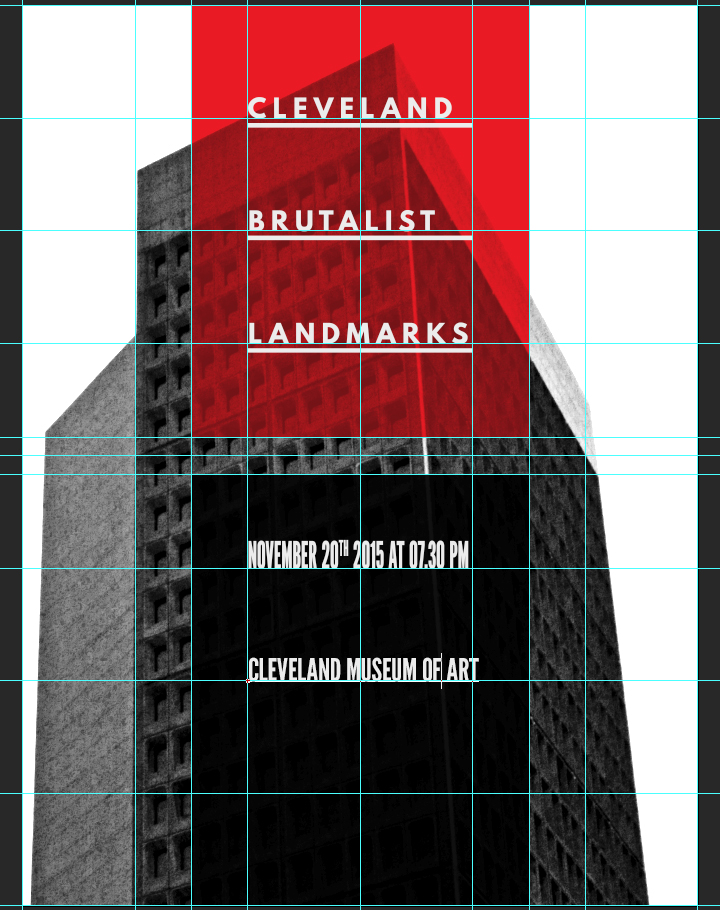
We are not creating a proper conference poster if we don’t add the secondary information like the lecturer’s name, a date, a location, and a URL. The information is broken down as follows:
“NOVEMBER 20TH 2015 AT 07.30 PM / CLEVELAND MUSEUM OF ART / A LECTURE BY DR RYAN G. BRAVIN / www.clevelandart.org”
The individual type objects are aligned in a similar fashion as before, on the grid lines. “NOVEMBER 20TH 2015 AT 07.30 PM” is set in League Gothic Condensed Regular, that is 72 points tall, colored in #ededed, and with kerning set to optical.
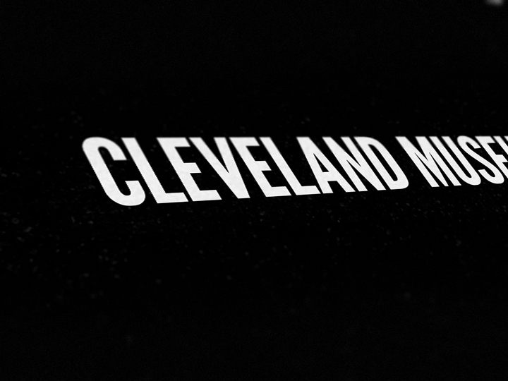
“CLEVELAND MUSEUM OF ART” is set in League Gothic Regular, that is colored in #ededed, that is 60 points tall, and with kerning set to optical.
“A LECTURE BY DR RYAN G. BRAVIN” is set in #ededed colored League Gothic Condensed Regular, that is 72 points tall, and with kerning set to optical.
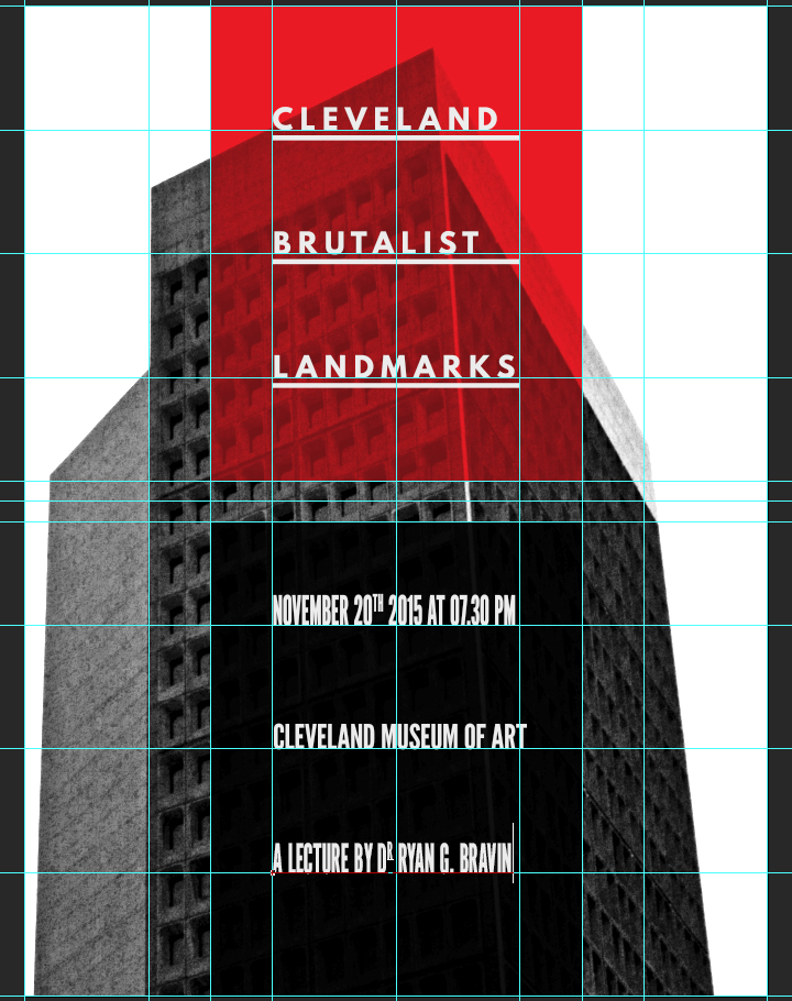
Finally, the URL to the site of the Cleveland Museum of Art, www.clevelandart.org, is set in #ededed colored League Spartan Bold, that is 24 points tall. The text object is located at X: 9″, and Y: 22.8″.

Here’s what the layer organization looks like:
And with our type in place, our piece is almost complete.
Now, it’s time to layer some more textures to polish the piece!
Textures and artifacts
Here’s a theory: one of the motivations to add textures to our work is to help us to add depth to our digital art, and to break away from their flat, clean, and precise origins. At this point in the process, the photo is pretty gritty, but the type above it is very clean. Adding more textures will allow us to weather that type and the column backgrounds.
The first texture we’ll add is PackingFoam.
It’s placed centered in the composition, rotated 90° clockwise, and scaled to 55%.
After sharpening the texture (Filter > Sharpen > Sharpen), we can change the blending mode to screen @ 15% opacity.

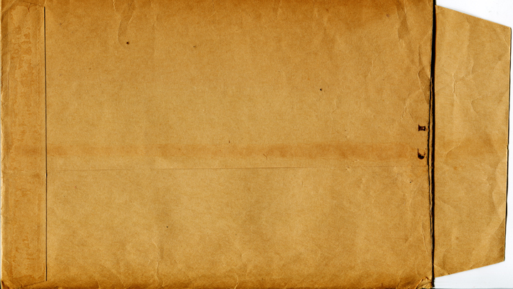
The next texture is the freebie we grabbed at the beginning, BB_AntiqueEnvelope_04.jpg.

It’s placed at X: 18″, and Y: 19.9″, rotated 90° counterclockwise, and scaled up to 1,150%.
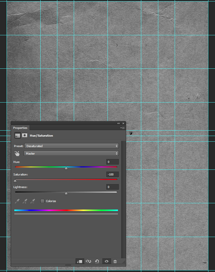
After sharpening, we’ll use a clipped hue/saturation adjustment layer to desaturate the texture.
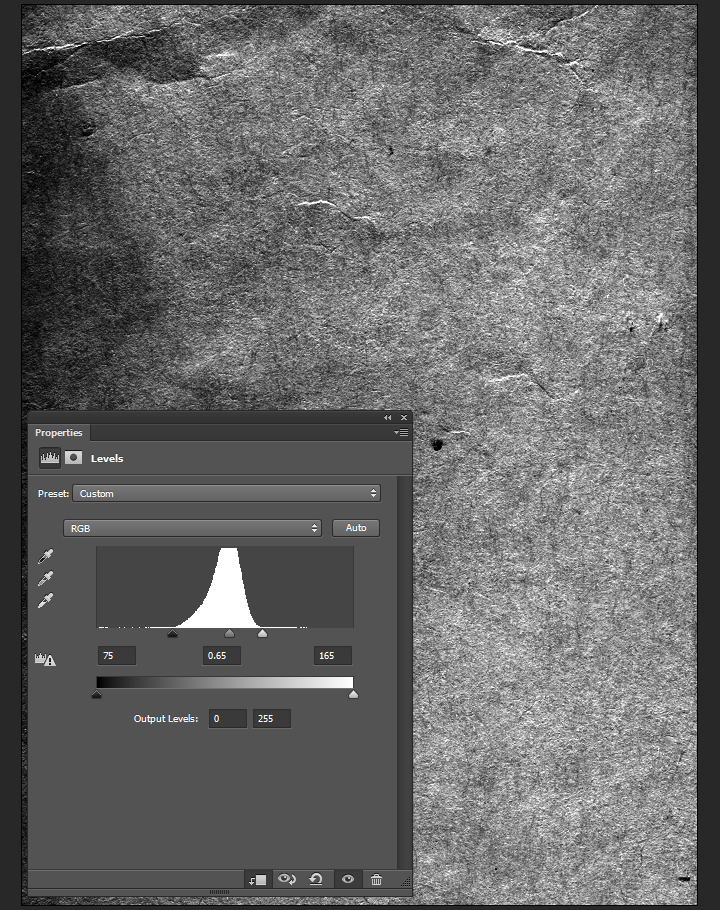
A clipped levels adjustment layer will help us to enhance the texture further.
Blending mode: soft light @ 35% opacity.
The next texture is from Jason’s set, and is called Corkboard.
Go pick Jason’s Texture Lot One up now at the Arsenal!

It’s placed centered in the composition, rotated 90° clockwise, and scaled to 55%.
After sharpening, the blending mode should be changed to soft light @ 25% opacity.
The texture levels are coming together nicely. We’ve added grain, light noise, and small artifacts to the piece with a few layers of substance. Let’s have a look at the layers before the ultimate polishing touches.
Last details
Lossless vignette effect
There is a way to create a lossless vignette effect in Photoshop, thanks to shape layers. The first step is to draw an ellipse that fits the canvas. It should be colored in #040404.
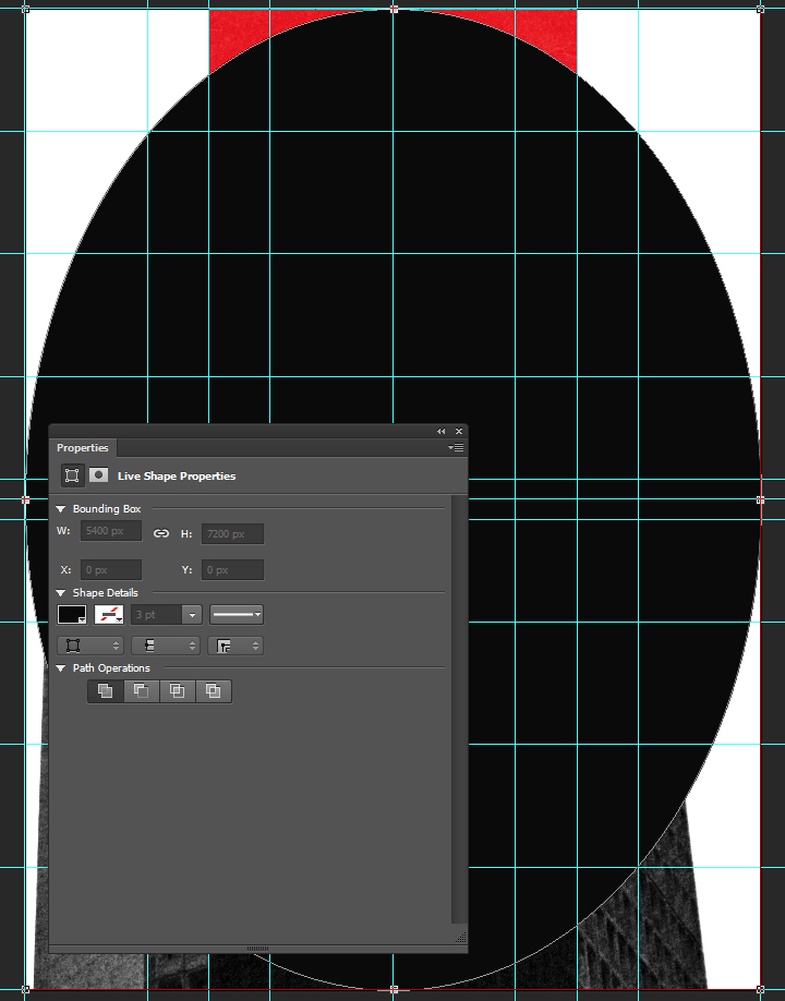
Next, we need to use one of the tools accessible via the direct selection tool (A), in the toolbar. It will allow us to display the ellipse inverted, getting closer to the vignette. Once the active tool is the direct selection tool, we need to change the path operation button‘s setting to subtract front shape.


The result is a very sharp edged ellipse, almost ready to be a vignette.
Next, through the layer’s properties panel, we need to feather the layer mask to 350 pixels. This creates the fuzzy edge for the vignette.
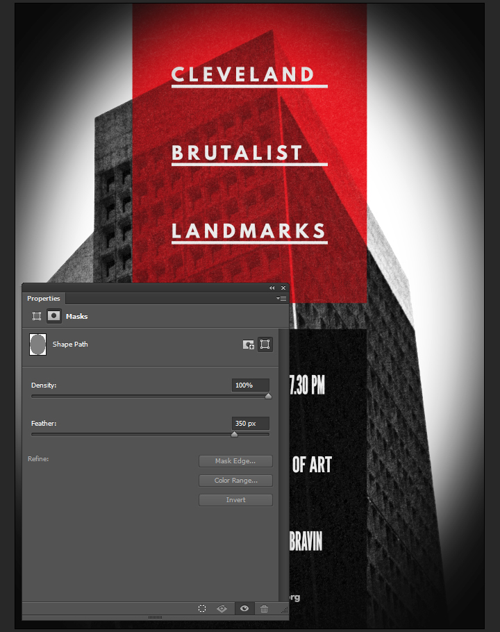
Finally, the blending mode for the vignette can be switched to soft light @ 50% opacity.
Last but not least: halftones
The last piece of the puzzle is a halftone effect. First step, to create a merged copy of the piece so far. We’ll use the CTRL/CMD+ALT/OPTION+SHIFT+E shortcut for that. It’ll create a layer containing a merged copy of the piece so far. I called it Halftones.
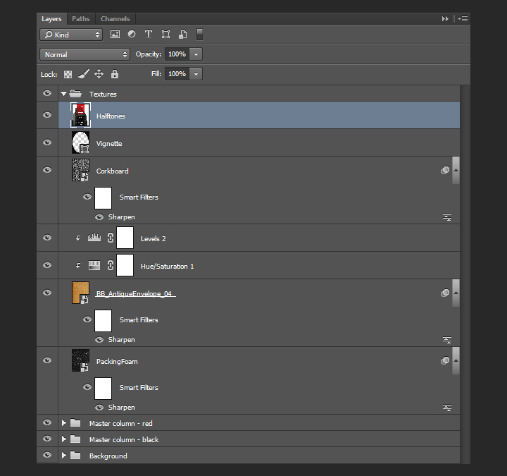
Once the layer is generated, it needs to be converted to a smart object.
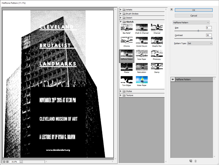
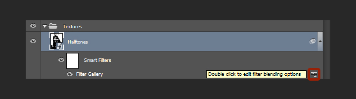
After resetting the color palette to default (D), we’ll use the filter gallery’s halftone effect (Filter > Filter Gallery > Sketch > Halftone pattern). We’re using a size value of 8, and a contrast value of 50.
Then, we need to change the effect’s blending mode to soft light @ 100% opacity.
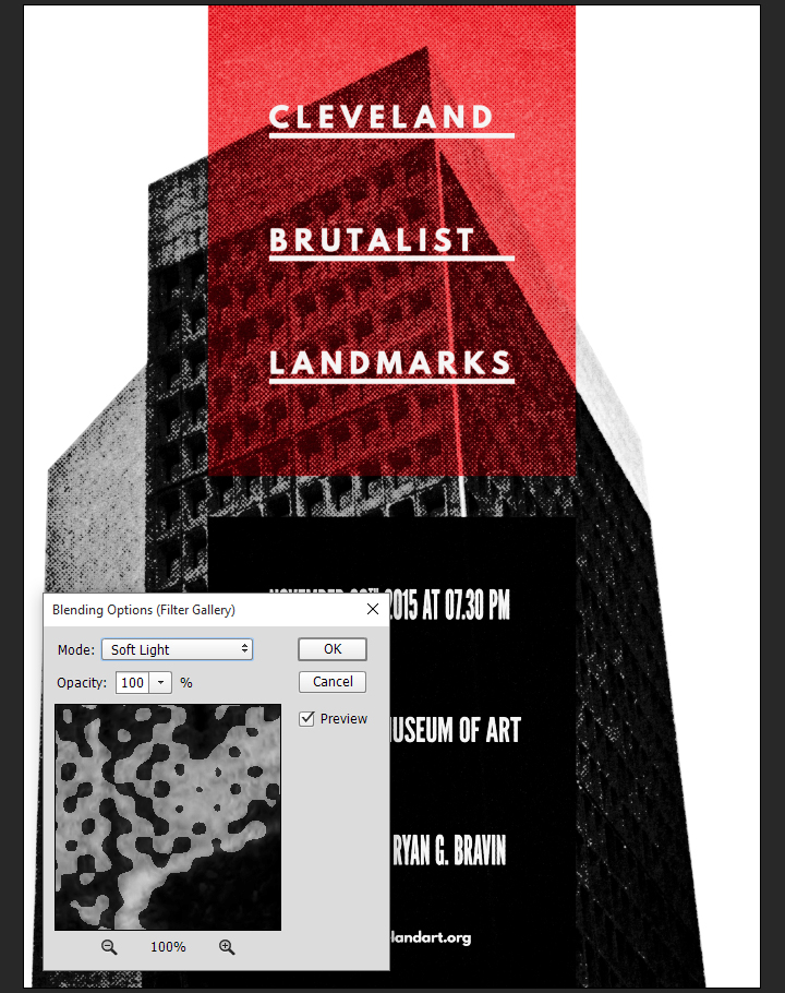
After that, we can change the layer’s blending mode to soft light @ 50% opacity.
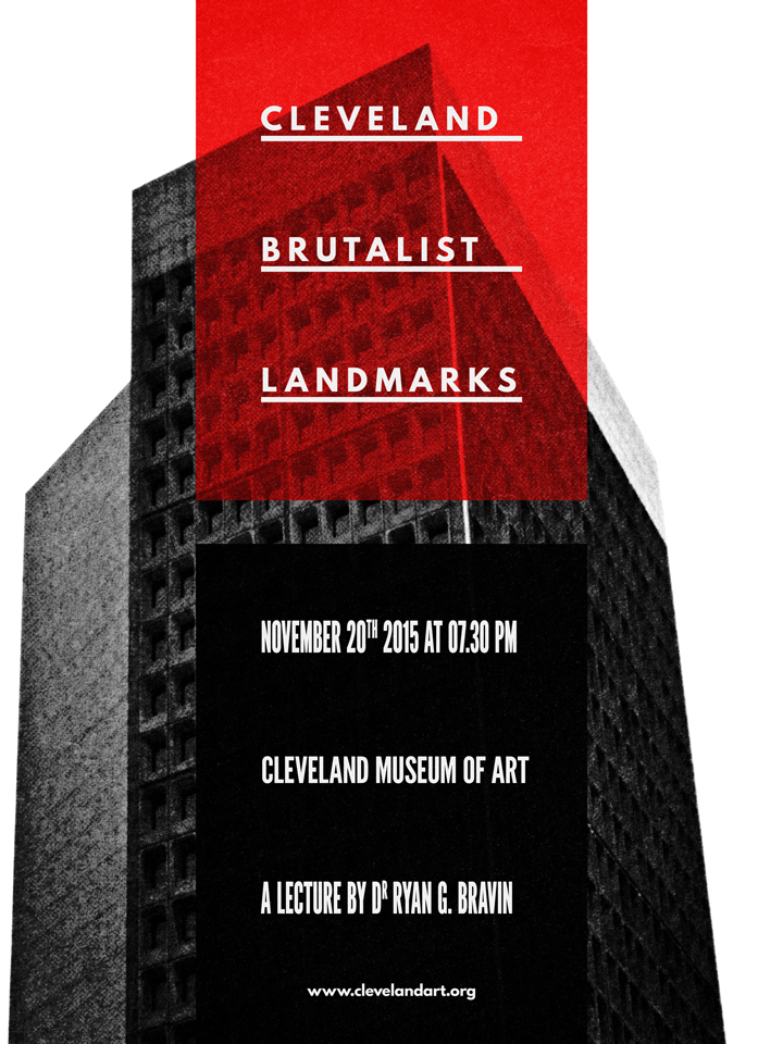
And our piece is now done! Here’s a look at our final layer stack.
Wrapping things up
Phew, that was a long tutorial! I hope that you enjoyed it, learned a few tricks here and there, and that your outcome matches the goals you had at the beginning.
We’d love to see your tutorial outcomes!
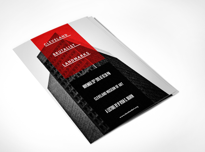
Mockup your poster using the free sample below from our Poster Mockup Templates Pack and please share your work with us in the comments, by tweeting at us at @go_media, or sharing them on our Facebook page.
Free Download: Free Poster PSD Sample from Go Media
If you already purchased Jason’s texture set, I hope you enjoy them, and that this tutorial gave you a sense of what you’ll be able to accomplish with them. If not, go grab them while they’re hot!
Go pick Jason’s Texture Lot One up now at the Arsenal!
And on that note, that’s it for me! Until next time, cheers!

Space has and will probably always be one of those things that man has long dreamt of conquering. From the darkest corners of the Milky Way to the farthest region of the known Universe we will always poses that urge to explore and look for new worlds, worlds that could change what we know about life itself. Read More ›