
Poster Design Inspiration: 50 We Love + Our Do’s and Don’ts
50 Poster Design Inspirations
You’ve been asking for tips on poster layout design and we’re here to help. Today, we’ll be using a sampling of inspiring posters to show you how to design your own.
We hope you enjoy these tips and hope that they inspire you to design your own. Ready to go? Download our free poster PSD from our Arsenal. Or, if you don’t use Photoshop, try our free poster mockup over at MockupEverything.com.
Want a chance to win free posters from Go Media? Click Here.
Now, onto our Poster Design Inspiration:
- Do: Demonstrate one message clearly.
Do Not: Make us stand in front of your poster scratching our head.
- Do: Keep it simple, crisp and clean.
Do Not: Fill the space just to fill the space.
- Do: Give the poster a sense of balance through the use of color, graphics, and text.
Don’t: Gather all of your elements on one side and leave us with a kink in our neck.
- Do: Rank in order of importance (ie give information like time, date, venue visual hierarchy).
Do Not: Make everything ALL ONE SIZE.
- Do: Express a sense of emotion by way of color and contrast.
Do Not: Go all color crazy on us.
- Or: Try a monochromatic theme instead.
- Do: Play with Hand Lettering and Type.
Do Not: Use every font in your library.

- Do: Be playful or use humor to provide an element of surprise.
Don’t blur into the background. We want to remember your poster!
Other Suggestions –
Do: Create depth and movement with your design elements if possible.
Do: Play with negative space.
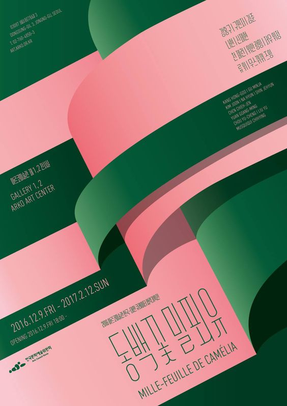
Do: Explore using blocks of color or shapes to emphasize other elements of your poster.
Do: Use photography to emphasize your design when needed.
Do: Create a beautiful piece of artwork that people will want to keep and collect.
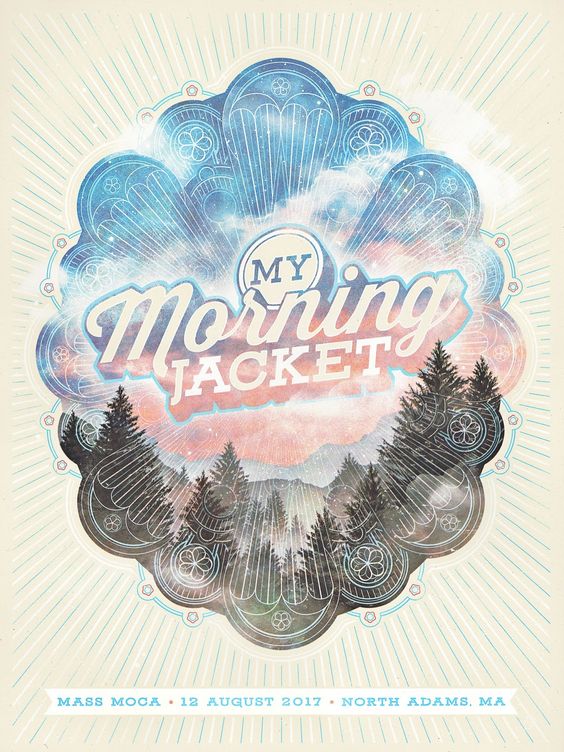
Do: Break the rules. We believe in you!
Follow our Poster Board on Pinterest here.









Comments are closed.