Author Archives: Simon Birky Hartmann
Introducing the cosmic fractal storm texture pack
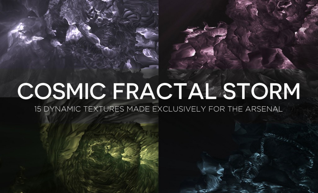
Hello everyone! It’s Simon again on this end of the keyboard. I’m returning for another tutorial, and boy, do we have a treat this week. Dustin Schmieding gifted us with yet another fantastic texture pack, the cosmic fractal storm texture collection.
The set is composed of three-dimensional scenes, resembling cloud formations, or landscapes. Each texture is 4,000×2,700 pixels @ 150 ppi. This gives us plenty of pixels to work with, even for big size print applications (posters, flyers, and more).
DOWNLOAD THE COSMIC FRACTAL STORM TEXTURE COLLECTION
Arsenal Members, you get this pack at no extra charge! (Feels like your birthday, doesn’t it?)
Using the pack: let’s play!
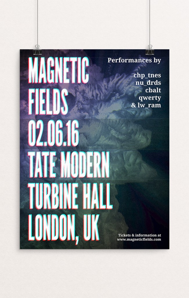
These assets are at home in a variety of contexts. They can be used as stand-alone assets, as background elements, as textures… We will explore some of these uses while we embark on the creation of a poster for a (fake) EDM event called Magnetic Fields.
The tutorial will have us explore tips and tricks to recreate a “VHS-like” effect, for all that analog glitch goodness.
We’ll use primarily Photoshop for this tutorial, as manipulating textures is easier with it, and because we won’t engage in complex type manipulation.

We are going to work extensively with textures. It’s a good time to remind you guys of a few base rules, and processes:
- Don’t know what a clipped layer is? Glad you asked! This means that the layer is only visible/applies to the layer directly below it. You can very quickly do this by holding ALT down on your keyboard and clicking between the two layers. Here’s a quick demonstration.
- Every time we’ll work with textures, we’ll follow this simple process: place as smart object, sharpen1, desaturate, enhance contrast with levels, and modify the blending mode.
- Placing the textures as smart objects, and using adjustment layers to tweak them, allows us to stick to a non-destructive workflow. We’ve explored in depth the numerous pros and few cons of such a workflow in this past tutorial: “How to Use Textures The Right Way.”
Notes: 1 – accessed through the Filter > Sharpen > Sharpen menu.
With this in place, it’s time to get started!
The concept
As hinted at during our walk-through of the product, these textures feature digital “landscapes” that make no mysteries about how they have been generated. In order to stick to the theme, we are going to give this poster a “Lo-Fi,” CRT-like screen effect. Think of VHS artifacts: scan lines, slight warps, etc.
The concert is being branded as Magnetic Fields, and will take place at the Tate Modern gallery in London, and more specifically in the Turbine Hall. It’s a beautiful industrial space, and hosted a Kraftwerk performance in the past. It’s perfectly fitting.


(Images via Tate.org/Marcus Leith/Tate Photography – © all rights reserved)
We’ll split our document in two columns to fit all the text (one side main event announcements, one side for the band names). The copy will read “Magnetic Field – 02.06.16 – Tate Modern – Turbine Hall – London, UK,” “Performances by chp_tnes – nu_drds – cbalt – qwerty – & lw_ram,” and “Tickets & information at www.magneticfields.com.”
The two typefaces we’ll use for the poster are League Gothic, and Droid Serif. They are both free for commercial use, so grabbing them is a no-brainer. They even feature an extended set of weights, for even more flexibility.
All of our band names are inspired by electronics/robotics/computer science jargon:
- chp_tnes (chiptunes)
- nu_drds (new droids)
- cbalt (cobalt)
- qwerty (look at your keyboard)
- lw_ram (low RAM)
The event is to take place on February 06th, 2016.
Photoshop Abstract Texture Tutorial
Document setup
Even though our event will take place in the United Kingdom, we will use an 18″x24″ canvas. Designers in the UK would typically use ISO paper sizes, like pretty much the rest of the world. Let’s just say that the performing acts all come from the USA, and that the poster is put together by an American concert promoter.

As mentioned before, we’ll split our canvas in columns, three to be exact. We’ll also mark a one inch security margin around the edges of our poster. Photoshop CC’s New Guide Layout feature is priceless to generate these rapidly (View > New guide layout).

Note: if you don’t have the CC version of Photoshop, you can leverage the power of GuideGuide to accomplish the grid-related tasks quickly. The current version isn’t free, but older versions are.

With the preparation work done, we can finally start to tackle the real thing.
The background
The background will be the base for our VHS effect. The first asset we need is GoMediaArsenal-CosmicFractalStorm-03.jpg, from Dustin’s texture pack.

It needs to be placed as a smart object at X: 0.5″, and Y:12″, scaled up to 135%, and sharpened (Filters > Sharpen > Sharpen).

Once in place, it looks like this.

Starting the magic
The VHS-like effect that we will create in a few steps rests on the power of levels, and of blending modes. First, we need three copies of our texture smart object.

Using clipped levels adjustment layers, we are going to “kill” the output of selective color ranges for each of the copies. Let’s start with GoMediaArsenal-CosmicFractalStorm-03 copy. Using the clipped levels adjustment layer, we are going to change the output of blue hues to zero. This will result in a layer turning to yellow hues. Pro tip: note that the additional copies have been hidden for clarity each time.

Using the same technique, the second copy GoMediaArsenal-CosmicFractalStorm-03 copy 2 will see its greens disappear, leaving us with a set of saturated purples.

Finally, we’ll get rid of the reds on GoMediaArsenal-CosmicFractalStorm-03 copy 3.

With that done, here’s our layer stack so far.

Next, we are going to create a few layer groups: one is for the copies and their adjustment layers, the other one for the background elements in general.

Now, we are going to change the blending mode of each copies to exclusion @ 100% opacity (the copies only – not their adjustment layers!).

The result is slightly underwhelming at the moment, but we are going to address that shortly.

Out-of-synchronization frames, part one
Next, we need to carefully offset each of the copies from the original smart object. For instance, instead of GoMediaArsenal-CosmicFractalStorm-03 copy being positioned at X: 0.5″, and Y:12″, it should be positioned at X: 0.55″, and Y:12.1″.

GoMediaArsenal-CosmicFractalStorm-03 copy 2 can go from its original spot to X: 0.495″, and Y:11.95″.

Finally, GoMediaArsenal-CosmicFractalStorm-03 copy 3 can migrate to X: 0.485″, and Y:11.97″.

The effect is taking shape: we just established the basis for out-of-synchronization frames, or tape damage. To make things more legible, we are going to lower the opacity of the copies to 50%.

Out-of-synchronization frames, part two
To make the effect more believable, we are going to alter a portion of it. Let’s start by creating a merged copy of everything so far (CTRL/CMD+ALT/OPTION+SHIFT+E), at the top of our layer stack. The generated layer should be called Shear.

We are now going to apply a shear filter to it (Filter > Distort > Shear). The effect is controlled through the small curve in the effect window. Clicking on the grid adds controls points (but no handles). Holding ALT/OPTIONS allows you to reset the manipulation. Wrap around loops disappearing image parts on the opposite side of the canvas. Repeat edge pixels stretches the pixels at the limit of the canvas to the image’s edges.

After creating a curve directed to the bottom right corner of the canvas, our result is pretty dramatic.

Using our guides, we are going to create selections that we’ll use to mask parts of the sheared layer.

With the selections active, we can head to Layer > Layer Mask > Reveal selection.


With that done, we can change the blending mode of the Shear layer to color dodge @ 35% opacity.

Additional touches
To complement the effect, we are going to add some thin horizontal lines at the edges of our selections. These lines will each be 1 point thick, run the full width of the poster, be colored in 50% gray (#808080), and perfectly aligned with the edges of the visible parts of the Shear layer. These lines should be created with either the pen tool (P), or with the line tool (U).

The settings options offered by Photoshop CC 2016 allows to customize the stroke. It should be noted that aligning the stroke to the outside produces the best result.
![]()

Once one of the lines is created, it can be duplicated and positioned to the appropriate locations.

Once in place, the lines’ blending mode can be changed to screen @ 25% opacity.

And after some layer organization, our background layers start resembling something.

Icing on the cake
Because our background needs to not compete with our type elements later, we are going to darken it. We’ll use a levels adjustment layer for that.

After one last look at the layer stack, we’re ready to move onto type!

Type
The foundations
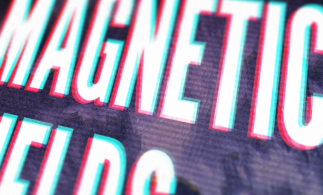
Now that our background is in place, we can start shaping our text blocks. The first one is the main one: “MAGNETIC FIELDS / 02.06.16 / TATE MODERN / TURBINE HALL / LONDON, UK.”
The type is set in League Gothic Condensed, that is 300 points tall, with a line spacing of 272 points, colored in white, and with kerning set to optical. These settings make the copy fit the two left columns of the grid, leaving the right column for the additional information blocks.


The next block is “Performances by // chp_tnes / nu_drds / cbalt / qwerty / & lw_ram.” The type is set in Droid Serif Bold, that is 54 points tall, aligned to the right, colored in white, and with kerning set to metric. These settings make the text block fit snugly in the top right corner of the poster.


The third and last text block is for the miscellaneous information: “Tickets & information at www.magneticfields.com.” It is set in Droid Serif Bold, that is 30 points tall, aligned to the right, colored in white, and with kerning set to metric. These settings make the text block fit snugly in the bottom right corner of the poster.


The result is interesting, but it lacks depth.

In order to address that, we are going to replicate the VHS effect we gave the background to the main type block. Let’s start by creating three copies of the type element.

Instead of using levels adjustment layers, we are going to assign hues directly to each type elements. This works because the type is a solid color object, as opposed to the visually complex texture we applied the effect to earlier.
The bottom copy, MAGNETIC FIELDS 02.06.16 TATE MODERN TURBINE HALL LONDON, UK copy 3, should be assigned the base blue color #0000ff.


The middle copy, MAGNETIC FIELDS 02.06.16 TATE MODERN TURBINE HALL LONDON, UK copy 2, should be assigned the base red color #ff0000.


The top copy, MAGNETIC FIELDS 02.06.16 TATE MODERN TURBINE HALL LONDON, UK copy, should be assigned the base green color #00ff00.


The top text element (the original one) should stay white.

From there, we can change the blending mode of the three copies to exclusion @ 100% opacity, and of the original element to overlay @ 100% opacity.


Now, in order to complete the effect, we simply have to offset the three copies in separate directions, using the arrow keys on our keyboard.
And with that done, we can move on to the last step: textures. Below is a look at our layer stack so far.

Textures!
Things to grab
Before we get moving, here are three assets to grab. They are all free. The first one is photocopy by clarisaponcedeleon, via DeviantArt.
The second is Film texture – grain explosion by JakezDaniel, on DeviantArt.
The third texture is vintage-paper-textures-volume-01-sbh-005, from the Vintage Paper Textures, Volume 1 set. It was made available through the “cute robot” book cover tutorial freebies.

DOWNLOAD THE CUTE ROBOT TUTORIAL FREEBIE ARCHIVE
The last asset is this pattern tile, that we’ll use for scan lines. You should download it by right-clicking on it, and using the Save image at menu.

Putting things in place
The first texture we’ll use is the film noise texture, film_texture___grain_explosion_by_jakezdaniel-d37pwfa.jpg.

It needs to be placed centered in the canvas, rotated of 90° clockwise, and scaled down to 80% so it covers the whole piece.

From there, we can change its blending mode to color dodge @ 15% opacity.

The next texture is the scanline pattern. Let’s open the file.

With the file open, we need to head to Edit > Define pattern. This will ask us to name it, and to validate. Once that is done, our pattern will be ready to use in our piece. Let’s close the pattern, and head back to our main file.

Back in the main file, let’s create a new, empty layer at the top of our layer stack.

We are going to apply the pattern using a layer style. First, we need to fill our layer with a solid color. Which one won’t matter, it is just to make sure the effect shows up. 50% gray is a good default choice in these cases (#808080).

Next, we can open up our layer style palette by double-clicking on the layer thumbnail in the layer panel.

Let’s navigate to the pattern overlay section. It’s a simple interface. We can control the pattern tile roughly the same way we can control a layer: blending mode, opacity, scale, etc.

Let’s use the drop-down menu to select our scanline pattern.

Finally, we can dramatically scale the pattern up to make sure the lines are visible (900%).

Our pattern is applied, but we need to give it an additional touch for more veracity. Let’s convert the layer to a smart object (Filters > Convert to smart filters).

Next, let’s assign a 2 pixels gaussian blur to the pattern layer/smart object (Filter > Blur > Gaussian blur).

Finally, let’s change the blending mode to overlay @ 10% opacity.

With the scanlines in place, we can move to a slight color alteration. We are going to use a gradient overlay for it. Just like before, we’ll need a layer filled with 50% gray (#808080).


Next, we are going to change the layer’s fill to 0%. This allows to hide the layer’s pixels (the gray), but to let any effects applied through the layer style panel to shine through.

Let’s open the gradient overlay side of the panel.

In the gradient drop down menu, let’s select the spectrum gradient.

Let’s change the blending mode of the gradient to overlay @ 15% opacity, and change the angle to -50°.

This gives us a nice added depth to the colors of the piece.

The next to last texture is vintage-paper-textures-volume-01-sbh-005.jpg, from the cute robot tutorial freebie archive.

It needs to be placed centered in the canvas, rotated of 90°, and scaled up to 440%.


Blending mode: soft light @ 25% opacity.

The last texture is photocopy_by_clarisaponcedeleon.jpg.

This one needs to be centered in the canvas, and slightly distorted (width: 212%, and height: 208%).

Levels adjustments.

Blending mode: soft light @ 75% opacity.

And with that, our piece is complete! After a last go at organizing our layers, here’s the full layer stack.

Wrapping things up!
Phew, that was a long one! I hope that you enjoyed following along the tutorial as much as I enjoyed creating it, and that your outcome matches the goals you set for yourself before diving in.

Did I leave anything unclear? Any suggestions? Don’t hesitate to reach out in the comments below! I’ll be happy to help out.

We’d love to see your tutorial outcomes! Please share them with us on the Go Media Facebook page, or on Twitter at @go_media.


And finally, I hope that this gave you a preview of the cool things you can achieve with the cosmic fractal storm texture pack, by Dustin Schmieding. The pack is available for download now!
On that note, that’s all for me today. Until next time, cheers!


