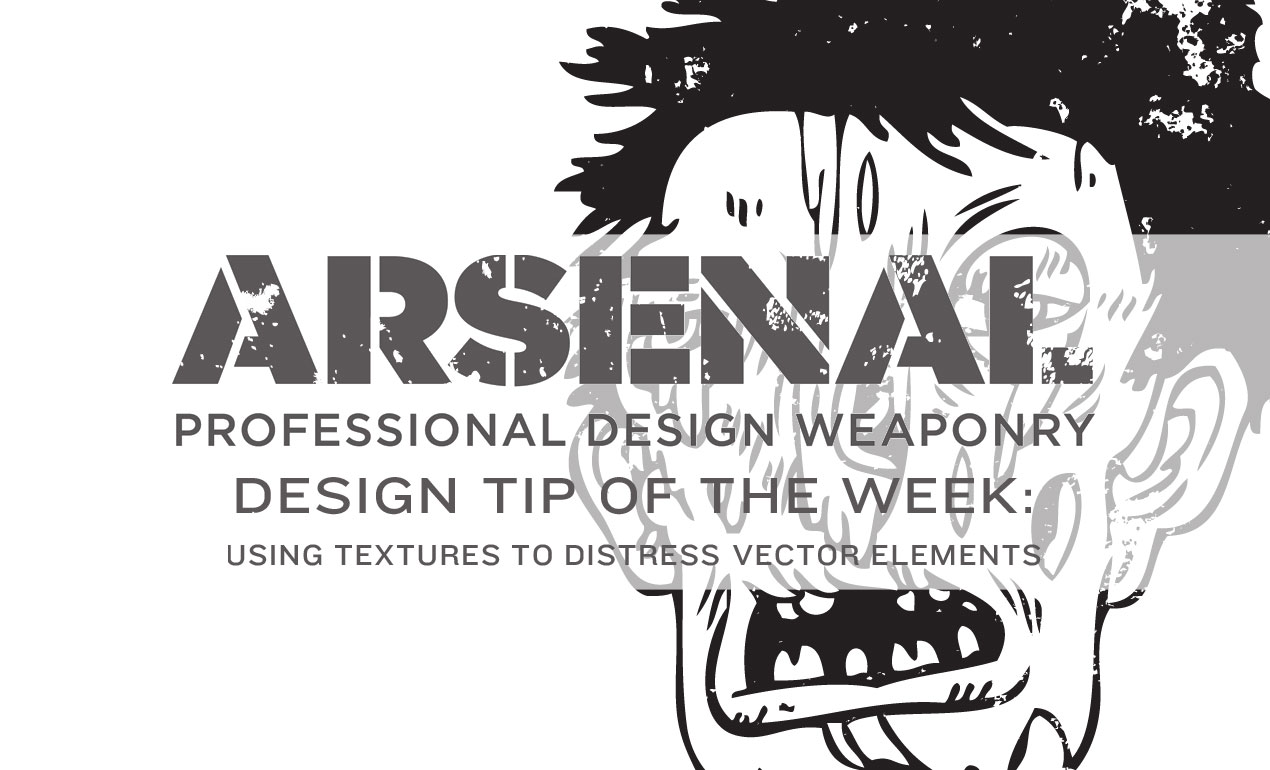
Tag Archives: adobe

Introduction

Hello there! It’s Simon on this end of the keyboard. I’m very happy to make my return to the Zine with a poster design tutorial, that will explore the possibilities offered by Jason Carne’s Texture Lot One. The tutorial will have us explore texture use tips and tricks, but also customized black and white conversion, large scale sharpening, type pairing, layout building, and more.

I’ll be using Photoshop CC for the tutorial, but any version of Photoshop past CS3 should be fine. Note also that I’m working on a Windows-based system, but other than visual appearance and slightly different keyboard shortcuts, that will not have any impact on the process we’ll go through.

the-shop-go-media-texture-lot-tutorial-000

Introducing Jason Carne’s Texture Lot One

texure-lot-1-hero

As the hero shot image tells us, the set contains 30 “finely crafted” textures, that will help us to give a wide array of artifacts to our flat, digital art. They come from a multitude of source material: burlap, cork board, a scratched cutting board, stone, and more.

the-shop-go-media-texture-lot-tutorial-002

The textures come in the form of high resolution, black and white textures.

the-shop-go-media-texture-lot-tutorial-003

The level of detail is superb, and gives us plenty to leverage to add substance to our compositions.

the-shop-go-media-texture-lot-tutorial-004

And one more for the road, just because we can.

the-shop-go-media-texture-lot-tutorial-005

Go pick Jason’s Texture Lot One up now at the Arsenal!

The brief

Let’s talk some more about the piece we’re putting together here. It’s a poster for a (fake) architecture lecture, focusing on Cleveland’s brutalist landmarks.

What is brutalism? Glad you asked:

Brutalist architecture is a movement in architecture that flourished from the 1950s to the mid-1970s, descending from the modernist architectural movement of the early 20th century. The term originates from the French word for “raw” in the term used by Le Corbusier to describe his choice of material béton brut (raw concrete). British architectural critic Reyner Banham adapted the term into “brutalism” (originally “New Brutalism”) to identify the emerging style.

Wikipedia

So, what does a brutalist building look like? There’s this amazing Tumblr called F**k yeah brutalism out there, and it’ll help me to answer that question:

the-shop-go-media-texture-lot-tutorial-006

(Education Wing, Cleveland Museum of Art, Cleveland, Ohio, 1971 -Marcel Breuer & Associates – via)

the-shop-go-media-texture-lot-tutorial-007

(State Historical Center, Columbus, Ohio, 1970 – Ireland and Associates – via)

the-shop-go-media-texture-lot-tutorial-008

(State Historical Center, Columbus, Ohio, 1970 – Ireland and Associates – via)

There is something monolithic, synthetic, and minimalistic at times.

Now, why choose Cleveland as the focal point of the fake lecture? It happens that Cleveland has its share of brutalist buildings. A 2007 article from the Plain Dealer lists the major local representative landmarks of the movement: Cleveland State University, Cuyahoga Community College Metro Campus, Cleveland Justice Center Complex, Crawford Hall (Case Western Reserve University), and more.

Assembling the free assets needed

It happens that there is a CC-licensed image of the Cleveland Ameritrust Building, one of these major landmarks, available on Flickr for us to use as the base of our poster. We’ll need to grab the biggest size available (4028 x 2704 pixels), through the all sizes page.

the-shop-go-media-texture-lot-tutorial-009

Other than the high resolution version of the image, we’ll also need to have two (free) typefaces accessible to us: League Spartan Bold, and League Gothic.

the-shop-go-media-texture-lot-tutorial-010

the-shop-go-media-texture-lot-tutorial-011

The last asset we’ll need to have at hand is this beautiful, free aged paper texture, courtesy of our very own Dustin Schmieding:

the-shop-go-media-texture-lot-tutorial-012

Got it all? Then it’s time to get started!

Preparing our Photoshop document

We’ll use is a “standard” 18″x24″ canvas for our piece. For the readers outside of the USA, feel free to use an A3 format. Note the fact that we’re using an RGB document, as some of the filters we’ll use require that color space to function.

the-shop-go-media-texture-lot-tutorial-100

Next, we need to setup a grid. It’ll help us when building the composition. First, we’ll leverage Adobe CC’s New guide layoutfunctionality to build a six columns by 8 rows main grid (View > New guide layout).

the-shop-go-media-texture-lot-tutorial-101

The result is a grid based on squares of 3″x3″.

the-shop-go-media-texture-lot-tutorial-102

Note: if you don’t have the CC version of Photoshop, you can leverage the power of GuideGuide to accomplish the grid-related tasks quickly. The current version isn’t free, but older versions are.

the-shop-go-media-texture-lot-tutorial-103

The next set of guides are going to help us establish the boundaries of the center column. We need vertical guides at4.5″, and at 13.5″.

the-shop-go-media-texture-lot-tutorial-104

Finally, we need horizontal guides at 11.5″, and at 12.5″.

the-shop-go-media-texture-lot-tutorial-105

And with that, our document is ready to go. It’s time to get started for real.

The background

Background color

The first thing we need to do is give a solid color to our background layer. It’s going to be the base for the effects we’ll build up through the tutorial. We’ll be using a very light gray, #ededed. If we were using pure white, the contrasts would be too strong, and some of the texture effects we’ll apply later would be “washed out.”

the-shop-go-media-texture-lot-tutorial-200

Photographic manipulations

Next, we need to place the photo in our composition. We’ll place the photo as a smart object, in order to maintain a lossless workflow. It will also guarantee us access to the untouched original file. To do so, we have to use File > Place (or File >Place embedded in Photoshop CC), and navigate to the photo file.

the-shop-go-media-texture-lot-tutorial-201

the-shop-go-media-texture-lot-tutorial-202

the-shop-go-media-texture-lot-tutorial-203

Once the image is included in our file, we will give it its final positioning and size using the absolute positioning tools at our disposal. The center point of the image should be at X: 2.55″, and Y: 26″. The image is scaled up to 125%.

the-shop-go-media-texture-lot-tutorial-204

the-shop-go-media-texture-lot-tutorial-205

the-shop-go-media-texture-lot-tutorial-206

With that done, we need to sharpen the smart object, since we scaled it up. We’ll use the high pass filter for that. The Zine archive features a short article about the technique already. Let’s start by duplicating the smart object.

the-shop-go-media-texture-lot-tutorial-207

Next, we need to run the high pass filter (Filter > Other > High pass). We’ll use a radius of 100 pixels.

the-shop-go-media-texture-lot-tutorial-208

The result doesn’t look like much. To obtain the desired effect, we need to change the copy’s blending mode to soft light @ 100% opacity.

the-shop-go-media-texture-lot-tutorial-209

Next, we are going to clip the copy to the original layer (CTRL/CMD+ALT/OPTION+G). This contains the high pass effect to the layer it’s clipped on.

the-shop-go-media-texture-lot-tutorial-210

With that done, we can change the blending mode of the original layer to multiply @ 100% opacity. This will make the photo adopt the soft gray we’ve used as background color as its main color once we’ve converted it to black and white.

the-shop-go-media-texture-lot-tutorial-211

Black and white adjustments

Desaturating a picture IS NOT a proper way to convert it to black and white. We are going to use a black and white adjustment layer for that. The preset we’ll use is called blue filter. Cyan, blue, and magenta hues in the original image will be light, while greens, yellows, and reds will be untouched or dark. For a higher contrast, the greens, yellows, and reds could be purposefully set to darker (using a negative value in the sliders).

the-shop-go-media-texture-lot-tutorial-212

The next step is a curve adjustment layer, set to the lighter preset. This allows us to soften the black and white conversion.

the-shop-go-media-texture-lot-tutorial-213

Finally, a levels adjustment layer allows us to push the contrast up.

the-shop-go-media-texture-lot-tutorial-214

It’s time for some layer organization.

the-shop-go-media-texture-lot-tutorial-215

A hint of texture

We are going to add one of Jason’s textures above the background. It will help us to generate a subtle grain effect. The texture is Corkscrewed – Light.

Go pick Jason’s Texture Lot One up now at the Arsenal!

the-shop-go-media-texture-lot-tutorial-216

It’s placed centered in our canvas, rotated of 90°, and scaled up to 225%.

the-shop-go-media-texture-lot-tutorial-217

After converting the texture layer to a smart object (Filter > Convert for smart filters), and sharpening the texture (Filter > Sharpen > Sharpen), we can change its blending mode to soft light @ 75% opacity.

the-shop-go-media-texture-lot-tutorial-218

That texture concludes our work on the background. Before switching gears and attacking the content columns, here’s a look at our layers so far.

the-shop-go-media-texture-lot-tutorial-219

Content columns

Setting up the columns backgrounds

Back when we set up the grid, we created a set of special guides that we’ll now use to delimit central column for our text. The column is split in two parts, one with a red background, and one with an almost-black background.

Let’s start with the almost black. It sits at the bottom half of the canvas. Here’s the area we have to delimit.

the-shop-go-media-texture-lot-tutorial-220

After creating a new layer, we need to fill it with a very dark gray, #040404.

the-shop-go-media-texture-lot-tutorial-221

Finally, the blending mode of that layer should be multiply @ 98% opacity. This will allow us to bring a hint of translucency in the shape.

the-shop-go-media-texture-lot-tutorial-222

The next shape will be its pendant at the top of the composition, and will be filled with a very bright red, #eb1d1d.

the-shop-go-media-texture-lot-tutorial-223

the-shop-go-media-texture-lot-tutorial-224

The blending mode of that layer should be multiply @ 50% opacity.

the-shop-go-media-texture-lot-tutorial-225

The shape’s translucency is too high (we need to remember that it will be the background to text later on). In order to address this, we’ll duplicate the layer, and change the blending mode of that copy to normal @ 50% opacity.

the-shop-go-media-texture-lot-tutorial-226

Layer organization

A quick note about layers, as we’re about to add type elements in there. Here’s what they should be organized into. The background elements have their layer group, and each half column elements have their dedicated layer group. From there, it’ll be easy to add the type in the proper group, so everything stays organized.

the-shop-go-media-texture-lot-tutorial-227

It’s time to talk about typography

As announced at the beginning, we’ll be using two type families: League Spartan Bold, and League Gothic.the-shop-go-media-texture-lot-tutorial-010

the-shop-go-media-texture-lot-tutorial-011

The main title

The main title reads “CLEVELAND / BRUTALIST / LANDMARKS,” and is set in all caps League Spartan Bold, colored in #ededed, that is 48 points tall, and with tracking set to 250. Each line is its own text object, and they are aligned to the grid lines within the column.

the-shop-go-media-texture-lot-tutorial-300

the-shop-go-media-texture-lot-tutorial-301

the-shop-go-media-texture-lot-tutorial-302

In order to further ground the title element, we are going to add horizontal dividers underneath each line of text. The dividers will be colored in #ededed, and measure 6″x0.125″. The dividers are positioned underneath each text line, 0.125″ under the text line. We’ll use shape layers to generate the dividers.

the-shop-go-media-texture-lot-tutorial-303

the-shop-go-media-texture-lot-tutorial-304

the-shop-go-media-texture-lot-tutorial-305

And here’s what the layers look like.

the-shop-go-media-texture-lot-tutorial-306

Additional information

We are not creating a proper conference poster if we don’t add the secondary information like the lecturer’s name, a date, a location, and a URL. The information is broken down as follows:

“NOVEMBER 20TH 2015 AT 07.30 PM / CLEVELAND MUSEUM OF ART / A LECTURE BY DR RYAN G. BRAVIN / www.clevelandart.org”

The individual type objects are aligned in a similar fashion as before, on the grid lines. “NOVEMBER 20TH 2015 AT 07.30 PM” is set in League Gothic Condensed Regular, that is 72 points tall, colored in #ededed, and with kerning set to optical.

the-shop-go-media-texture-lot-tutorial-307

“CLEVELAND MUSEUM OF ART” is set in League Gothic Regular, that is colored in #ededed, that is 60 points tall, and with kerning set to optical.

the-shop-go-media-texture-lot-tutorial-308

“A LECTURE BY DR RYAN G. BRAVIN” is set in #ededed colored League Gothic Condensed Regular, that is 72 points tall, and with kerning set to optical.

the-shop-go-media-texture-lot-tutorial-309

Finally, the URL to the site of the Cleveland Museum of Art, www.clevelandart.org, is set in #ededed colored League Spartan Bold, that is 24 points tall. The text object is located at X: 9″, and Y: 22.8″.

the-shop-go-media-texture-lot-tutorial-310

Here’s what the layer organization looks like:

the-shop-go-media-texture-lot-tutorial-311

And with our type in place, our piece is almost complete.

the-shop-go-media-texture-lot-tutorial-312

Now, it’s time to layer some more textures to polish the piece!

Textures and artifacts

Here’s a theory: one of the motivations to add textures to our work is to help us to add depth to our digital art, and to break away from their flat, clean, and precise origins. At this point in the process, the photo is pretty gritty, but the type above it is very clean. Adding more textures will allow us to weather that type and the column backgrounds.

The first texture we’ll add is PackingFoam.

the-shop-go-media-texture-lot-tutorial-400

It’s placed centered in the composition, rotated 90° clockwise, and scaled to 55%.

the-shop-go-media-texture-lot-tutorial-401

After sharpening the texture (Filter > Sharpen > Sharpen), we can change the blending mode to screen @ 15% opacity.

the-shop-go-media-texture-lot-tutorial-402

The next texture is the freebie we grabbed at the beginning, BB_AntiqueEnvelope_04.jpg.

the-shop-go-media-texture-lot-tutorial-403

It’s placed at X: 18″, and Y: 19.9″, rotated 90° counterclockwise, and scaled up to 1,150%.

the-shop-go-media-texture-lot-tutorial-404

After sharpening, we’ll use a clipped hue/saturation adjustment layer to desaturate the texture.

the-shop-go-media-texture-lot-tutorial-405

A clipped levels adjustment layer will help us to enhance the texture further.

the-shop-go-media-texture-lot-tutorial-406

Blending mode: soft light @ 35% opacity.

the-shop-go-media-texture-lot-tutorial-407

The next texture is from Jason’s set, and is called Corkboard.

Go pick Jason’s Texture Lot One up now at the Arsenal!

the-shop-go-media-texture-lot-tutorial-408

It’s placed centered in the composition, rotated 90° clockwise, and scaled to 55%.

the-shop-go-media-texture-lot-tutorial-409

After sharpening, the blending mode should be changed to soft light @ 25% opacity.

the-shop-go-media-texture-lot-tutorial-410

The texture levels are coming together nicely. We’ve added grain, light noise, and small artifacts to the piece with a few layers of substance. Let’s have a look at the layers before the ultimate polishing touches.

the-shop-go-media-texture-lot-tutorial-411

Last details

Lossless vignette effect

There is a way to create a lossless vignette effect in Photoshop, thanks to shape layers. The first step is to draw an ellipse that fits the canvas. It should be colored in #040404.

the-shop-go-media-texture-lot-tutorial-412

Next, we need to use one of the tools accessible via the direct selection tool (A), in the toolbar. It will allow us to display the ellipse inverted, getting closer to the vignette. Once the active tool is the direct selection tool, we need to change the path operation button‘s setting to subtract front shape.

the-shop-go-media-texture-lot-tutorial-413

the-shop-go-media-texture-lot-tutorial-414

The result is a very sharp edged ellipse, almost ready to be a vignette.

the-shop-go-media-texture-lot-tutorial-415

Next, through the layer’s properties panel, we need to feather the layer mask to 350 pixels. This creates the fuzzy edge for the vignette.

the-shop-go-media-texture-lot-tutorial-416

Finally, the blending mode for the vignette can be switched to soft light @ 50% opacity.

the-shop-go-media-texture-lot-tutorial-417

Last but not least: halftones

The last piece of the puzzle is a halftone effect. First step, to create a merged copy of the piece so far. We’ll use the CTRL/CMD+ALT/OPTION+SHIFT+E shortcut for that. It’ll create a layer containing a merged copy of the piece so far. I called it Halftones.

the-shop-go-media-texture-lot-tutorial-418

Once the layer is generated, it needs to be converted to a smart object.

the-shop-go-media-texture-lot-tutorial-419

After resetting the color palette to default (D), we’ll use the filter gallery’s halftone effect (Filter > Filter Gallery > Sketch > Halftone pattern). We’re using a size value of 8, and a contrast value of 50.

the-shop-go-media-texture-lot-tutorial-420

Then, we need to change the effect’s blending mode to soft light @ 100% opacity.

the-shop-go-media-texture-lot-tutorial-421

the-shop-go-media-texture-lot-tutorial-422

After that, we can change the layer’s blending mode to soft light @ 50% opacity.

the-shop-go-media-texture-lot-tutorial-423

And our piece is now done! Here’s a look at our final layer stack.

the-shop-go-media-texture-lot-tutorial-424

Wrapping things up

Phew, that was a long tutorial! I hope that you enjoyed it, learned a few tricks here and there, and that your outcome matches the goals you had at the beginning.

the-shop-go-media-texture-lot-tutorial-425

the-shop-go-media-texture-lot-tutorial-426

We’d love to see your tutorial outcomes!

Mockup your poster using the free sample below from our Poster Mockup Templates Pack and please share your work with us in the comments, by tweeting at us at @go_media, or sharing them on our Facebook page.

Free Download: Free Poster PSD Sample from Go Media 

the-shop-go-media-texture-lot-tutorial-427

If you already purchased Jason’s texture set, I hope you enjoy them, and that this tutorial gave you a sense of what you’ll be able to accomplish with them. If not, go grab them while they’re hot!

Go pick Jason’s Texture Lot One up now at the Arsenal!

the-shop-go-media-texture-lot-tutorial-428

And on that note, that’s it for me! Until next time, cheers!

Space has and will probably always be one of those things that man has long dreamt of conquering. From the darkest corners of the Milky Way to the farthest region of the known Universe we will always poses that urge to explore and look for new worlds, worlds that could change what we know about life itself. Read More ›