Category Archives: Design Tips

How to Use the Best Mockup Templates for Graphic Designers
Here at Go Media’s Arsenal, we have been creating and curating design resources since 2006, when we first began releasing our collection of royalty-free stock vectors. We have since expanded to textures, fonts, e-books, tutorials and perhaps most famously, mockup templates.
We passionately create our mockup templates and love that we have become a go-to for professionals in the industry. Because of this, we get tons of questions every single day about our mockups and how to use them.
So, we thought we’d create a quick (and free!) guide to killer mockups, which includes information and advice we dole out regularly. This includes:
– Info for Newbies, like how to open and use our mockup templates
– How to Use Smart-Object Enabled Mockups and Displacement Maps
– Tips to Killer Mockups (Using Them to Your Advantage for Future Success!)
– Pro Tips for using the best mockup templates for graphic designers (ours!)
With the download you’ll also get:
– a mockup PSD free download
– a vector freebie pack
If you’d like to grab the guide, simply sign up for the Arsenal newsletter below. Please note, you’ll have to confirm your subscription in the first email in order to receive your free download in the second email, so wait for it…
Subscribe for our Updates and get the Killer Mockup Guide & Freebies
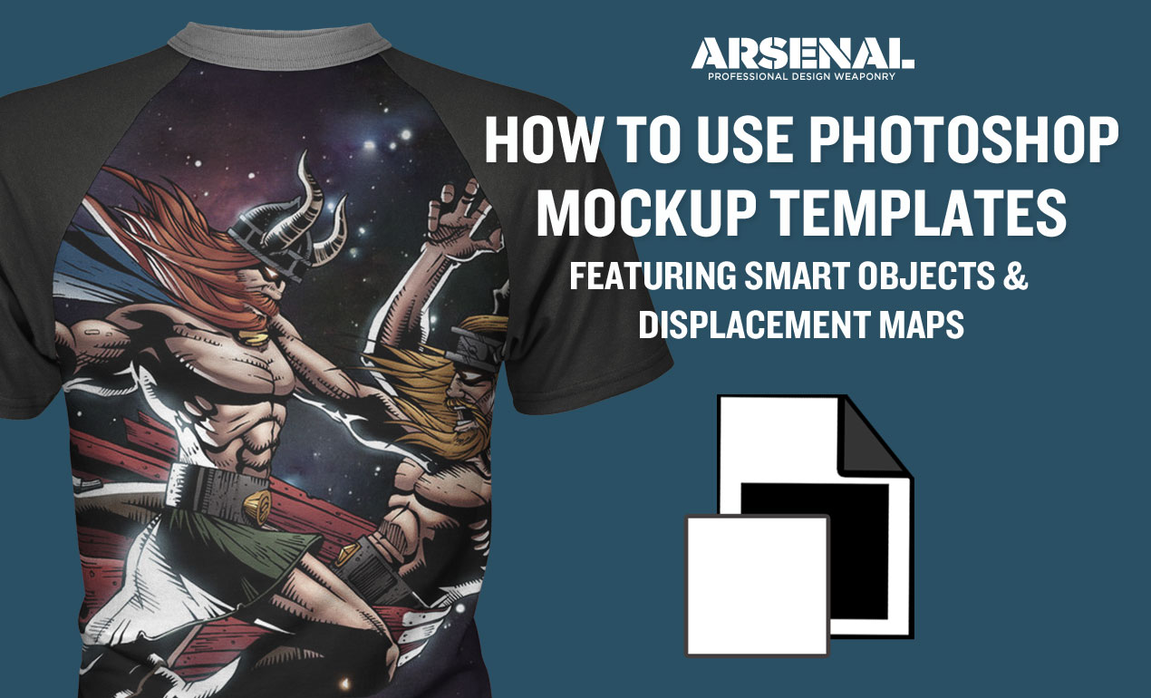
Smart-Object Enabled Mockup Template Packs!
Congratulations on purchasing your brand new mockup template pack! If the pack is smart-object enabled or features a displacement map, this post is for you. Read More ›
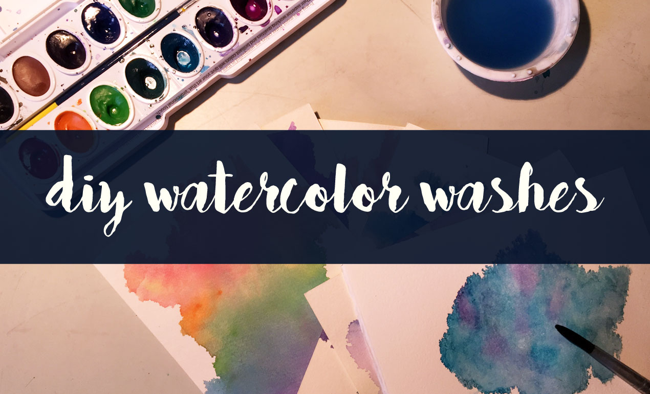
In today’s Design Tip of the Day, we’re creating DIY Watercolor Washes using a fun and easy method that results in completely one of a kind, abstract elements like some of the ones we just released in our Watercolors 3 Elements and Texture Pack. Want to see how we created them? Let’s go! Read More ›
How to Use Paper Textures in Photoshop >
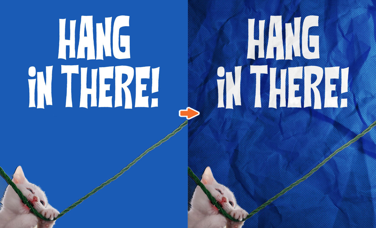
What’s better than the old “Hang in there” cat poster? Not much in my book. But today, we’re going to add a little more character to one, just for kicks, using our new Crumpled Paper Texture Pack. Let’s see if we can make something purr-dy fantastic even better! Read More ›

Great Poster Design Tips:
Recently, we received an email from a Go Media friend asking a simple, yet incredibly complicated question: “What are the qualities of a good poster design?”
And while we’ve done many a blog post about posters that inspire us, we haven’t covered why they have done such a great job of doing so.
So today we are going to do our best to answer that question – as simply as possible.
As we all may know, a poster’s job is often three-fold; it serves to advertise and communicate information while acting as a piece of artwork.
A great poster communicates a message clearly.
Of those three tasks, the poster absolutely must deliver a message as clear as a bell, so that it is as digestible in as little time as possible.
To accomplish this, make sure your poster flows well to do that:
- make sure it is easy to read from a distance
- grabs the viewer’s attention with a main image or headline, then
- answers the questions who, what, when, where and how and
- leaves the least important details to the fine print

A great poster is simple.
In order to communicate your message, your poster should be relatively simple. If you bombard them with too much information, they’ll leave overwhelmed.
Remember:
- Less is more.
- Let it breathe! Leave enough white space so that the viewer can absorb the information.
- Choose complimentary color palettes

A great poster captures your attention.
When designing your poster, certain elements will capture the attention of your viewer above others. These include playing with:
High contrast

Dominant images


Bold and/or playful typefaces

Extreme minimalism
Bold color palettes


A monochromatic theme

A great poster motivates your viewer to take action.
Many posters serve to advertise shows, concerts, movies or other events. Your goal is to entice the viewer to respond to your art in some way, shape or form – by making a call, hitting up a website or heading to a show. Can you think of an out-of-the-box way for them to take action immediately, such as with a coupon code, QR code or by enticing them to enroll or sign up by a certain date for some wonderful reason?

A great poster knows where to call home.
When designing, it’s vital to keep in mind where it will call home. If it will exist in one environment only, you can cater its size and color to that environment. If not, make your choices understanding that this poster could live almost anywhere. Picture it both living in a dark dingy club or a on a bright red gallery wall.
A great poster starts a conversation with your viewer.
Most folks are on the move when they encounter a poster. If it’s clever in concept, they will be more likely to take time to interact with it. So, take the time to start a conversation with your viewer. Evoke an emotion in them. Make them laugh, think. Take them on a journey – if only for a moment.

A great poster is just plain lovely.
Yes, posters serve to communicate and call your viewer to take action, but they also serve as pieces of artwork. This only helps to reinforce their message. Enjoy the process!


Follow us on Pinterest for more posters we love!
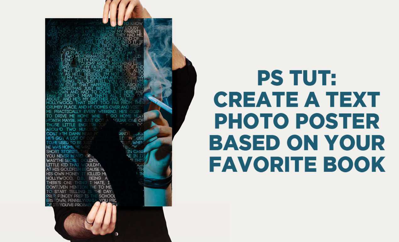
Let’s Create a Text Portrait Poster!
In today’s tutorial, we are going to be creating a text photo poster created by combining the image of our choice with related text. I’ll create mine based on my favorite book of all time, The Catcher in the Rye. Which book will you choose? Read More ›

In today’s design tip of the week, we’re going to play with making our exes disappear, as inspired by my viewing of External Sunshine of the Spotless Mind this past weekend. (Thank you Netflix!)
You’ll need:
– Photo of you and your ex
– Photoshop
STEP ONE: Give your phone to your best friend for the next few minutes (we’re tempting fate here, I know), then open your photo in Photoshop. Select the blur tool, and check the “Sample All Layers” box.

STEP TWO: Shift + Ctrl + N to add a new layer to your document.

STEP THREE: Making sure that this layer is selected, use the blur tool to wipe away years of resentment.

You’re done!


How to Create Color Palettes for your Brand:
Ever admire a brand that seems to have it’s color scheme on lock down, but feel helpless in regards to where to start? Ever get stuck in the middle of a design project and feel as if the colors you’re working with aren’t meant to be?
It’s time to dial a lifeline.
Our Design Tip of the Day shows us how to use a simple online app, Adobe Color CC, to create monochromatic and complimentary color palettes for your new brand or next design project. (And yes, it’s free to use!)
Here are four ways you can start getting some beautiful results in minutes:
Upload an Image to Adobe Color CC
Use the camera icon to upload an image meant to inspire your color scheme to Adobe Color CC.

The app will produce a color scheme for you, in several slightly different options, based on various moods.

Create a Complimentary Color Palette with Adobe Color CC
Adobe Color CC will assist you in choosing complimentary colors, or colors on the opposite spectrum of the color wheel. Simply choose “Complimentary” from the Color Rule Option and either enter your RGB value into the first box, or move one arm of the color wheel until you arrive at your preferred color. Adobe Color CC will do the rest. Here are my results >

Create Monochrome Color Palette with Adobe Color CC
Adobe Color CC will assist you in choosing monochrome colors, or colors of a similar hue, on the color wheel. As above, simply choose “Monochromatic” from the Color Rule Option and either enter your RGB value into the first box, or move one arm of the color wheel until you arrive at your preferred color. Adobe Color CC will do the rest. Here are my results >

Explore the Adobe Color CC Community
Lastly, use the explore tab to see what the Adobe CC community has contributed. You’ll find some great inspiration here!

In all of these scenarios, feel free to save to your library, share with friends, publish to the community and play around for days. Have fun, everyone!

How to Make Your Own Handwritten Font
If you’ve ever been too intimidated to make a font, please stand up!
Read More ›

How to Warp Text in Adobe Illustrator:
Our Design Tip of the Day shows us how to use envelope distortion to warp text in pretty simple yet wicked ways. Shall we get started? Read More ›

Hey Designers, are you making the most of hashtags on social media? If not, you can easily throw a tasteful number after each post and get some more eyes on your work. Let’s look at some hashtags that will give you the most bang for your buck, shall we? Read More ›

How to Organize Your Design Files
Design file names and folder structure are a key ingredient to your success as a graphic designer.
Read More ›
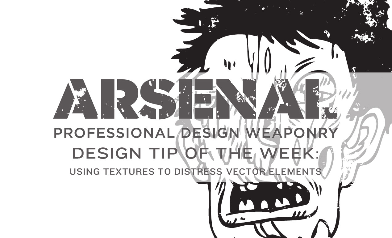
Today, we’ll be using Adobe Illustrator to add some gritty, grungy textures to an Arsenal vector to take it from great to greater. Ready? Read More ›
Create an Abstract Background in PS in Five Steps
Today, we’ll be creating an abstract background texture using Photoshop. Let’s start by opening PS and creating a new document, sized 4235 x 2927. Read More ›

Our Design Tip of the Week combines two Arsenal product categories coming together for one hauntingly beautiful purpose. Today, we’re experimenting with Go Media vectors and textures. Are you ready? Read More ›

Join us each and every week here at the Arsenal blog, where we we’ll be sharing a design shortcut or mini-tutorial to make your life a little easier (and design a lot more fun). Read More ›

Today’s design tip will only take a minute or two out of your day. We’re going to show you how to quickly change layer opacity. Let’s go! Read More ›
Dreading saving all of your artboards out as individual files upon project completion? We’re here to help. Read More ›

My niece and nephew are obsessed with Jib Jab! They spend hours creating silly videos with our family playing the role of ice skating stars, hula dancers and Justin Bieber.
Read More ›

Today we’re creating this sweet paint splash effect using our Paint Splatters Vector Pack, recently released here on our Arsenal.
Here’s what you’ll need for today’s tutorial:
- Photoshop
- Download: Paint Splash Effect Files (contains a Paint Splatters Effect PSD & Paint Splash Effect Photoshop Action)
Let’s go!
1. Open up our Photoshop file (Paint Splatters Tutorial PSD).
2. Choose a dashing picture of your boss, place it where you see “Your Artwork Here” and make sure your photo is centered in the middle of your document. You may have to turn off some layers to ensure your photo is centered, so take a peek at how the document should look before we press play on our action:
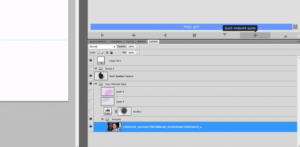
3. Load the Paint Splash Action by Go Media’s Arsenal into PS (Window > Actions > Load Actions > navigate to the file)
4. Desaturate your photo, if
4. Press play on your new Photoshop Action and you’ll be all set!
Options:
Want to add more colors or change the color layers seen on the Action?
No problem. Just deselect the colors shown on the layer and add your own layer(s) above the color layers you see in the file. Choose a new color and a basic brush (I chose a soft basic brush size 500, opacity 25% – but play with this.) Simply brush your color across your boss’s beautiful face. When complete, set the color layer to “screen” or “divide.”
Have fun with it!
In other news:
If you love the vectors used in this pack, check out our Paint Splatters Vector Pack. We combined several of these vectors to achieve the large paint splatter effect the PS action affords you.
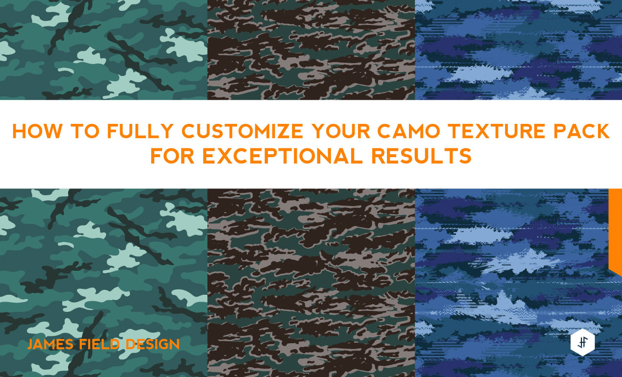
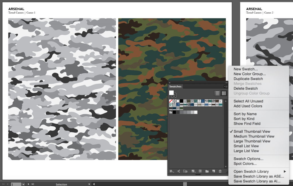
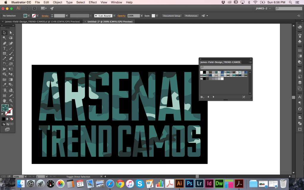
How to Use Camo Textures
Hi, I’m James Field, a freelance designer specializing in graphics for sports-fashion apparel. I have created a Trend Camos Texture Pack based on recent research into upcoming and current design
trends and increasing requests from clients. I’m going to show how they can be used and customized for your specific needs. I’m using Adobe Illustrator CC, but this technique has been
working in all versions since I started designing around eight years ago, so you should be OK with whatever release you have.
THE PRODUCT
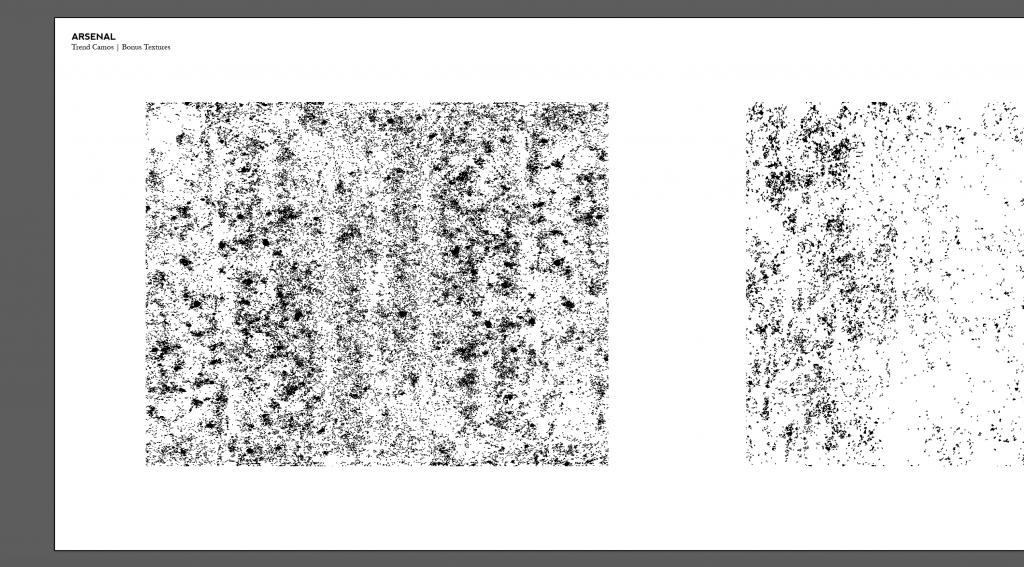
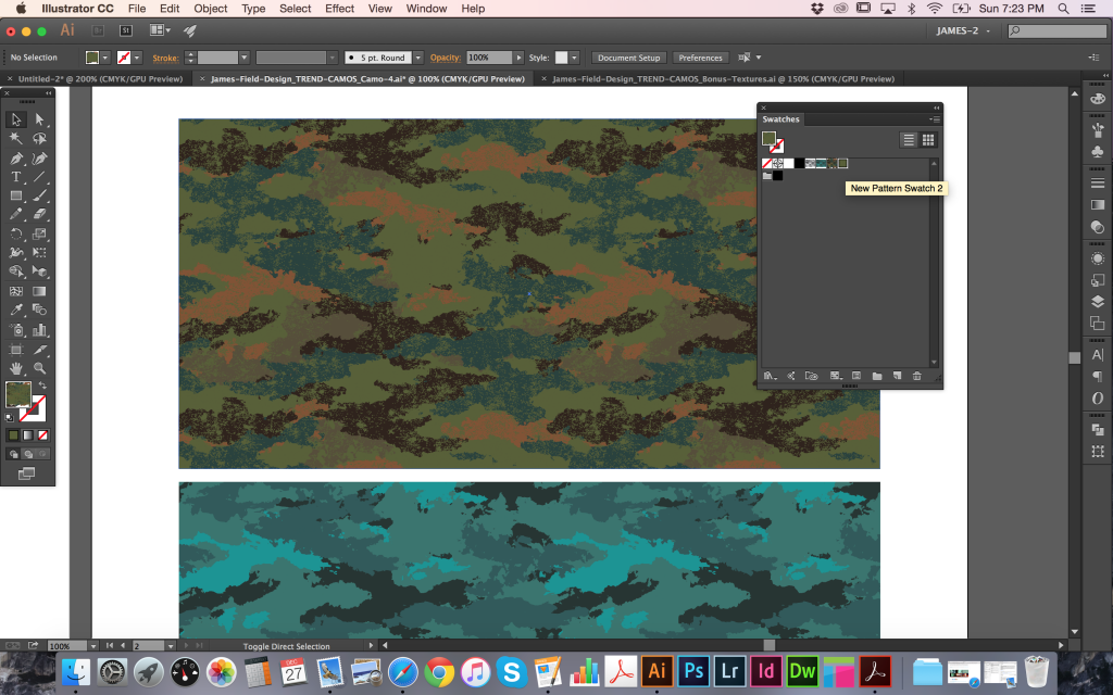
I’m referring to the Trend Camos Texture Pack that I put together for Arsenal. The pack contains x15 different fully repeating camouflage patterns inspired by the latest sports-fashion trends developing on the street. There’s something for guys and girls and many can work for both. All are already available as swatches for immediate use in the colors I have chosen but can be easily adjusted, combined, or altered to create something specific for your own needs. As a bonus, I have supplied three fully repeating textures that can be layered to create distressed versions or used in your other projects on their own. The final camo in the pack is provided as layered TIFF files that can be colored and used directly within illustrator as this works best for the more complicated distorted look.
Learn More about the Trend Camo Texture Pack
HOW TO USE : THE BASICS
There are a number of files supplied and the easiest way to use the camos right out of the pack is to open the main document showcasing all of the designs together.

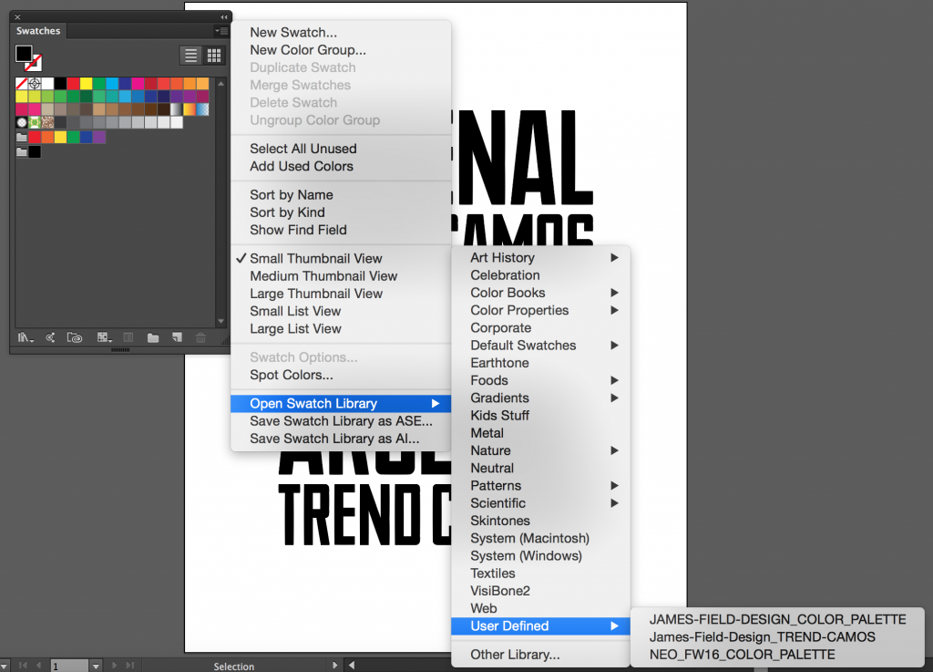
On each page you can see the individual camo patterns applied as both a grayscale and full color swatch. These can be found by name in your Swatches panel. To use these swatches directly in your work, you will need to save a library. This way, it can be opened in other documents whenever you need. Simply click the Panel Menu Icon in the top right corner of the Swatches panel and select Save Swatch Library as AI… to save them into your User Defined swatches library for later use.
When working in a new document, you can open your Swatches panel, click the Panel Menu Icon in top-right corner, then follow Open Swatch Library > User Defined and select the
library you just saved. To apply them, you can now select an object and choose a camo pattern from the Swatches panel to fill it with.

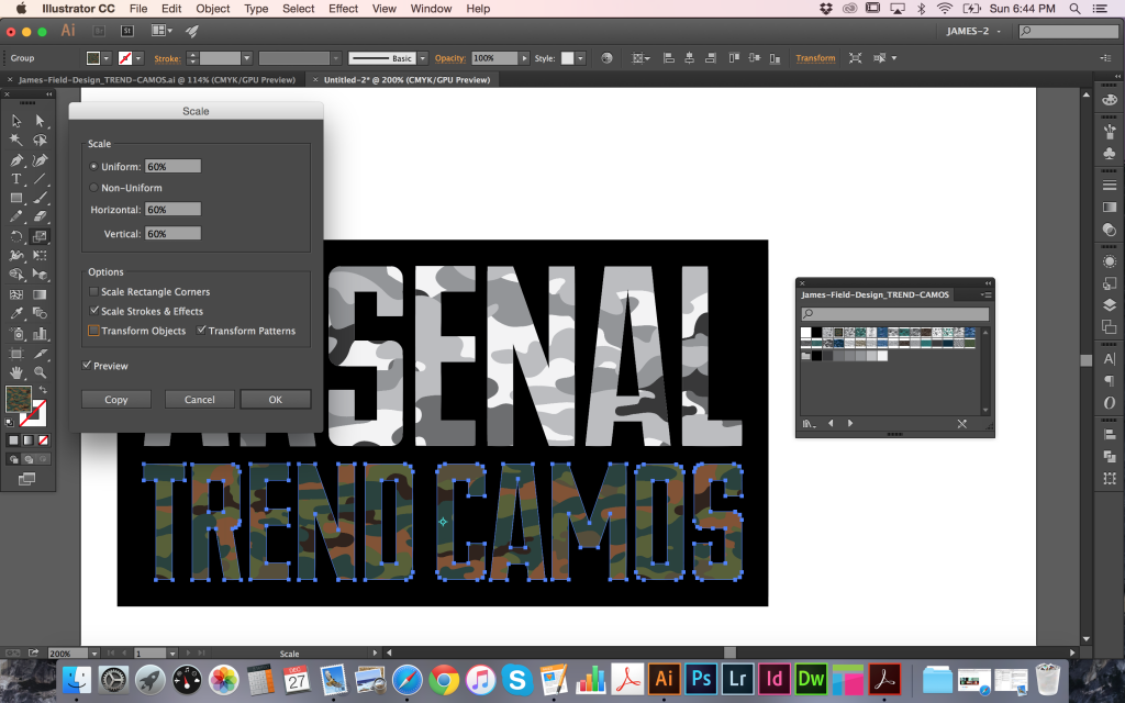
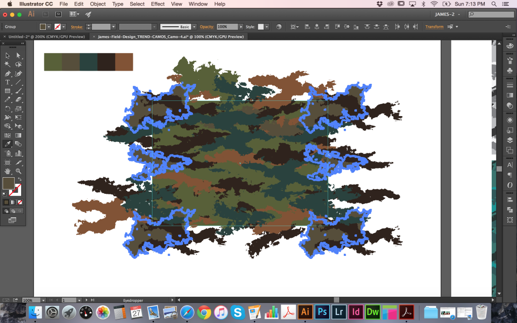
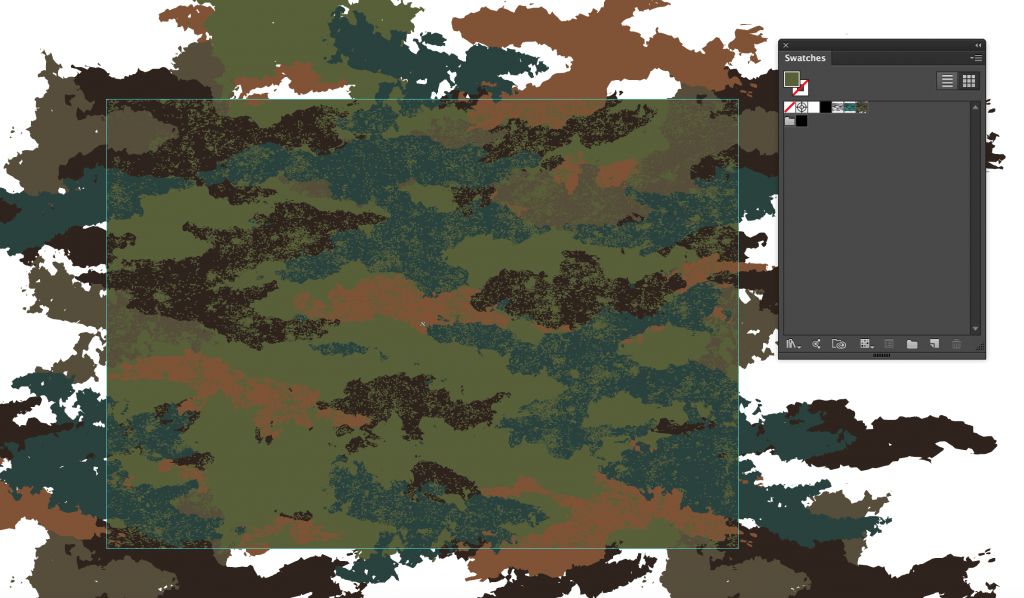
Often some quick adjustments are required to get things looking as you want them, so I’ll go through some of the most simple but important techniques. Firstly, the scale of the camo pattern filling the TREND CAMOS text in my example is a little too large to effectively see the extent of the pattern. To change it, select the object and double-click the Scale tool in the Tools Panel to bring up a number of Scale options. To adjust only the scale of the pattern and not the object itself, make sure to deselect the Transform Objects check box. In my example I have chosen to reduce uniformly to 60% and left the Preview check box selected to view the results.
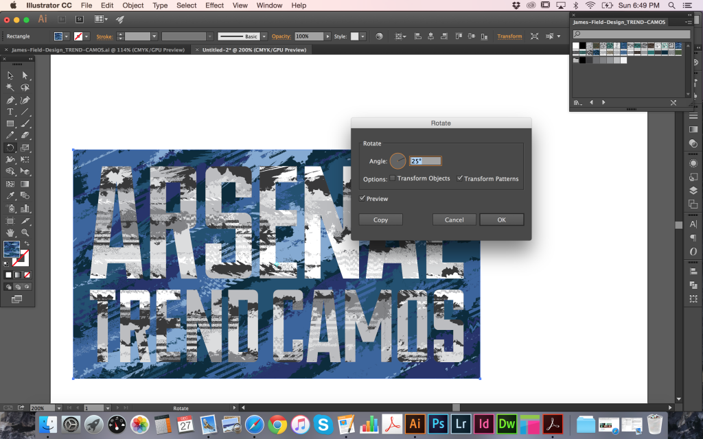
Next, I will show you how to rotate patterns. In my example, I have filled the outlined text and the background rectangle in the same camo pattern, but using different colors. To increase the
contrast between the two, I selected the rectangle object, then double-clicked the Rotate tool in the Tools panel to bring up the Rotate options. Again, deselecting Transform Objects allows
movement of only the pattern inside.
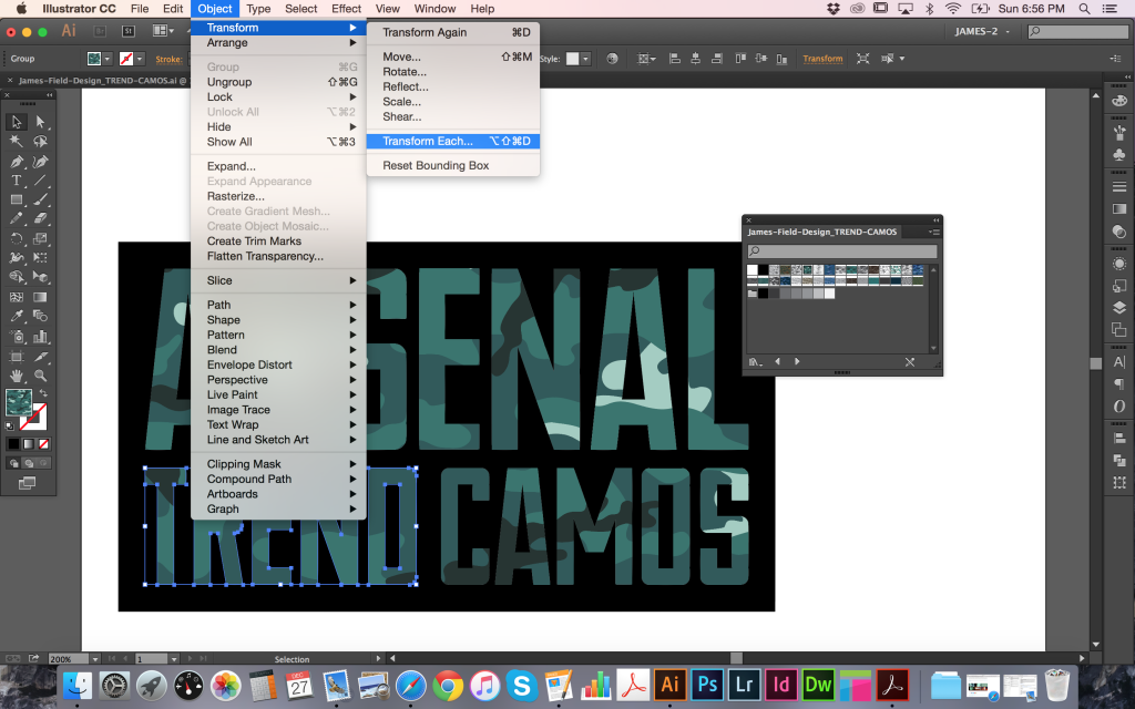
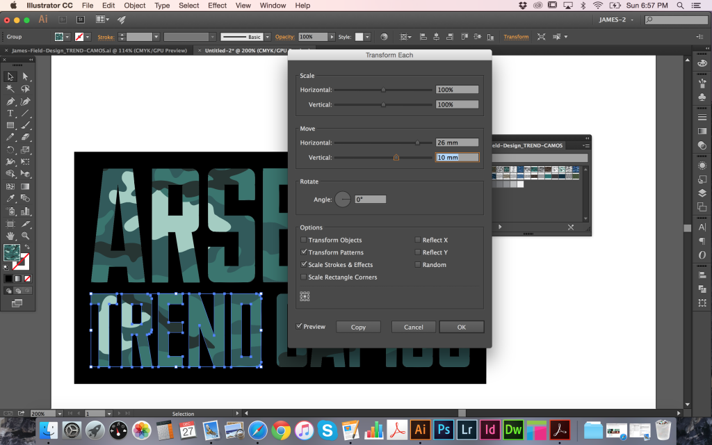
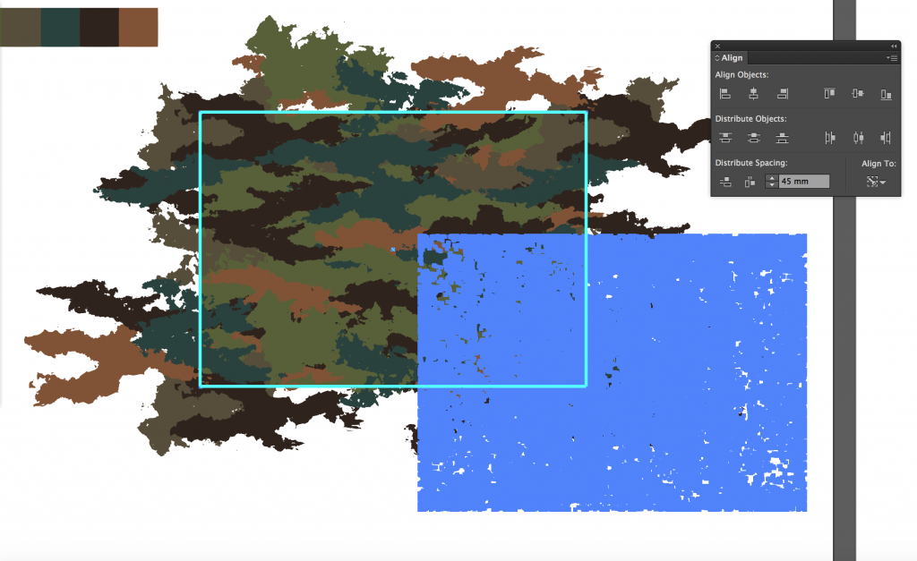
Finally, it can be very useful to move the position of the camo pattern to exactly where it is needed within an object. In my third example below, there are no light colored shapes on the
word TREND, but I would like there to be some. After selecting the outlined TREND text object, go to Object > Transform > Transform Each to bring up a more comprehensive set of Scale,
Rotation and Movement options. To move just the pattern, deselect the Transform Object check box as before and with the Preview box checked, go ahead and adjust the Horizontal and
Vertical sliders as required.
CUSTOMIZING YOUR CAMOS
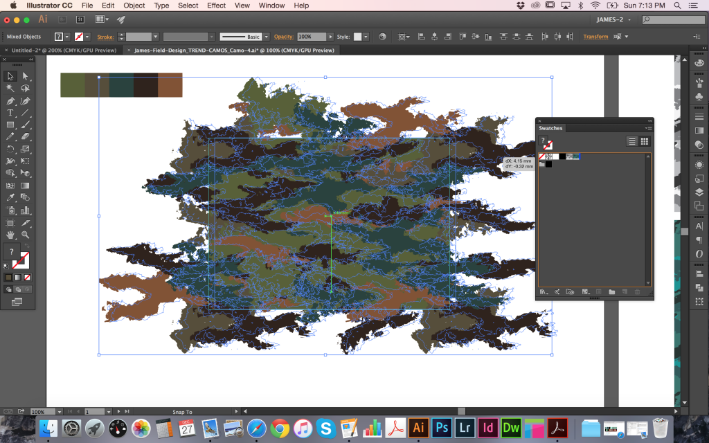
If you’d like to go a step further and customize the individual camos to more exacting specifications, then you can find each of the patterns ready to work with in their own individual documents. Opening any of these files you will see an artboard on the left with the original elements used to make the pattern. The rectangular guidelines are provided to show the boundaries of the tile area. Below this are the camo pattern shapes that you can recolor and below those are a rectangular background that can also be colored. Importantly, there is a second clear (no fill, no outline) rectangle at the very back that is the exact same size/shape as the guidelines that are used to define the pattern tile area. This MUST be left as it is and not grouped together with the other elements. The key to updating the camo patterns for yourself is to leave that clear rectangle alone, and to make the same changes to elements on all sides.
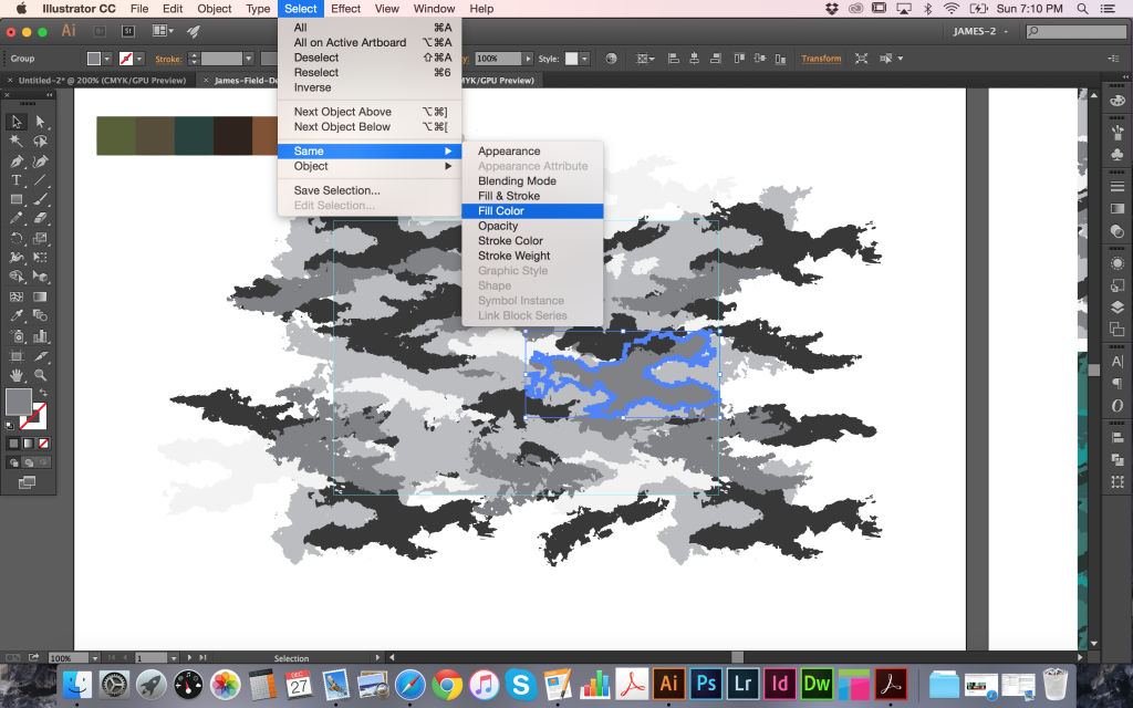
The most straightforward way to recolor the pattern is to select an individual element then follow Select > Same > Fill Color to collect all objects that same shade and apply your own new color. Continue to do this until you have your own color scheme created. In many cases, the camo shapes have been left intact so you can go in and change, add, or remove individual pieces to further adjust the look of the camo. However, always remember to make sure any elements overlapping the guidelines are also updated on their opposite sides in order to maintain the fully repeating visual. When you’re happy with the look of your pattern, select the entire camo (make sure to include that clear rectangle at the very back) and drag directly into your swatches panel. You should now see a new swatch created in the panel that can be applied to objects.
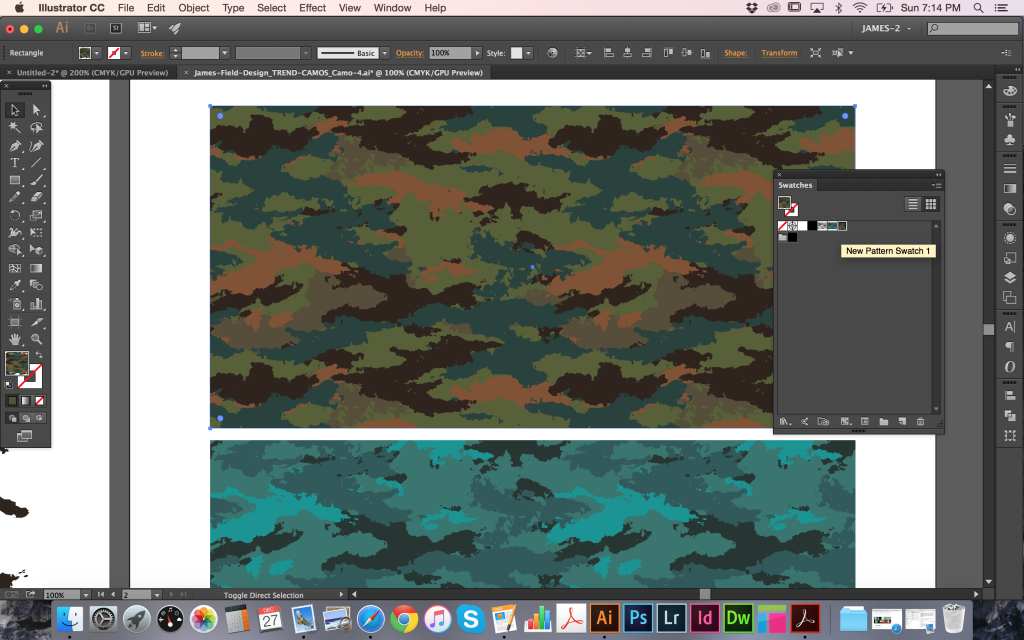
Provided with the Trend Camos are a set of three fully repeating bonus textures that can also be introduced into your camo patterns. Open that file and select the one (or more) that you want to use. Next, select and copy, then paste into your camo document. To make it repeat with your camo, you should resize and align to the guidelines and recolor to fit your scheme. To make an effective distressed look, use the same color as your background rectangle, then once again drag everything directly into your swatches panel.
NEXT STEPS
This is just the start of what can be achieved with the contents of the Trend Camos Pack. You can combine them, adjust them, resize, and recolor to fit your project as needed. As my first
ever tutorial, I hope everything was easy to follow and you found the info to be useful. If you have any questions or would like to see more, please get in touch and I’ll do my best to help out! I hope you enjoy using the Trend Camos Pack and I look forward to receiving your feedback.
Learn More about the Trend Camo Texture Pack
Learn more about James on his Official Site | Behance | LinkedIn | Twitter | Tumblr | Facebook

Quotes on Authenticity, Creativity, and Kicking Ass…
Sometimes we all need that extra boost to inspire our work. Here are some of our favorite quotes on art, creativity, and authenticity. May they inspire some vulnerability in your day today!