Tag Archives: poster design
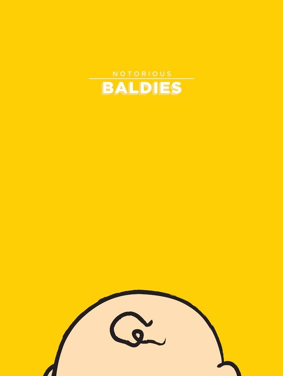
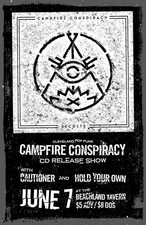
50 Poster Design Inspirations
You’ve been asking for tips on poster layout design and we’re here to help. Today, we’ll be using a sampling of inspiring posters to show you how to design your own. Read More ›
Great Poster Design Tips:
Recently, we received an email from a Go Media friend asking a simple, yet incredibly complicated question: “What are the qualities of a good poster design?”
And while we’ve done many a blog post about posters that inspire us, we haven’t covered why they have done such a great job of doing so.
So today we are going to do our best to answer that question – as simply as possible.
As we all may know, a poster’s job is often three-fold; it serves to advertise and communicate information while acting as a piece of artwork.
A great poster communicates a message clearly.
Of those three tasks, the poster absolutely must deliver a message as clear as a bell, so that it is as digestible in as little time as possible.
To accomplish this, make sure your poster flows well to do that:
- make sure it is easy to read from a distance
- grabs the viewer’s attention with a main image or headline, then
- answers the questions who, what, when, where and how and
- leaves the least important details to the fine print
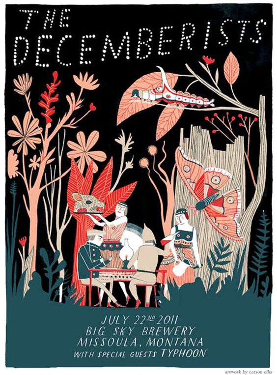
A great poster is simple.
In order to communicate your message, your poster should be relatively simple. If you bombard them with too much information, they’ll leave overwhelmed.
Remember:
- Less is more.
- Let it breathe! Leave enough white space so that the viewer can absorb the information.
- Choose complimentary color palettes
A great poster captures your attention.
When designing your poster, certain elements will capture the attention of your viewer above others. These include playing with:
High contrast
Dominant images
Bold and/or playful typefaces

Extreme minimalism
Bold color palettes
A monochromatic theme

A great poster motivates your viewer to take action.
Many posters serve to advertise shows, concerts, movies or other events. Your goal is to entice the viewer to respond to your art in some way, shape or form – by making a call, hitting up a website or heading to a show. Can you think of an out-of-the-box way for them to take action immediately, such as with a coupon code, QR code or by enticing them to enroll or sign up by a certain date for some wonderful reason?
A great poster knows where to call home.
When designing, it’s vital to keep in mind where it will call home. If it will exist in one environment only, you can cater its size and color to that environment. If not, make your choices understanding that this poster could live almost anywhere. Picture it both living in a dark dingy club or a on a bright red gallery wall.
A great poster starts a conversation with your viewer.
Most folks are on the move when they encounter a poster. If it’s clever in concept, they will be more likely to take time to interact with it. So, take the time to start a conversation with your viewer. Evoke an emotion in them. Make them laugh, think. Take them on a journey – if only for a moment.
A great poster is just plain lovely.
Yes, posters serve to communicate and call your viewer to take action, but they also serve as pieces of artwork. This only helps to reinforce their message. Enjoy the process!
Follow us on Pinterest for more posters we love!
The Battle Is On!
Welcome to Designer Face Off, a series created here at Go Media’s Arsenal. Designer Face Off brings your favorite designers, creators and entrepreneurs together like never before. The rules are simple – in each rapid fire interview, challengers poise 2 to 3 questions to the other party. They, in turn, will respond to the questions asked of them. All of this is to be completed under 5 minutes, and no topic is off of the table!
Who’s up next?
Designer Face Off #1 Aaron Sechrist vs Oliver Barrett
Meet Aaron Sechrist, aka OkPants:
Aaron, OkPants, is a freelance graphic designer and illustrator who enjoys working on projects that pull from both disciplines under the moniker OkPants. After cutting his teeth in various jobs in the music and publishing industries and yelling for various fruitless Cleveland-area DIY bands, he made the move to freelance and found happiness as well as actual income working with good people, creators and brands within the entertainment, music and apparel industry. His gig posters sleep with the Boss and Prince in the Rock and Roll Hall of Fame and Museum and he enjoys participating in art shows across the country. He also likes designing things for himself and sells them through the OkPants Webstore as well as through Made by Superior.
Meet Oliver Barrett:
Oliver is a former agency-guy who’s learned from several years of mistakes, panic, and triumphs that he might be onto something as a solo designer/illustrator/art-director/generic creative title.
Watch >>
Follow >>
So, who’s going to win the social media battle? Show these fellas some love!
Learn more about OkPants on his Official Site, as well as his Twitter | Tumblr | Facebook | Instagram | Dribble | Shop
Learn more about Oliver on his Official Site, as well as his Twitter | Instagram | Tumblr | Dribbble
____
Who do you nominate for our next Design Face Off? Please leave a comment below!
Introduction
Hello there! It’s Simon on this end of the keyboard. I’m very happy to make my return to the Zine with a poster design tutorial, that will explore the possibilities offered by Jason Carne’s Texture Lot One. The tutorial will have us explore texture use tips and tricks, but also customized black and white conversion, large scale sharpening, type pairing, layout building, and more.
I’ll be using Photoshop CC for the tutorial, but any version of Photoshop past CS3 should be fine. Note also that I’m working on a Windows-based system, but other than visual appearance and slightly different keyboard shortcuts, that will not have any impact on the process we’ll go through.
Introducing Jason Carne’s Texture Lot One
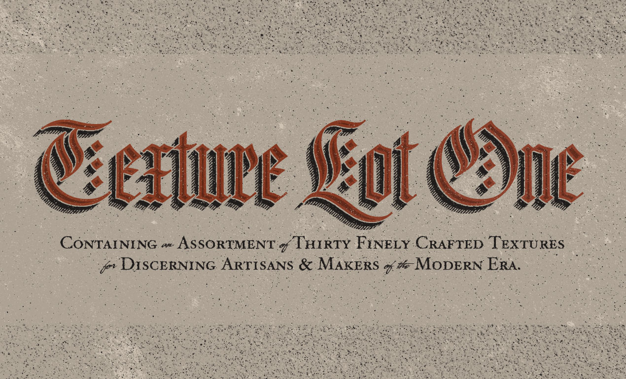
As the hero shot image tells us, the set contains 30 “finely crafted” textures, that will help us to give a wide array of artifacts to our flat, digital art. They come from a multitude of source material: burlap, cork board, a scratched cutting board, stone, and more.
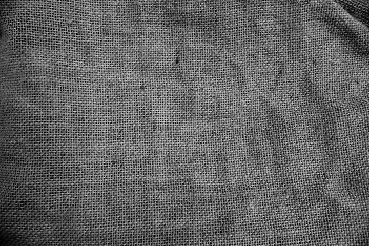
The textures come in the form of high resolution, black and white textures.
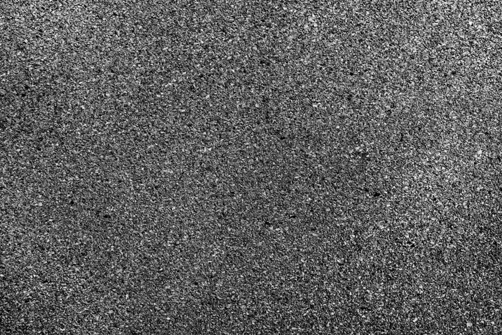
The level of detail is superb, and gives us plenty to leverage to add substance to our compositions.
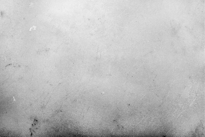
And one more for the road, just because we can.
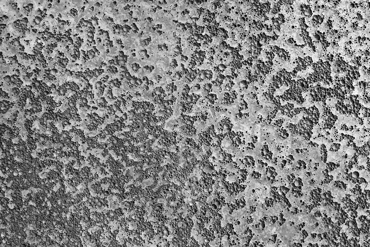
Go pick Jason’s Texture Lot One up now at the Arsenal!
The brief
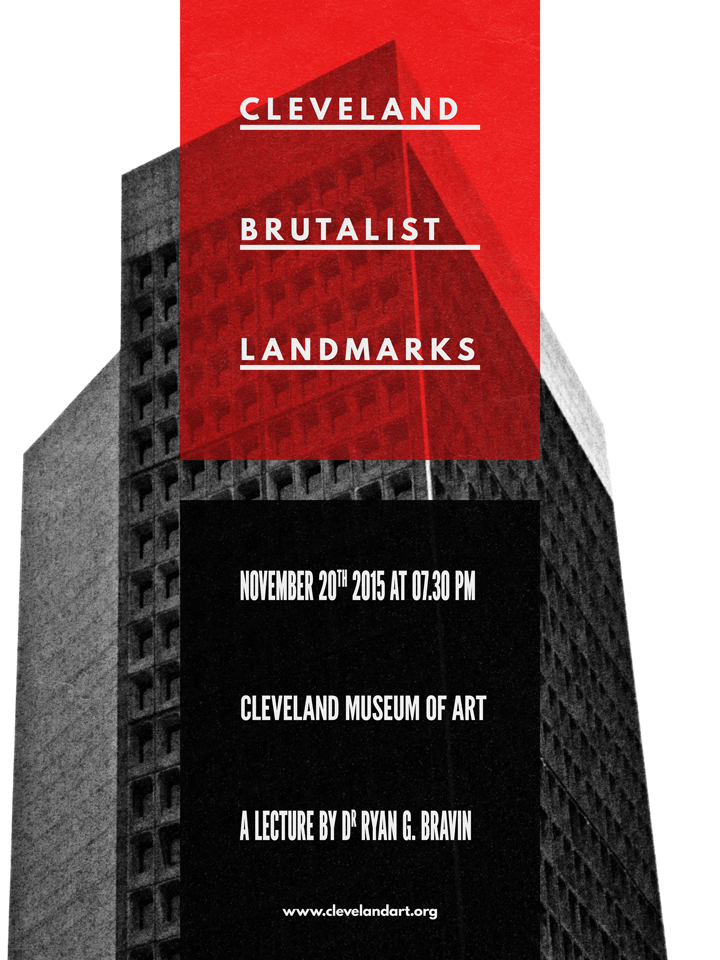
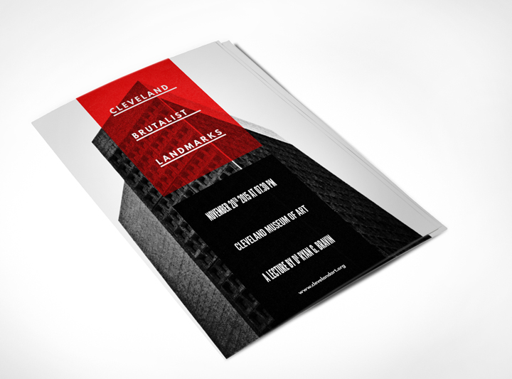
Let’s talk some more about the piece we’re putting together here. It’s a poster for a (fake) architecture lecture, focusing on Cleveland’s brutalist landmarks.
What is brutalism? Glad you asked:
Brutalist architecture is a movement in architecture that flourished from the 1950s to the mid-1970s, descending from the modernist architectural movement of the early 20th century. The term originates from the French word for “raw” in the term used by Le Corbusier to describe his choice of material béton brut (raw concrete). British architectural critic Reyner Banham adapted the term into “brutalism” (originally “New Brutalism”) to identify the emerging style.
So, what does a brutalist building look like? There’s this amazing Tumblr called F**k yeah brutalism out there, and it’ll help me to answer that question:
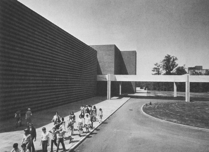
(Education Wing, Cleveland Museum of Art, Cleveland, Ohio, 1971 -Marcel Breuer & Associates – via)
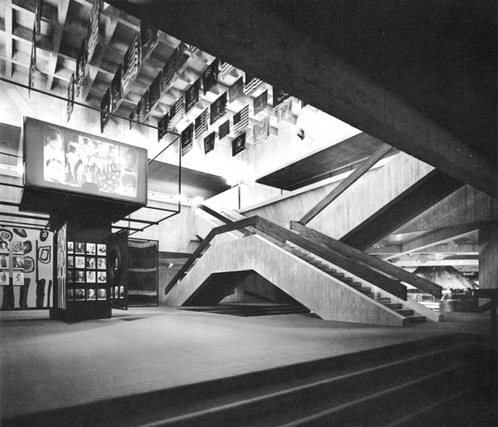
(State Historical Center, Columbus, Ohio, 1970 – Ireland and Associates – via)

(State Historical Center, Columbus, Ohio, 1970 – Ireland and Associates – via)
There is something monolithic, synthetic, and minimalistic at times.
Now, why choose Cleveland as the focal point of the fake lecture? It happens that Cleveland has its share of brutalist buildings. A 2007 article from the Plain Dealer lists the major local representative landmarks of the movement: Cleveland State University, Cuyahoga Community College Metro Campus, Cleveland Justice Center Complex, Crawford Hall (Case Western Reserve University), and more.
Assembling the free assets needed
It happens that there is a CC-licensed image of the Cleveland Ameritrust Building, one of these major landmarks, available on Flickr for us to use as the base of our poster. We’ll need to grab the biggest size available (4028 x 2704 pixels), through the all sizes page.

Other than the high resolution version of the image, we’ll also need to have two (free) typefaces accessible to us: League Spartan Bold, and League Gothic.

The last asset we’ll need to have at hand is this beautiful, free aged paper texture, courtesy of our very own Dustin Schmieding:
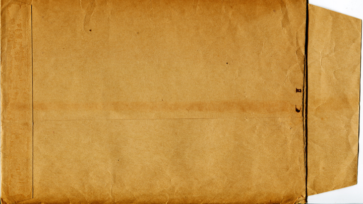
Got it all? Then it’s time to get started!
Preparing our Photoshop document
We’ll use is a “standard” 18″x24″ canvas for our piece. For the readers outside of the USA, feel free to use an A3 format. Note the fact that we’re using an RGB document, as some of the filters we’ll use require that color space to function.
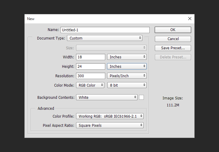
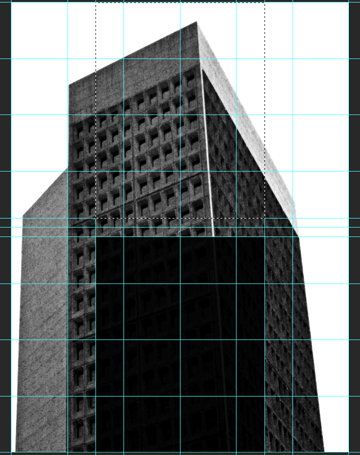
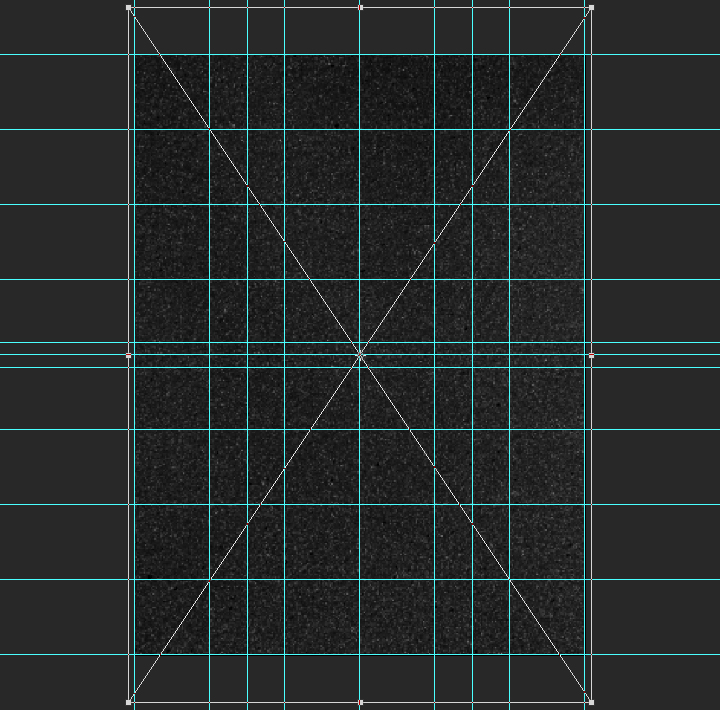
Next, we need to setup a grid. It’ll help us when building the composition. First, we’ll leverage Adobe CC’s New guide layoutfunctionality to build a six columns by 8 rows main grid (View > New guide layout).
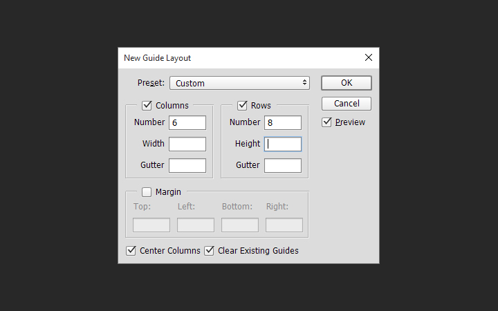
The result is a grid based on squares of 3″x3″.
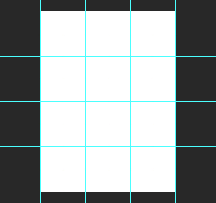
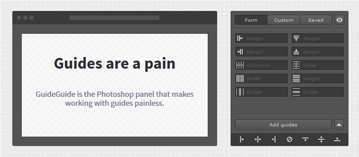
Note: if you don’t have the CC version of Photoshop, you can leverage the power of GuideGuide to accomplish the grid-related tasks quickly. The current version isn’t free, but older versions are.
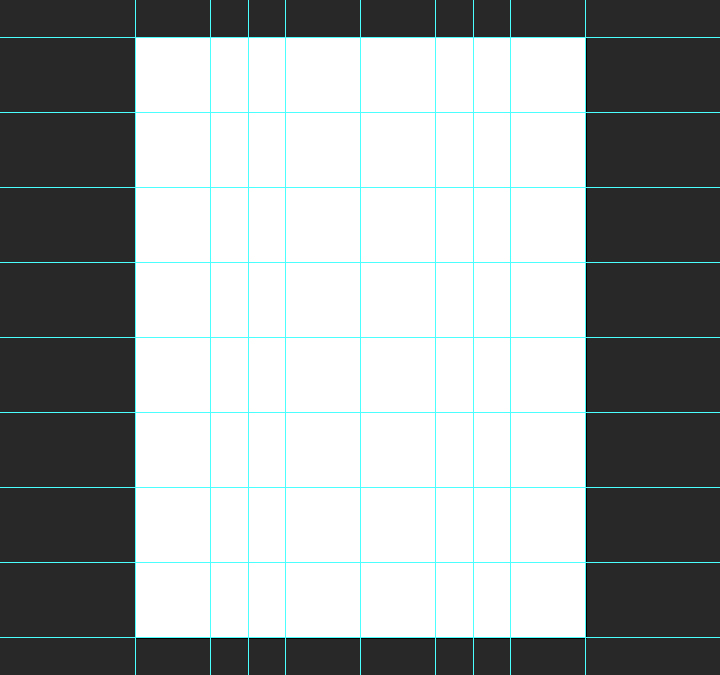
The next set of guides are going to help us establish the boundaries of the center column. We need vertical guides at4.5″, and at 13.5″.
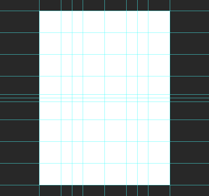
Finally, we need horizontal guides at 11.5″, and at 12.5″.
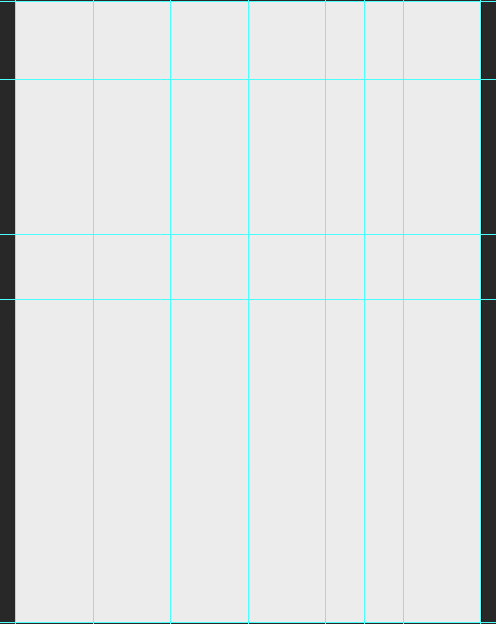
And with that, our document is ready to go. It’s time to get started for real.
The background
Background color
The first thing we need to do is give a solid color to our background layer. It’s going to be the base for the effects we’ll build up through the tutorial. We’ll be using a very light gray, #ededed. If we were using pure white, the contrasts would be too strong, and some of the texture effects we’ll apply later would be “washed out.”
Photographic manipulations
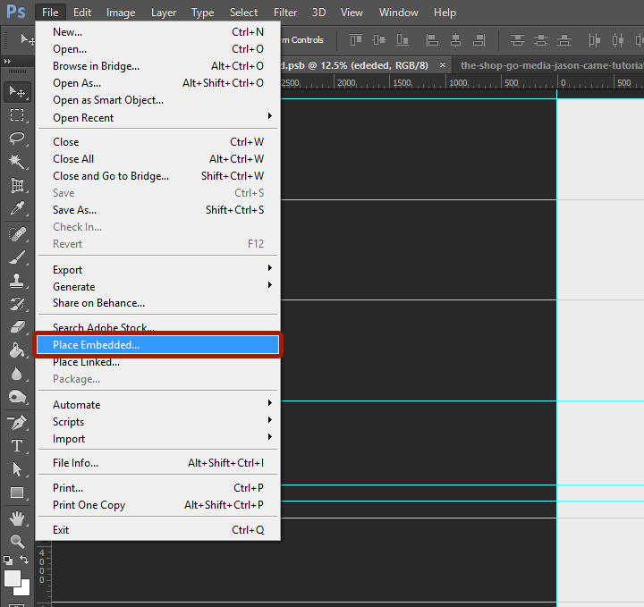
Next, we need to place the photo in our composition. We’ll place the photo as a smart object, in order to maintain a lossless workflow. It will also guarantee us access to the untouched original file. To do so, we have to use File > Place (or File >Place embedded in Photoshop CC), and navigate to the photo file.
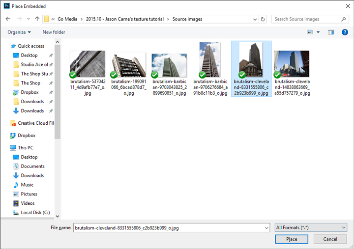
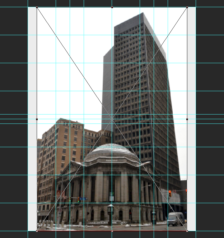
Once the image is included in our file, we will give it its final positioning and size using the absolute positioning tools at our disposal. The center point of the image should be at X: 2.55″, and Y: 26″. The image is scaled up to 125%.
![]()
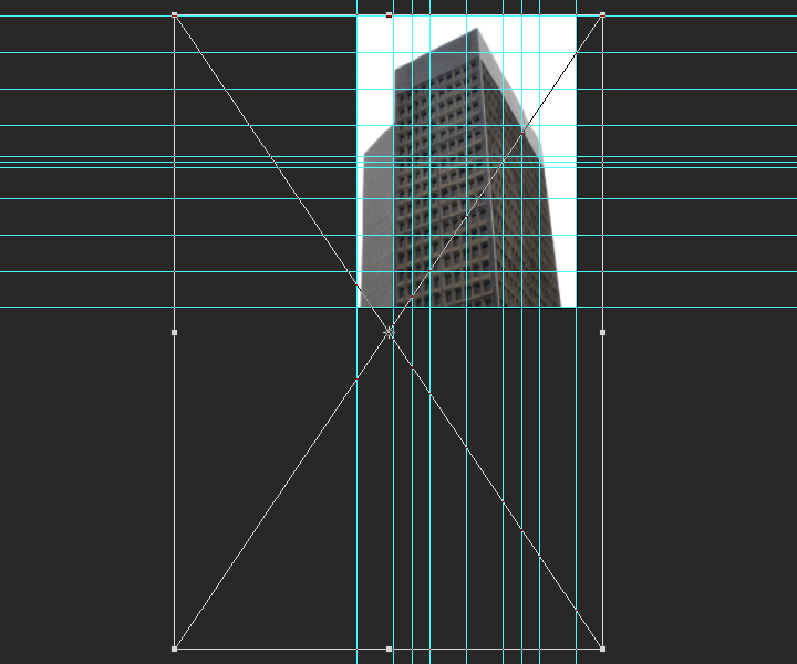
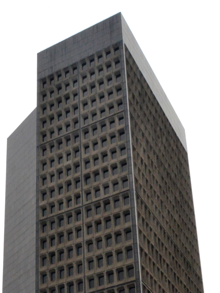
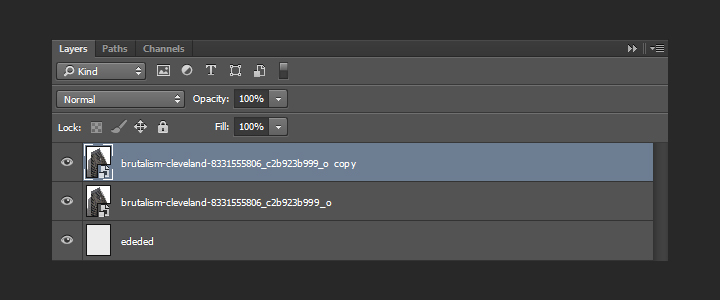
With that done, we need to sharpen the smart object, since we scaled it up. We’ll use the high pass filter for that. The Zine archive features a short article about the technique already. Let’s start by duplicating the smart object.
Next, we need to run the high pass filter (Filter > Other > High pass). We’ll use a radius of 100 pixels.
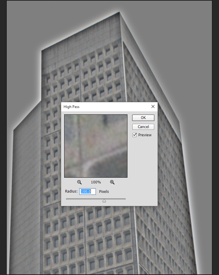
The result doesn’t look like much. To obtain the desired effect, we need to change the copy’s blending mode to soft light @ 100% opacity.
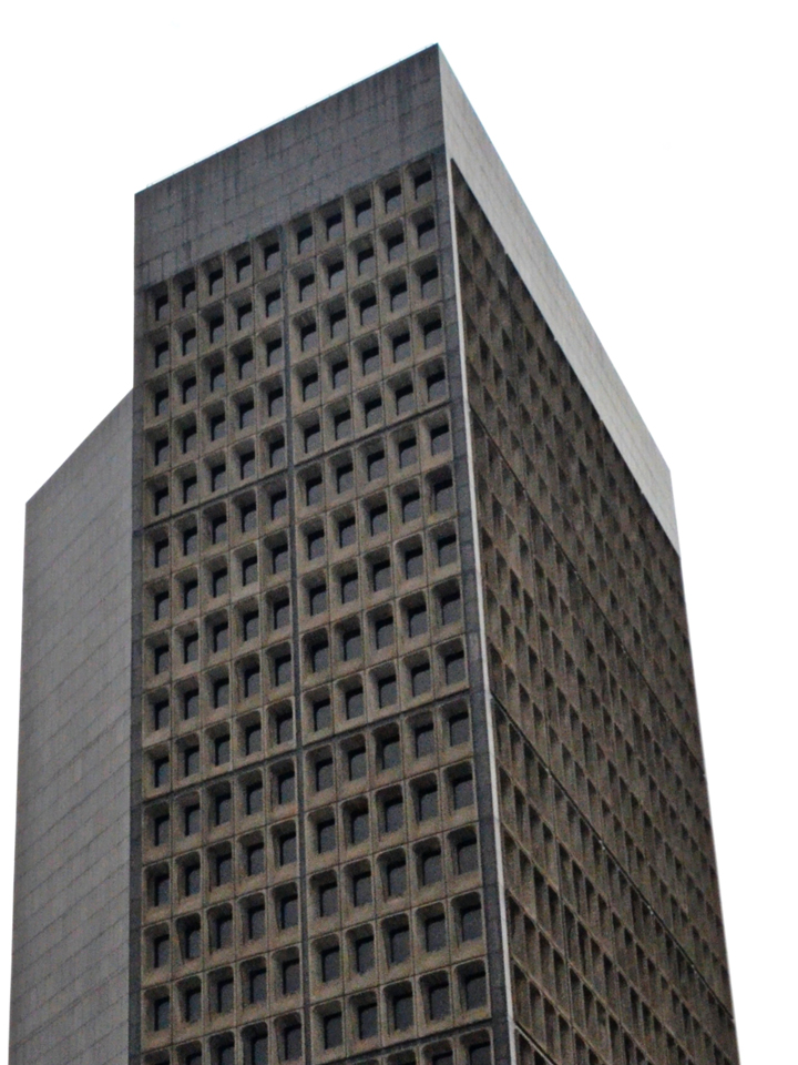
Next, we are going to clip the copy to the original layer (CTRL/CMD+ALT/OPTION+G). This contains the high pass effect to the layer it’s clipped on.
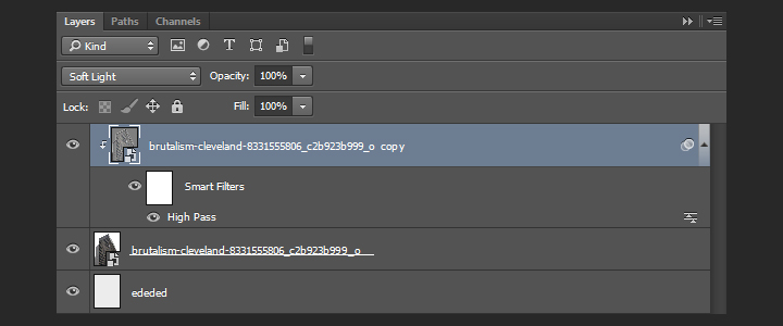
With that done, we can change the blending mode of the original layer to multiply @ 100% opacity. This will make the photo adopt the soft gray we’ve used as background color as its main color once we’ve converted it to black and white.
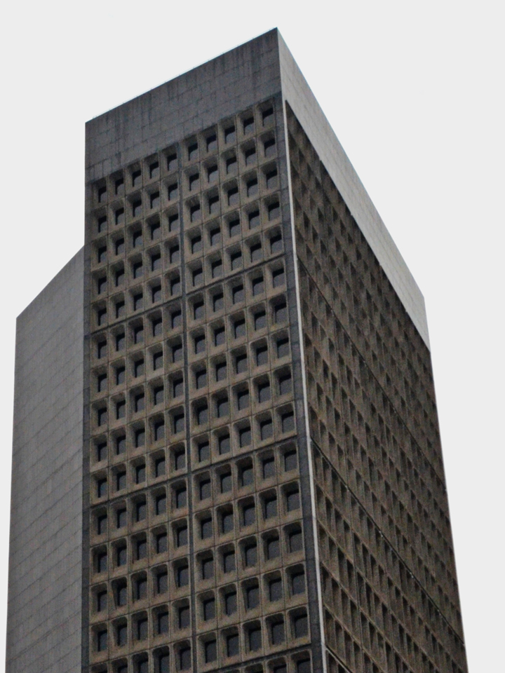
Black and white adjustments
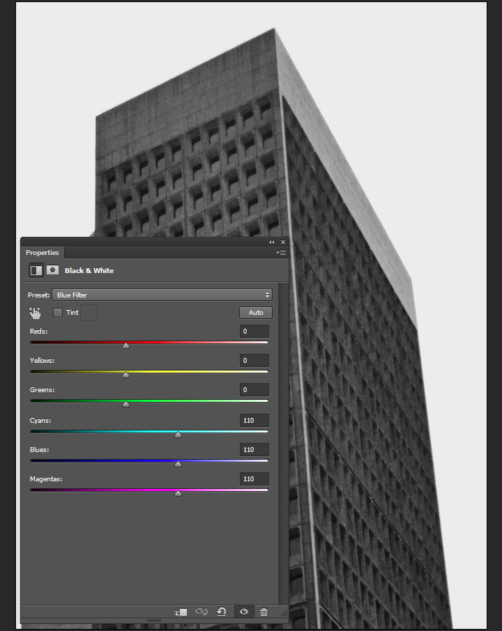
Desaturating a picture IS NOT a proper way to convert it to black and white. We are going to use a black and white adjustment layer for that. The preset we’ll use is called blue filter. Cyan, blue, and magenta hues in the original image will be light, while greens, yellows, and reds will be untouched or dark. For a higher contrast, the greens, yellows, and reds could be purposefully set to darker (using a negative value in the sliders).
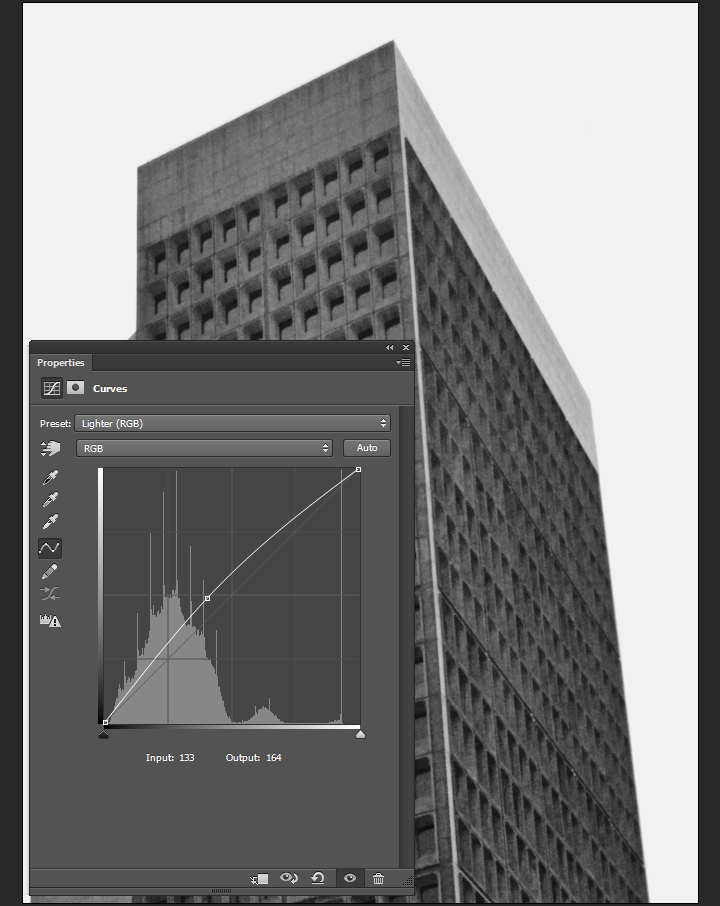
The next step is a curve adjustment layer, set to the lighter preset. This allows us to soften the black and white conversion.
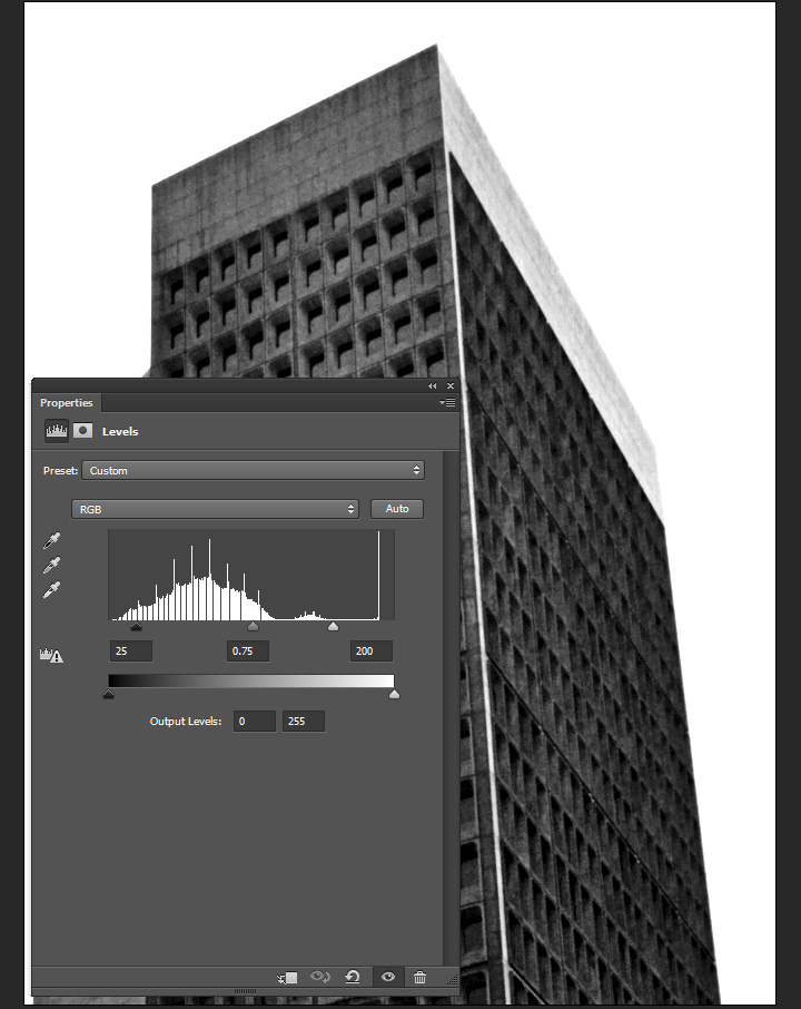
Finally, a levels adjustment layer allows us to push the contrast up.
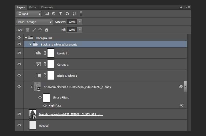
It’s time for some layer organization.
A hint of texture
We are going to add one of Jason’s textures above the background. It will help us to generate a subtle grain effect. The texture is Corkscrewed – Light.
Go pick Jason’s Texture Lot One up now at the Arsenal!
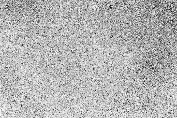
It’s placed centered in our canvas, rotated of 90°, and scaled up to 225%.
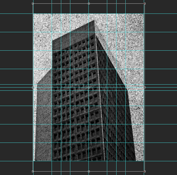
After converting the texture layer to a smart object (Filter > Convert for smart filters), and sharpening the texture (Filter > Sharpen > Sharpen), we can change its blending mode to soft light @ 75% opacity.
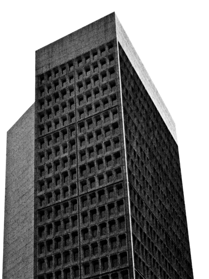
That texture concludes our work on the background. Before switching gears and attacking the content columns, here’s a look at our layers so far.
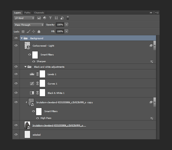
Content columns
Setting up the columns backgrounds
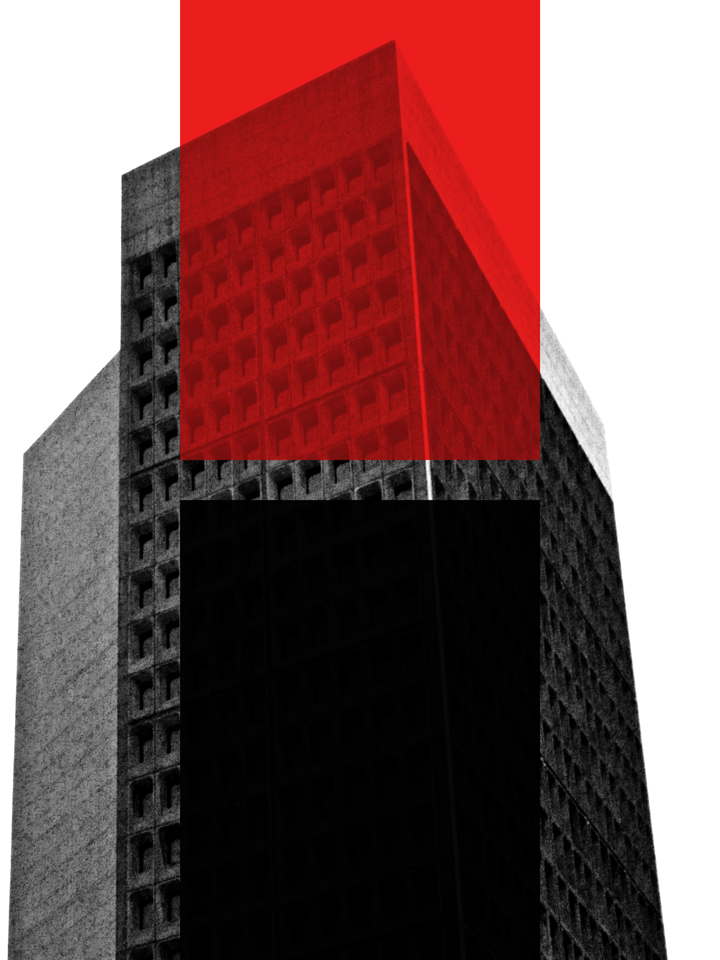
Back when we set up the grid, we created a set of special guides that we’ll now use to delimit central column for our text. The column is split in two parts, one with a red background, and one with an almost-black background.
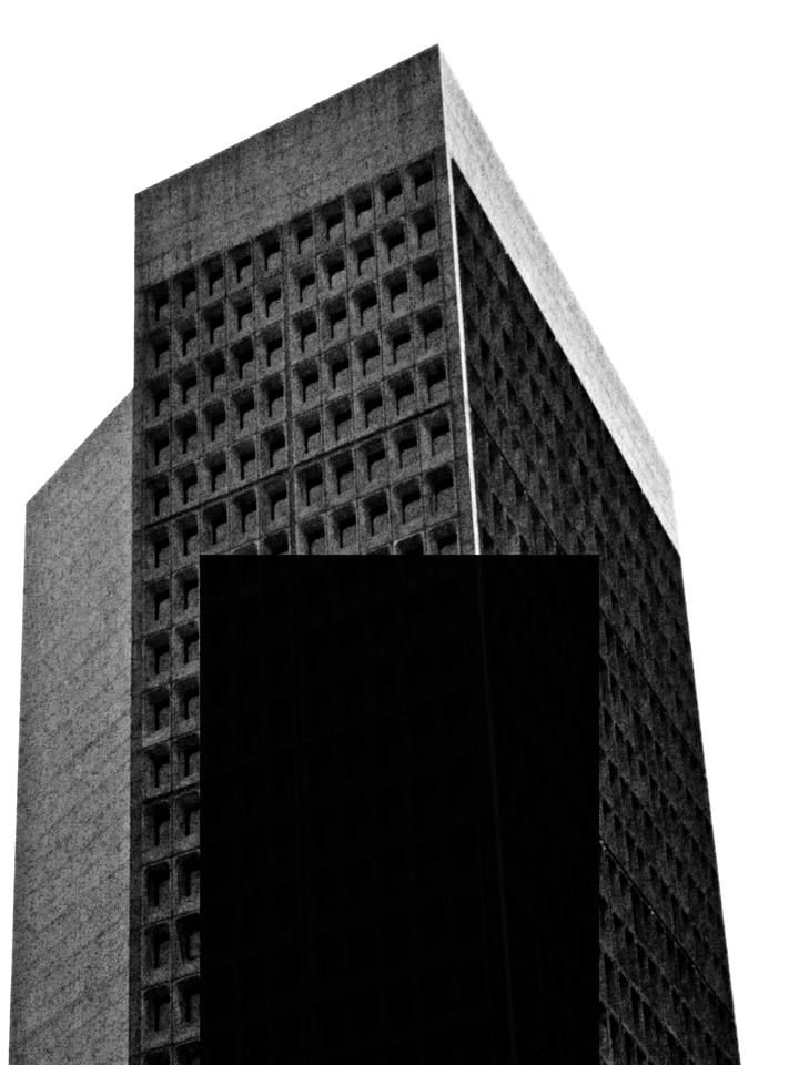
Let’s start with the almost black. It sits at the bottom half of the canvas. Here’s the area we have to delimit.
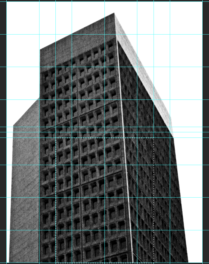
After creating a new layer, we need to fill it with a very dark gray, #040404.
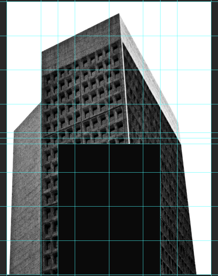
Finally, the blending mode of that layer should be multiply @ 98% opacity. This will allow us to bring a hint of translucency in the shape.
The next shape will be its pendant at the top of the composition, and will be filled with a very bright red, #eb1d1d.
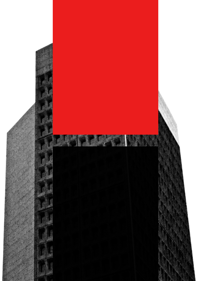
The blending mode of that layer should be multiply @ 50% opacity.
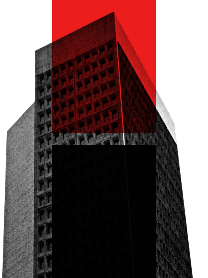
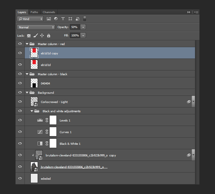
The shape’s translucency is too high (we need to remember that it will be the background to text later on). In order to address this, we’ll duplicate the layer, and change the blending mode of that copy to normal @ 50% opacity.
Layer organization
A quick note about layers, as we’re about to add type elements in there. Here’s what they should be organized into. The background elements have their layer group, and each half column elements have their dedicated layer group. From there, it’ll be easy to add the type in the proper group, so everything stays organized.
It’s time to talk about typography
As announced at the beginning, we’ll be using two type families: League Spartan Bold, and League Gothic.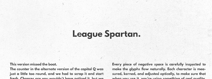

The main title
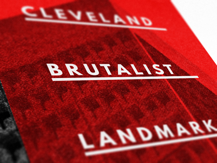
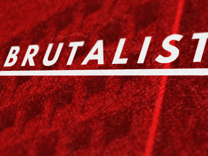
The main title reads “CLEVELAND / BRUTALIST / LANDMARKS,” and is set in all caps League Spartan Bold, colored in #ededed, that is 48 points tall, and with tracking set to 250. Each line is its own text object, and they are aligned to the grid lines within the column.

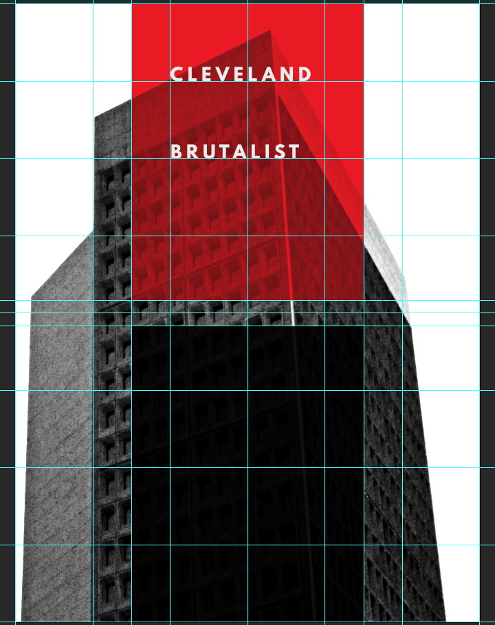
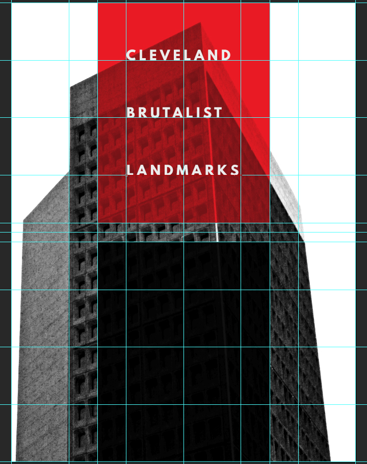
In order to further ground the title element, we are going to add horizontal dividers underneath each line of text. The dividers will be colored in #ededed, and measure 6″x0.125″. The dividers are positioned underneath each text line, 0.125″ under the text line. We’ll use shape layers to generate the dividers.
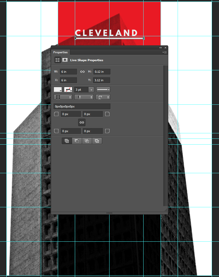
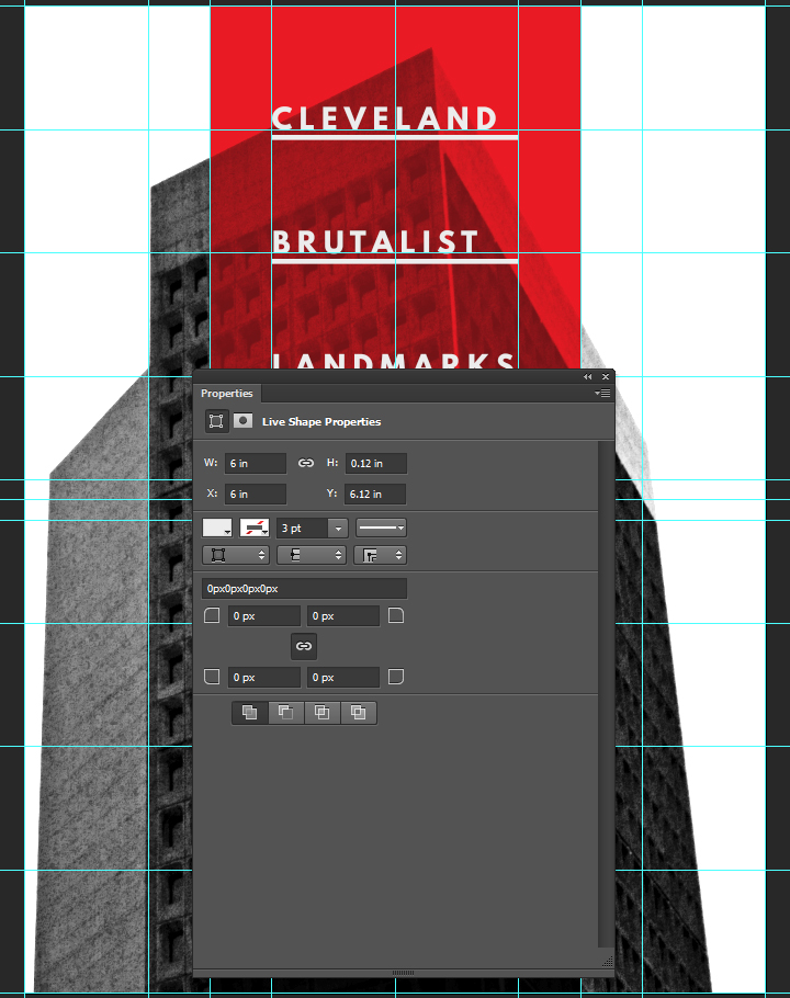
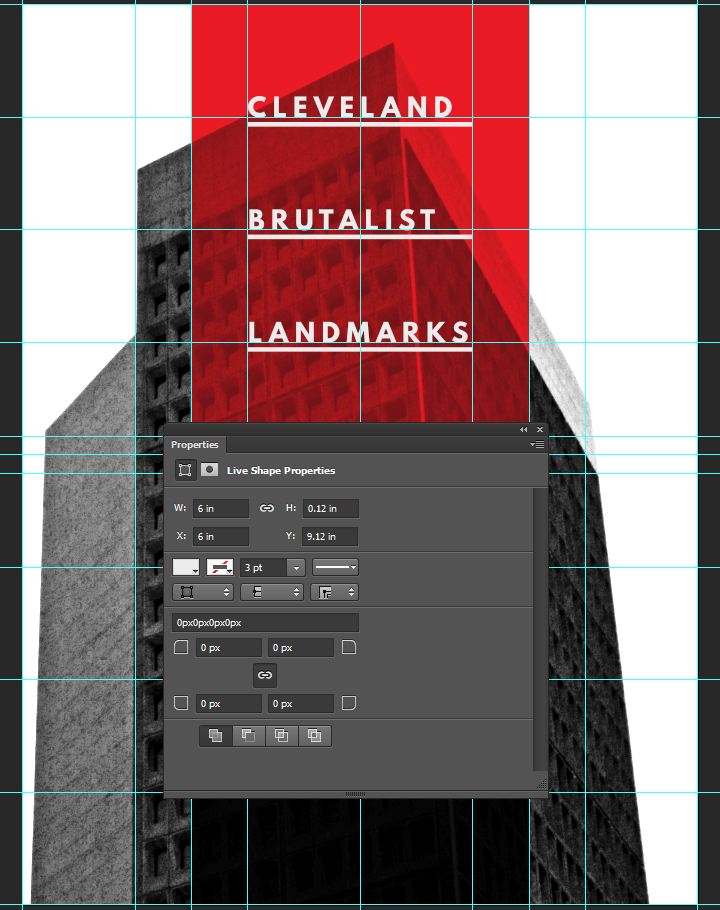
And here’s what the layers look like.
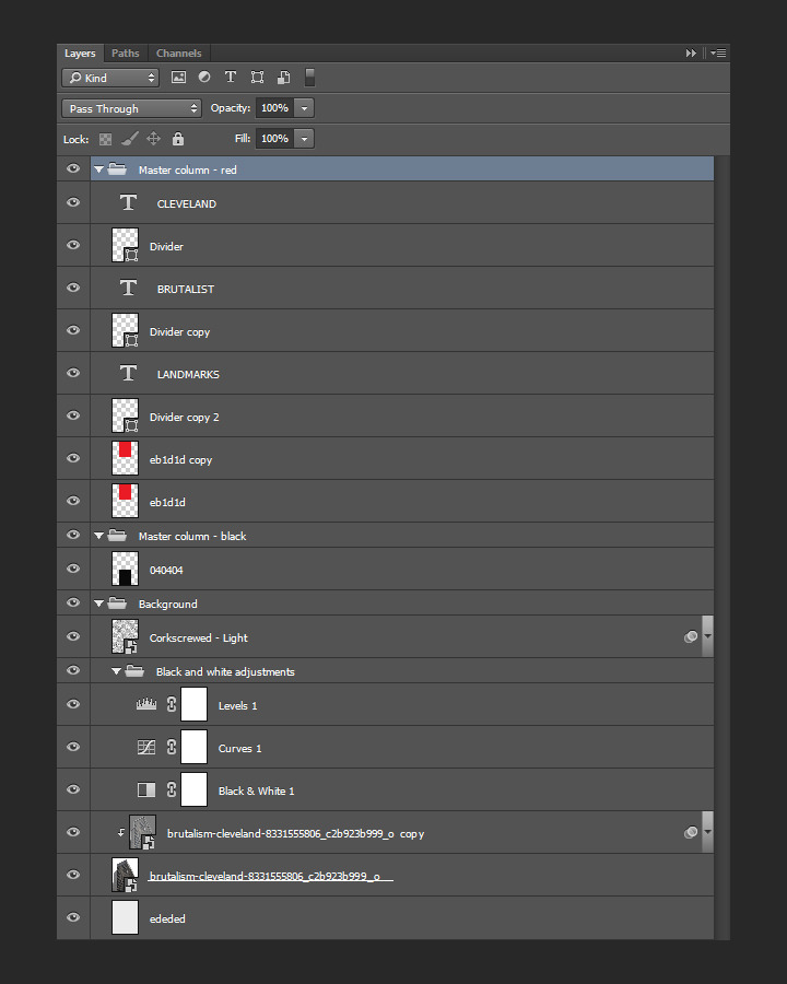
Additional information
We are not creating a proper conference poster if we don’t add the secondary information like the lecturer’s name, a date, a location, and a URL. The information is broken down as follows:
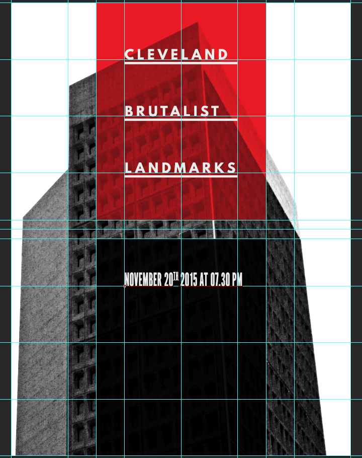
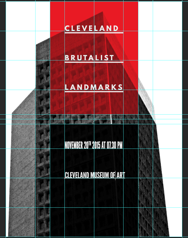
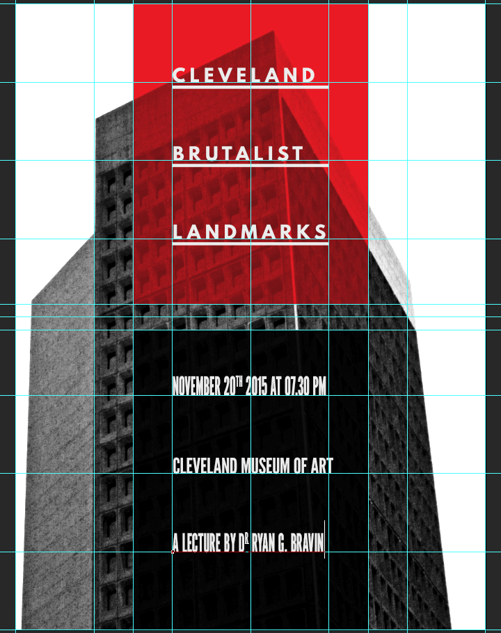
“NOVEMBER 20TH 2015 AT 07.30 PM / CLEVELAND MUSEUM OF ART / A LECTURE BY DR RYAN G. BRAVIN / www.clevelandart.org”
The individual type objects are aligned in a similar fashion as before, on the grid lines. “NOVEMBER 20TH 2015 AT 07.30 PM” is set in League Gothic Condensed Regular, that is 72 points tall, colored in #ededed, and with kerning set to optical.
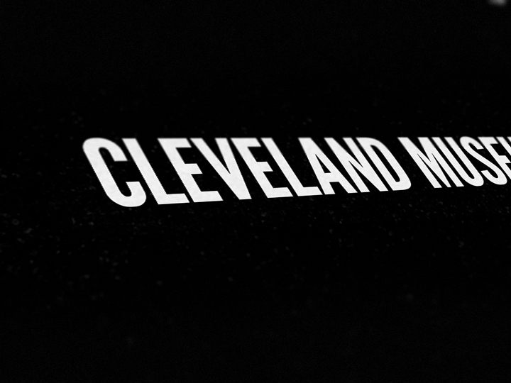
“CLEVELAND MUSEUM OF ART” is set in League Gothic Regular, that is colored in #ededed, that is 60 points tall, and with kerning set to optical.
“A LECTURE BY DR RYAN G. BRAVIN” is set in #ededed colored League Gothic Condensed Regular, that is 72 points tall, and with kerning set to optical.
Finally, the URL to the site of the Cleveland Museum of Art, www.clevelandart.org, is set in #ededed colored League Spartan Bold, that is 24 points tall. The text object is located at X: 9″, and Y: 22.8″.

Here’s what the layer organization looks like:
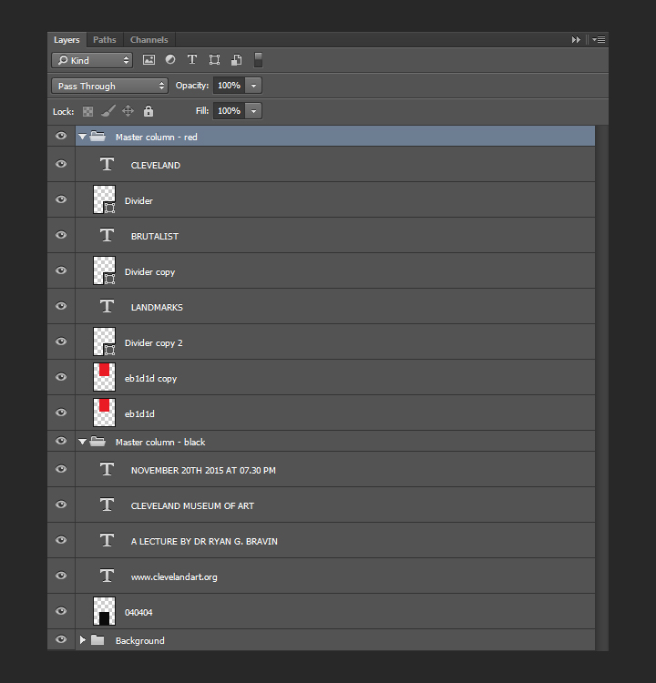
And with our type in place, our piece is almost complete.
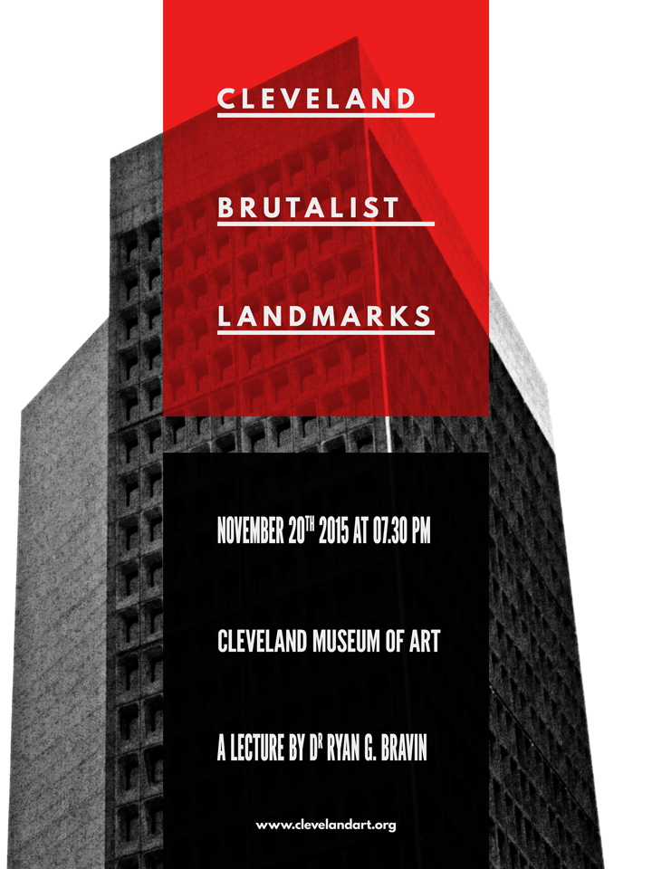
Now, it’s time to layer some more textures to polish the piece!
Textures and artifacts
Here’s a theory: one of the motivations to add textures to our work is to help us to add depth to our digital art, and to break away from their flat, clean, and precise origins. At this point in the process, the photo is pretty gritty, but the type above it is very clean. Adding more textures will allow us to weather that type and the column backgrounds.
The first texture we’ll add is PackingFoam.
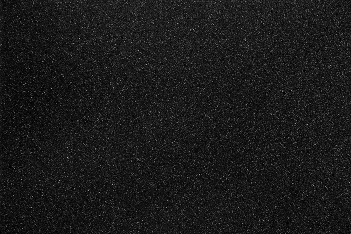
It’s placed centered in the composition, rotated 90° clockwise, and scaled to 55%.
After sharpening the texture (Filter > Sharpen > Sharpen), we can change the blending mode to screen @ 15% opacity.

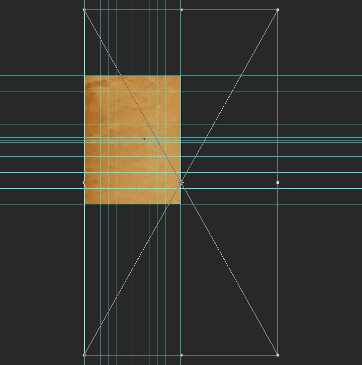
The next texture is the freebie we grabbed at the beginning, BB_AntiqueEnvelope_04.jpg.

It’s placed at X: 18″, and Y: 19.9″, rotated 90° counterclockwise, and scaled up to 1,150%.
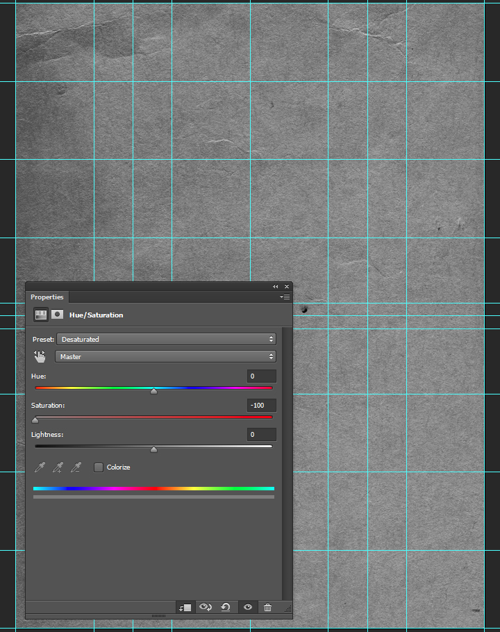
After sharpening, we’ll use a clipped hue/saturation adjustment layer to desaturate the texture.
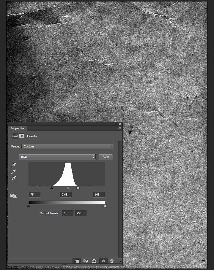
A clipped levels adjustment layer will help us to enhance the texture further.
Blending mode: soft light @ 35% opacity.
The next texture is from Jason’s set, and is called Corkboard.
Go pick Jason’s Texture Lot One up now at the Arsenal!

It’s placed centered in the composition, rotated 90° clockwise, and scaled to 55%.
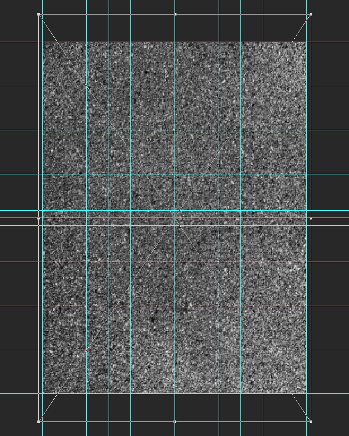
After sharpening, the blending mode should be changed to soft light @ 25% opacity.
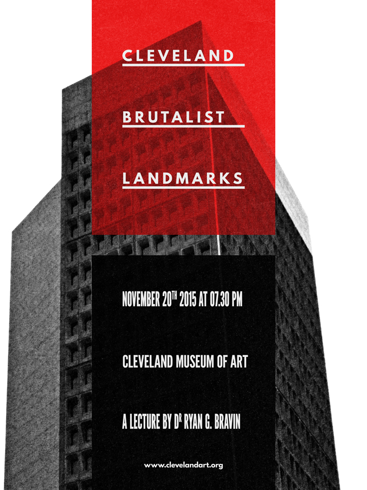
The texture levels are coming together nicely. We’ve added grain, light noise, and small artifacts to the piece with a few layers of substance. Let’s have a look at the layers before the ultimate polishing touches.
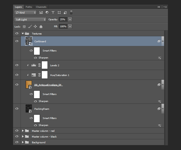
Last details
Lossless vignette effect
There is a way to create a lossless vignette effect in Photoshop, thanks to shape layers. The first step is to draw an ellipse that fits the canvas. It should be colored in #040404.
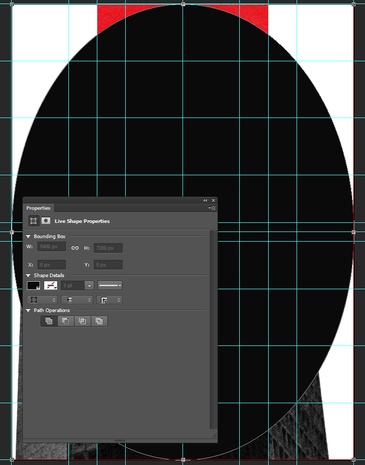
Next, we need to use one of the tools accessible via the direct selection tool (A), in the toolbar. It will allow us to display the ellipse inverted, getting closer to the vignette. Once the active tool is the direct selection tool, we need to change the path operation button‘s setting to subtract front shape.


The result is a very sharp edged ellipse, almost ready to be a vignette.
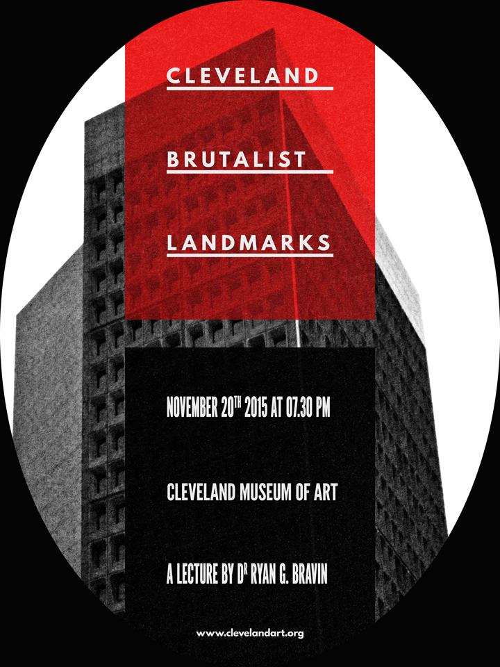
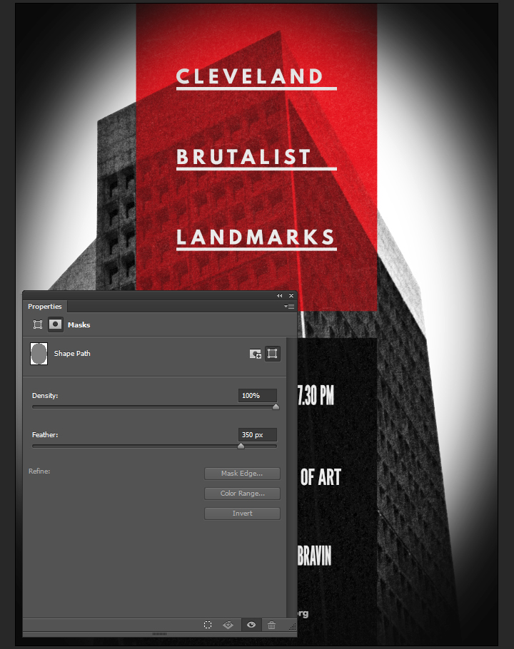
Next, through the layer’s properties panel, we need to feather the layer mask to 350 pixels. This creates the fuzzy edge for the vignette.
Finally, the blending mode for the vignette can be switched to soft light @ 50% opacity.
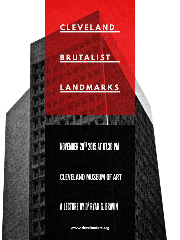
Last but not least: halftones
The last piece of the puzzle is a halftone effect. First step, to create a merged copy of the piece so far. We’ll use the CTRL/CMD+ALT/OPTION+SHIFT+E shortcut for that. It’ll create a layer containing a merged copy of the piece so far. I called it Halftones.
Once the layer is generated, it needs to be converted to a smart object.

After resetting the color palette to default (D), we’ll use the filter gallery’s halftone effect (Filter > Filter Gallery > Sketch > Halftone pattern). We’re using a size value of 8, and a contrast value of 50.
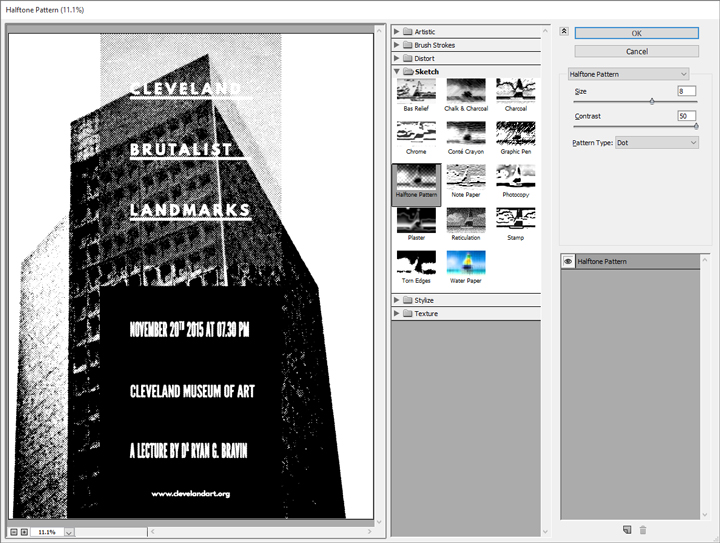
Then, we need to change the effect’s blending mode to soft light @ 100% opacity.

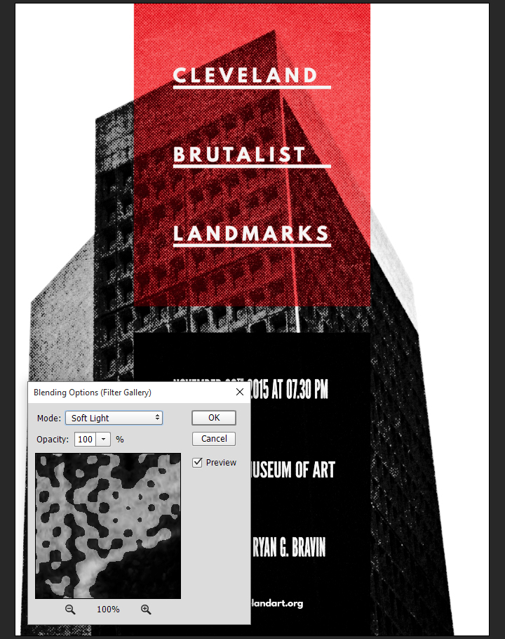
After that, we can change the layer’s blending mode to soft light @ 50% opacity.
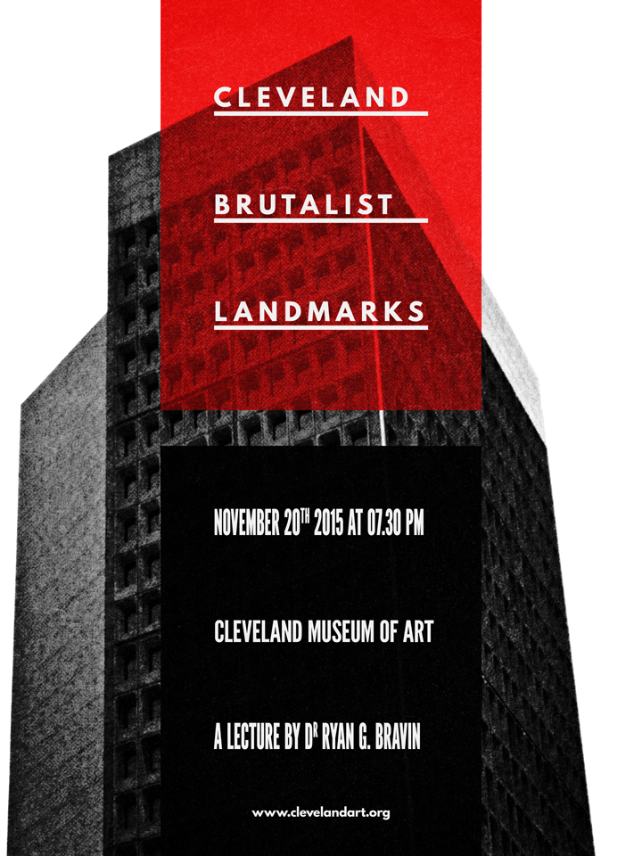
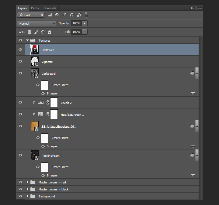
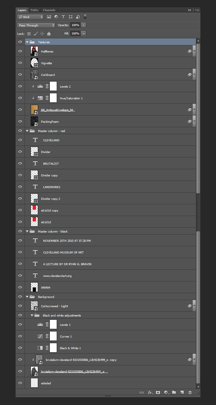
And our piece is now done! Here’s a look at our final layer stack.
Wrapping things up
Phew, that was a long tutorial! I hope that you enjoyed it, learned a few tricks here and there, and that your outcome matches the goals you had at the beginning.
We’d love to see your tutorial outcomes!
Mockup your poster using the free sample below from our Poster Mockup Templates Pack and please share your work with us in the comments, by tweeting at us at @go_media, or sharing them on our Facebook page.
Free Download: Free Poster PSD Sample from Go Media
If you already purchased Jason’s texture set, I hope you enjoy them, and that this tutorial gave you a sense of what you’ll be able to accomplish with them. If not, go grab them while they’re hot!
Go pick Jason’s Texture Lot One up now at the Arsenal!
And on that note, that’s it for me! Until next time, cheers!


