Category Archives: Status Updates
As a special gift, we are giving our Arsenal subscribers (brand new and old) these super cool Arsenal patches during the month of May. This was all made possible through a partnership with our friends at Patch Superstore. If you’d be so kind, make sure to thank Patch Superstore with a quick tweet here:
[Tweet “Thank you for the awesome Arsenal patch @patchsuperstore! From a @go_media Arsenal Member!”]
To receive your patch, make sure you are subscribed to our Arsenal membership!
If you need to reactivate your subscription, here are a couple ways to do it:
- If your account is on hold, follow these instructions.
- If your account is cancelled, head to My Account (upper right-hand side of your screen), View Orders, Subscriptions. Next click “View” to view your cancelled subscription, and
click into “Resubscribe” to get going again.
If you need further assistance, email Heather at [email protected], find her on chat or call her at 216.939.0000 x 239. Please have the email associated with your account on hand.
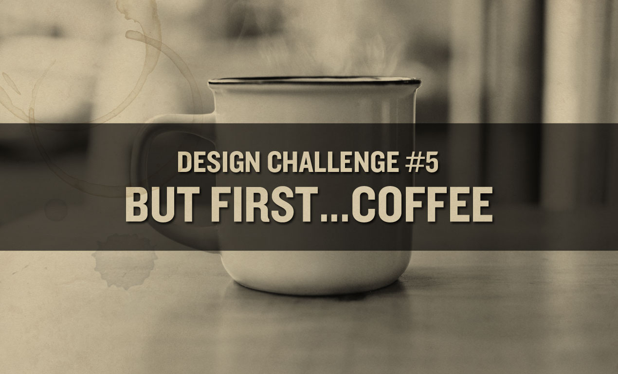
Interested in helping support arts education programming for kids? This is the design challenge for you!
To take part, create a coffee cup design as outlined in the PDF attached. The winner will receive a coffee cup with their design on it, as well as the satisfaction of knowing their design will be produced on cups that will be raffled off in gift baskets at Go Media’s upcoming Creativity at Work fundraiser in support of the Center for Arts-Inspired Learning. One hundred percent of proceeds will be going to ensuring that children here in Cleveland who need arts programming the most receive it!
Here is all the info you need, including where and when to send your final design >> Design Challenge #5
Enjoy and make sure to share your work with us on the We Are Weapons Facebook Page!
Design Challenge #5 is thanks to Arsenal Member Michael Garrett of Xtreme Custom Graphics, who is generously donating his time, efforts and printing talents to us this month!
Hey Arsenal Friends! Today, we’ll be going over how to create food typography. This tutorial is for beginners by someone who is relatively new to the world of food typography. Let’s explore together!
What you need for this tutorial:
- Adobe Photoshop and Illustrator
- A piece of white paper
- A camera (preferably a DSLR)
- Our Coffee Vector Pack
- Our Flourishes 4 Vector Pack
- Sortdecai font from our library (*Or, receive all of these Arsenal products with our Membership!)
- This photo from our friends at Unsplash
Step One: Create a Photoshop document sized 8 x 6 inches. Download Sortdecai font from our library. Type out the word COFE in your document using Sortdeci, filling the doc. Bring the opacity down to about 10%. Print this page out to use as a template. If you’re a Pro and can be assured your F and E will look identical, go ahead and print out a full COFFEE template. If you’re sticking with me, we’ll be using Photoshop to duplicate our F and E letters in step three.

Step Two: Step away from your computer. Here comes the fun part! Pour some coffee grounds out and get ready to make some magic. Using a small paintbrush in combination with an exacto knife to start creating your custom coffee typography. Once you’re finished, use a DSLR to take a sharp macro photo of your piece.

Step Three: Using your magic wand tool in Photoshop, duplicate your F and E to create a full COFFEE lettered piece.

Step Four: Head to Image > Adjustments > Curves. Play with your curves until you achieve the look you’re after, with the coffee grounds appearing as realistic as possible.
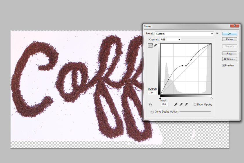
Step Five: Delete your background layer. Next, double-click on your coffee art layer to reveal the layer styles box. Under blending options, head down to the slider that reads: This layer under “Blend if Grey.” Slide the white slider down like so until your background disappears. Save this file as a PNG.

Step Six. Open up the photo you downloaded from Unsplash in Photoshop. Place your Coffee PNG into the document, on the right-hand side. Place it where you think it looks best.

Step Seven. I think our work needs a little extra pizazz. So, let’s pull some of our vector elements into the document. Open the Coffee Vector Pack and Flourish 4 Vector Packs up in AI. Place these vectors above the mug, so that your flourish vectors represent steam and the coffee vectors playfully rise above the mug as well. By double clicking on each layer to pull up the layer style menu, I’ve set all of my vectors to divide with a drop shadow of 6%.

And you’re done!

Retro Supply‘s Dustin Lee shares with us how he went from $35k in debt, creatively frustrated, with his first child on the way, to making over $125k in one year on Creative Market (and making a full-time living selling digital products every year since.) No fluff in this talk. It’s filled with big mindset shifts that will help you easily uncover profitable creative ideas to show you how to make a semi-passive income each month and eliminate the work you hate.
Learn more about how to make money as a freelance designer in this WMC Fest 8 video here:
Learn more about Dustin on his site, Retro Supply, and connect with him on social media –
Twitter | Facebook | YouTube | Vimeo | Pinterest | Instagram
I’m so proud to show off the results of Design Challenge #1, our Elysium Cinema Poster Project! Read More ›
Win 2 Big Ticket VIP Passes to HOW Design Live 2018
Go Media’s Arsenal is so excited to be hosting this giveaway thanks to the folks at HOW Design Live. HOW Design Live 2018, happening this April 30 through May 3, 2018 in Boston, is one of the largest annual gatherings of creative professionals in the world. It’s a career-changing, life-altering experience that provides you access to up to 100 educational sessions and keynotes that will change your thinking, radically improve your work and build business and marketing skills essential to your job. During the event you will:
– have access to up to 100 educational sessions and keynotes that will change your thinking, radically improve your work and build business and marketing skills essential to your job
– hear powerful keynotes representing some of the best creative minds in the world
– experience a truly global happening, with nearly 4,000 attendees from every state in the U.S. and from dozens of countries around the world
– have an exclusive opportunity to preview new tools, technologies and products in the industry’s largest exhibit hall
– become part of a creative community that embraces every attendee, validates your work and empowers you to do great things
What you get if you win:
The Big Ticket VIP Pass (onsite ticket price of $2,959) is the highest level ticket to HOW Design Live and includes: all the benefits of the Big Ticket
- Access to all breakout sessions, Keynotes, Exhibit Hall and receptions for all four days
- Plus, you’ll receive audio and video recordings from many of the sessions, included free with your registration“Plus” as a VIP, you will have access to a special Sunday night program just for Big Ticket Plus attendees, a VIP lounge to relax and recharge, VIP seating for all keynotes to assure you get a good seat and a pre-conference concierge service to answer any questions related to the conference. The winner will receive 2 of these Big Ticket VIP passes.Please take the time to learn more about HOW Design Live here and follow them on social media: Facebook | Twitter | Instagram | YouTube | LinkedIn
Here are the rules for the HOW Design Live 2018 Ticket Giveaway: Enter to win 2 Big Ticket VIP passes to the upcoming HOW Design Live – Boston: April 30 to May 3, 2018. Simply enter your email address and like Go Media on social media for your chance at the prize. You may enter once per email address and must be 21 or older to enter. By entering the giveaway, you will be automatically entered into our Arsenal and Weapons of Mass Creation Fest email mailing lists. You must be an active subscriber to both at the time of the drawing win the grand prize. Share the giveaway! For every friend that also enters, you will receive 25 bonus entries. You may also receive 5 extra entries when you visit the WMC Fest Facebook page when prompted. Contest ends on November 28th at 8 a.m. EST. At this time, Woobox will randomly select a winner for us. We ask that our winner send us a photo of them at HOW Design to share on our social media. Best of luck everyone!
It’s time to become a member!
Our Arsenal Membership sounds like a dream, and it is.
Subscribe for only $15 per month to access every product in our library. Yep – every vector, mockup template, tutorial, and business resource Go Media has ever made. No strings attached, cancel at anytime.
Bonus: if you sign up during the month of September, our friends at Jakprints will hook you up with a box of design goodies to welcome you to our membership.
Weapons of Mass Creation Fest Workshops
We have carefully curated three Weapons of Mass Creation Fest workshops that we think you’ll find not only inspiring and enjoyable but also important to your careers and creative lives moving forward. Read More ›
Weapons of Mass Creation Fest 8
Hello Arsenal Fans. Did you know that Go Media hold an annual design conference called Weapons of Mass Creation Fest? Read More ›
Gig Poster Design Inspiration
Here are 15 gig poster design inspirations to inspire your day. Enjoy! Read More ›
Take our Quick Survey + Get an Arsenal Coupon
Weapons of Mass Creation Fest 8 Early Bird Tickets are now available!
These tickets, getting you into all three days of the conference, are limited in quantity and available through 4/2.
Please note, Cleveland Design Studio Tour and workshop tickets are separately ticketed items and will be made available on our Event Brite page. Stay tuned for the workshop tickets soon.
Speaker, workshop leader, panelist and band announcements coming your way, so stay tuned to our official site!
Official Site Purchase Tickets
WMC is a massively popular three-day event created and hosted in Cleveland, OH. Attendees mostly include professional designers, artists, students and small business owners who flock from around the country, including popular creative hubs like New York, Los Angeles, Austin, San Francisco and Chicago. This year, attendees will have access to 16 speakers, 3 workshops, 2 panels and 15 vendors. Alumni include Stefan Sagmeister, Michael Bierut, Debbie Millman, Tad Carpenter, Aaron Draplin, Austin Kleon, Brandon Rike, Chuck Anderson, Dan Christofferson, James White, Johnny Cupcakes, Mark Brickey and the Adventures in Design Podcast, and Jon Contino and National Poster Retrospecticus. WMC Fest attendance has ballooned every year since its 2010 debut, with over 1,200 packing event venues in 2016. Stay tuned to more information about next year’s event at wmcfest.com.
How to Create a Vintage Image with Photoshop
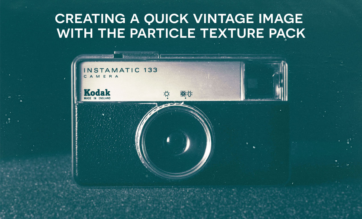
We’ve just released the Particle Texture Pack, which includes 20 unique high-resolution jpeg files of dust, scratches, and scrapes for your downloading pleasure. The pack is gloriously simple to use. Simply File > Place your image under your new texture, apply some vintage color corrections to your photo, change your blending mode to screen and poof! You’re done! Let’s review that below. Read More ›
We’re happy to announce WMC 8 will be taking place August 18-20 at Mahall’s in Lakewood, Ohio, just outside of Cleveland. Be sure to check our site for regular updates and more info. Get ready to party.
About Weapons of Mass Creation Fest: WMC is a massively popular three-day event created and hosted in Cleveland, OH. Attendees mostly include professional designers, artists, students and small business owners who flock from around the country, including popular creative hubs like New York, Los Angeles, Austin, San Francisco and Chicago. This year, attendees will have access to 17 speakers, as well as workshops, panels and vendors. Alumni include Stefan Sagmeister, Michael Bierut, Debbie Millman, Tad Carpenter, Aaron Draplin, Austin Kleon, Brandon Rike, Chuck Anderson, Dan Christofferson, James White, Johnny Cupcakes, Mark Brickey and the Adventures in Design Podcast, Stay tuned to more information about next year’s event at wmcfest.com.
We’re sharing indie patch inspiration
Who else is obsessed with patches? Here are some we fancy. We hope they get your creative juices flowing. You never know…you might be the next Michael Jackson of patch design. But remember that these are only here to serve as inspiration. You are your own unique unicorn, so do your own thing. Have fun!
Click on each patch for more information.


Join Cleveland’s coolest creatives for a night of fun, frivolity, and fundraising. Get an inside look at the Go Media office, rub elbows with the creative class, shop for amazing artwork, drink, eat, listen to music and help support the Center for Arts Inspired Learning, an organization that truly changes lives through the arts.
The Center for Arts-Inspired Learning’s teaching artists turn geometry into a dance class or social studies into an action news studio and push kids to get inspired about learning and proud of what they can achieve. Last year alone, over 200,000 pre-K through high school students were impacted by their work in over 7,000 programs.
The details:
Who: You and 10 of your best friends
When: Friday, March 10th, 2017 from 5:30 to 9:00 pm
Where: Go Media Headquarters – 4507 Lorain Avenue, Cleveland 44102
How: It’s an open house, so please come anytime. Admission is free. RSVP on our Facebook page.
We can’t wait to see you there!
How to Create a Coloring Book in Photoshop >
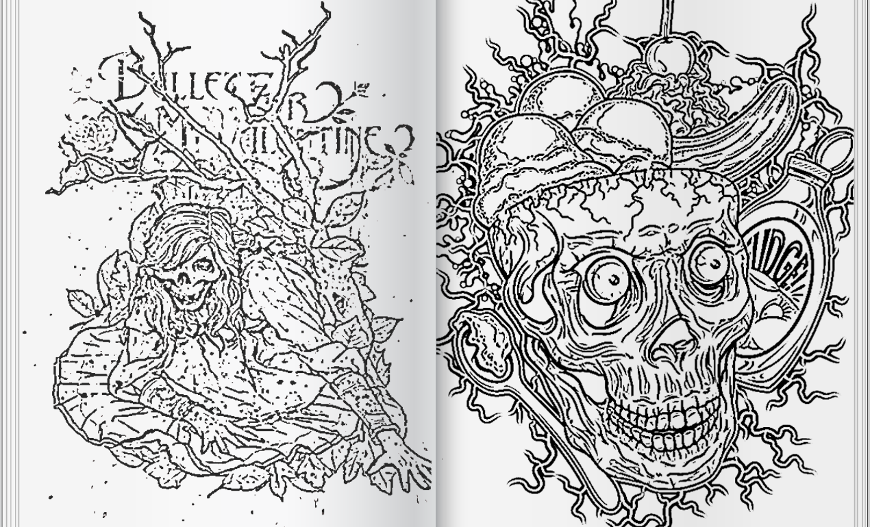
It’s time for the holidays! That means lots of relaxation time, including time spent curled up by the fire. If you’re like me, it’s hard to keep still when all you want to do is create all the time. This is where coloring books come in. They’re perfect for cold winter nights when you need to keep yourself busy without going into full work mode. Read More ›
On today’s podcast, Heather sits down with designers Jason Carne and Lenny Terenzi to talk about what happens when your passion for art and design is dampened by a stretch of creative burnout. Read More ›
An Interview with Sign Painter Extraordinaire
Today, we’re proud to release a talk from our design conference, Weapons of Mass Creation Festival 7, which happened this past August 2016, in sunny Cleveland, Ohio. Read More ›
9/7/2016: Beverage Packaging Design Inspiration
Every Wednesday, we’d like to scour the web for the best in inspiration from designers killing it at their craft. Please enjoy this incredible art and join us on Pinterest, where we’re dedicated to collecting our own work, as well as the work of those we most admire.
Today we’re going to narrow in on killer beveraging packaging design inspiration. Let’s take a look at what our fellow designers are doing over at Dribbble, shall we?
Cover image and beverage design packaging designed by your friends here at graphic and web design studio Go Media.


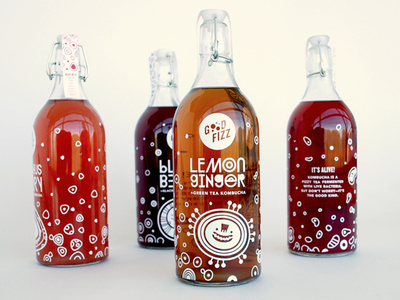


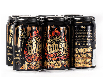

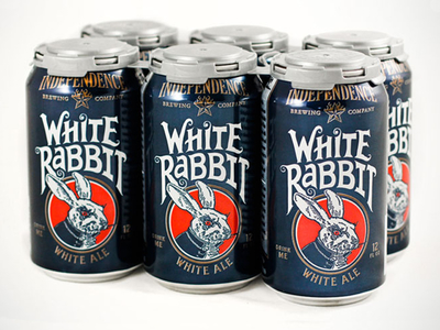
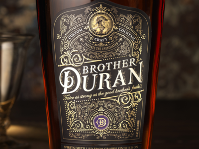


Have a great day, everyone. See you next Wednesday for more inspiration!
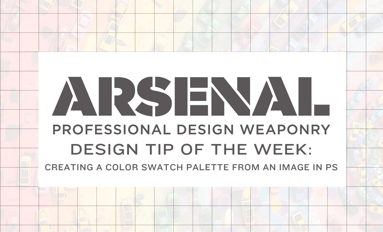
Design Tip of the Week: How to Create a Color Swatch from a Photo in PS
Creating a color palette before getting your hands dirty will help you work more efficiently. If you know which colors you’re inspired by, let’s create our palette and say goodbye to extra hassle.
Read More ›
Today’ll we’ll be using Adobe Photoshop to create a seamless pattern. We’ll be using the Tattooesque Elements Vector Pack by Arsenal Artist Jeremy Child. Download it now and join us! Read More ›
Hey Arsenal Fans! It’s Heather and Bryan back with you again with an update about this week’s releases! Read More ›
There’s so much great work on the web, but it’s hard to take it all in. Today, we’re doing our best to appreciate just a small slice of it.
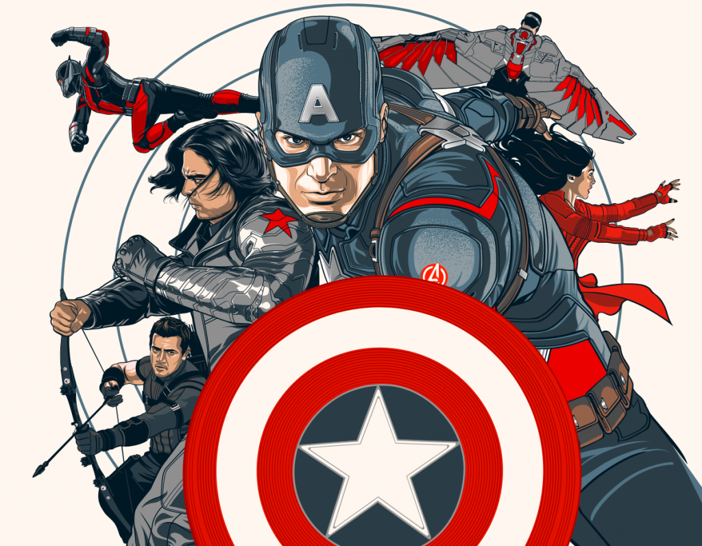
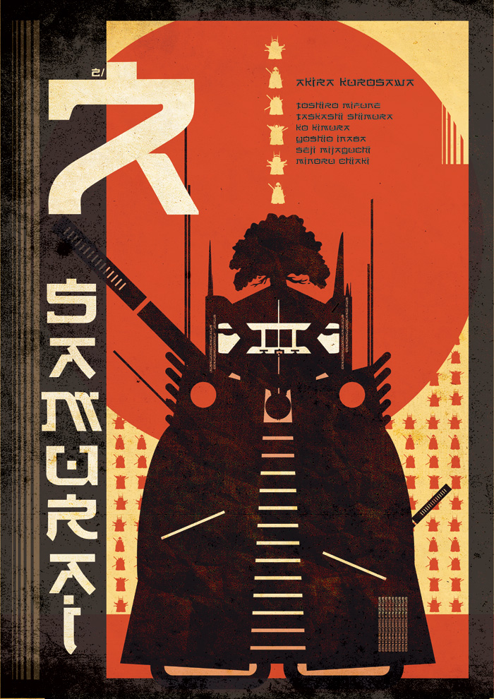
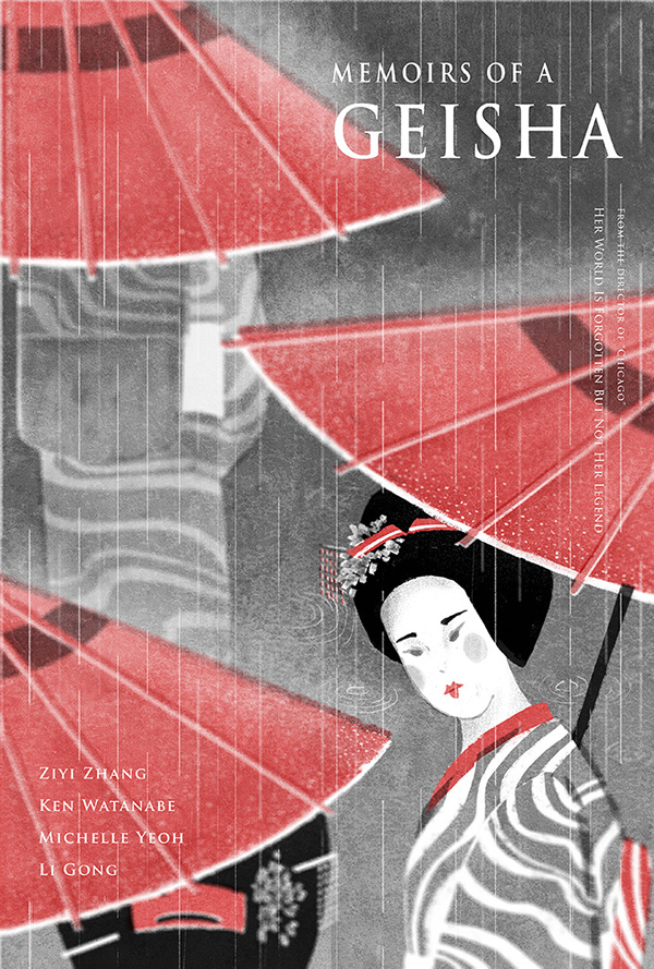
Here are some alternative movie posters posted by our talented counterparts. Click on each to be taken to the original page and learn more about the artists, including Maria Suarez Inclan, designer of the hero art. Enjoy!
Alternative Movie Poster Inspiration








How do you attend the midwest’s premier design conference (ours…the amazing WMC Fest) for 50% off? Heather and Bryan are chatting about that, as well as what else is new at the Arsenal, in today’s update video. Read More ›
Located here in the heart of Cleveland, we can’t help but to be huge fans of the Cleveland Cavaliers. Sunday, June 19th was a momentous day for our entire city. The curse was indeed reversed and we became the champions we were (kind of) patiently waiting to be. We’re still high on life over here and the following designs have us feeling even more so.
Found on Behance and Dribbble, shout-out to our fellow designers for their incredible talent. Note: header art by: Joe Caione


Which mockups do you want?
Arsenal customers, we want to hear from you! We feel like going on a mockup-template-making spree and need your suggestions so that we can pack our library with the best resources. Please take our quick survey and let us know what you want to see next.
Cleveland’s Kumar Arora is an entrepreneur, designer, marketer and investor behind many notable startups and brands. Read More ›
Borislav Mitkov’s got our attention. Freelance artist and Senior Concept Artist for Ubisoft Entertainment, Mitkov has experience working on such game design projects as “Star Wars Galaxies,” “Tom Clancy’s H.A.W.X” for XBox, “Prince of Persia: Trilogy” and “Assassin’s Creed: Rogue” for PS3. Read More ›
It’s Sticker Month!
If you’re an Arsenal Member or if you decide to subscribe before midnight on 5/31, you’re in luck!
We’re partnering with Rocky from Slap! Stickers, a monthly sticker subscription service. We’re friends with Rocky from the interwebs, but met him last month at Creative South. We saw his stickers in the flesh and knew we had to gift some to you, our members!

How do you get the glorious sticker pack?
Current subscribers…zip, zilch. Just bask in the glory of the Arsenal Membership and wait. We’ll be mailing out your stickers in the beginning of June. Please stay subscribed to make sure you get your stickers!
Not yet a member? Subscribe now!
Let’s Review:
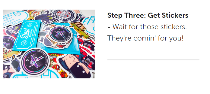
Check out Slap! Stickers on Twitter | Facebook | Dribble | Tumblr | Instagram
Have you guys seen the trailer for Stefan Sagmeister’s The Happy Film?
We’ve been watching it on repeat since it premiered, even more giddily since learning Stefan is speaking at this year’s best creative conference, Weapons of Mass Creation Fest, this August!
Enjoy this trailer and make sure to purchase your tickets to see Stefan (with or without bunny suit – your guess) on the Ohio Theatre stage this summer. Smiles guaranteed.
Event: Weapons of Mass Creation Fest produced by Go Media
Dates: August 5, 6, 7, 2016
Location: Ohio Theatre, Playhouse Square, Cleveland, OH
Ticket and all information available now
WMC Tickets = Happiness Arsenal Members Special Discount Code
The Happy Film (festival trailer) from {group theory} on Vimeo.
Etsy is a beautiful playground of handmade accessories, jewelry, tools and vintage goods. Many makers have found incredible success selling their wares there. Read More ›
Enter to win unlimited design workshops at Go Media’s Weapons of Mass Creation Fest 7, the design conference coming to Cleveland this August 5 – 7! Read More ›
Free Black Paper Textures
Here are eight free paper textures just for you! Read More ›
Our newest video tutorial release is a extraordinary journey through the thoughts of illustrator Katia Oloy, Senior Concept Artist at Scopely and former art direction team member for Disney’s It’s a Small World, the animated series. Read More ›
We were lucky enough to grab a couple moments with Cleveland’s hottest underground artist, Ben Sakai, last week. Read More ›
Go Media is slammed with work and in immediate need of a junior designer to help with our current work load. This is an entry-level position with entry level pay. This is also a temporary position. I can guarantee three months of work. So, please don’t quit your job for this opportunity. But if you are a recent graduate looking to build up your portfolio and experience, this may be an ideal opportunity for you.
Please email a cover letter, resume and a link to an online portfolio to [email protected]. Please note that we get a high volume of emails regarding jobs and internship opportunities at Go Media. If we don’t respond right away, please bear with us.
Once we receive your application, we will review it and if we are interested, we will be in contact. Good luck and we look forward to hearing from you.
Hey Arsenal Fans! We’ve got some great new releases for you this week! Check out our video for a quick debrief, including what you’ll get if you subscribe to our membership by Friday! Read More ›
This week on the Arsenal, we’re geeking over Michael Bierut, some incredibly dynamic textures and an EDM poster tutorial by our favorite frenchman. Read More ›
Graphic Design Portfolio Tips
An outstanding online portfolio is a must for any creative. Believe us, it’s true. When popping open emails from those applying for graphic design positions here at Cleveland design studio Go Media, we’re often shocked at the number of folks who do not have an online portfolio, or have one that’s outdated or terribly underwhelming. Today, let’s all make a commitment to ourselves. It’s time to up our game because it’s so worth the time and energy. After all, it just may land you the job of your dreams, the promotion you’re deserving of, or the recognition you have been desiring.
Quick Tips: Do’s and Don’ts >
Do’s:
- Illustrate your strengths clearly and cleanly.
- Show versatility if you’re capable.
- Use minimal colors and fonts. Keep it simple!
- Maintain your brand across all platforms.
- When using case studies, start from the beginning and take us through the journey with you.
- Also, give us a healthy dose of successes and an insider’s guide to the decisions you made along the way.
- Tell us how you solved the problem for your client and wrap it up in a pretty bow!
- When using testimonials, place them alongside relevant work (instead of on a separate page).
- On your about page, show your face! We want to see who we’re dealing with!
- Include a working email address on the site. We’ll want to contact you.
- Do consider adding a contact form.
- Keep your portfolio updated with new projects.
Don’ts:
- Don’t include any fluff.
- Don’t stretch the truth. Instead, show us only where you really shine.
- Don’t allow your site design to distract from your work.
- When using case studies, don’t hesitate to give insights to challenges along the way.
- On your about page, don’t be afraid to be a little quirky. (If you’re quirky…)
- Don’t write a novel on your about page.
- Don’t just throw a bunch of testimonials on a testimonials page.
- Don’t forget to regularly check all of your links.
Inspiring Portfolios:
- Go Media
- Andy J. Miller
- Jean Jullien
- Jack Hughes Illustration
- Owen Gildersleeve
- Rose Blake
- Janine Rewell
- Olly Moss
- Kyle Platts
- Matt Luckhurst
- Yeni Kim
- Timothy Goodman
- James Victore
- Jessica Hische
- Colin Tierney
- Becca Clason
- Andrew Colin Beck
- Danielle Evans
- Jon Contino
- Justin Mezzell
- Ryan Hamrick
- Promise Tangeman
- OkPants
- Dan Cassaro
- Daniel Mackey
- Simon Pan
- Sam Dallyn
- Charlotte Tang
- Ian Barnard
This Week on the Arsenal…
We’re so excited about this week’s releases that we’re shouting from the rooftops of Go Media’s headquarters!
Read More ›
Insights with an Art Director
Chris Comella, Go Media’s Art Director, has come a long way with the company. A member of the staff for eight of its 13 years in existence, he has seen the company grow from a small crew of illustrators elbowing one another in a small 1 bedroom condo to a million dollar business thriving in the CLE.
We sat down with Chris to talk about his role and advice to young designers hoping to follow a similar path.
Heather: What are the steps that led up to your current position as Art Director?
Chris: At Go Media, there has never really been a rigid hierarchy. So, my role more organically came about… I wasn’t vying for that next ‘title rung’ in the creative ladder so to speak, I just over time started to work on and care about more than just the daily, bread and butter client work. Things like evolving our creative process was a big picture item I began focusing on.
In terms of little picture, day to day things – It’s important to learn how to better understand and guide your clients, guide your designer teammates to produce the best work they can, and really take ownership and pride of the work that’s being produced on a daily basis. These are all things I find myself mixing up in on a daily basis. Luckily for me, my team is really great and they help make the job really easy.
Heather: In your opinion, what are qualities that make up a great art director?
Chris: There are the tangible things that come to mind, such as having a good foundation of experience to draw from, being comfortable communicating ideas to both clients and the design team, having a strong vision for the work itself and how to go about executing that work. On a daily basis, those are the things that will help make you an effective member of the team.
But I also can’t help but reflect on some of the intangible qualities of our team which I’ve come to be proud of. Something as simple as our collective personality, or common way of thinking is something that really gives us our edge. At the risk of sounding like a cheese ball, I’ll say that one of our distinguishing traits is that we truly care about the work. Nothing is more of a bummer to me when people aren’t pushing their work, or put another way, aren’t treating the work in front of them as an opportunity. The art director is in a good position to really instill these ‘character’ traits because in a lot of ways, they set the tone of the team. And when you make a point to really show an above and beyond way of going about your work, that becomes a benchmark for the team. I can tell you right now, when someone is excited about the work they’re doing, it’s infectious and it’s something that invites the people around you to get in on it. I think those intangibles are something an art director is uniquely suited to observe and guide. Not only instilling those traits directly, but by observing through others what’s happening and discovering what they all combine to create.
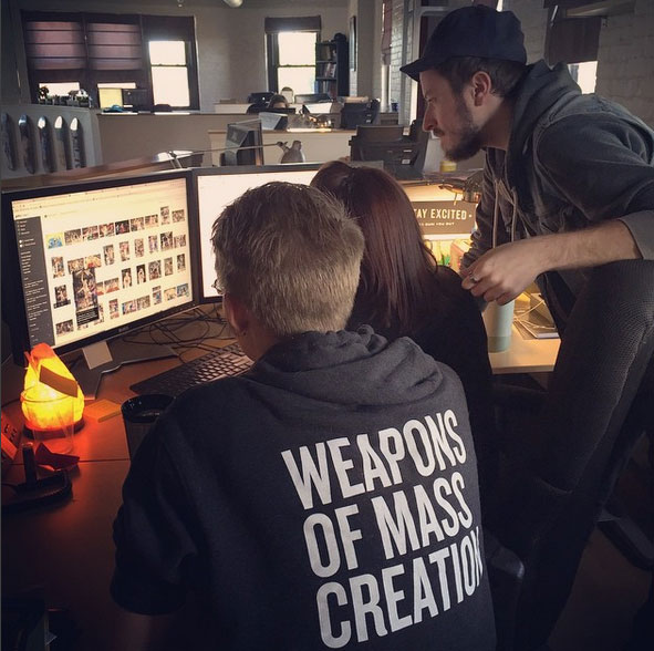
Heather: The design team here at Go Media is incredibly hard working and cohesive. You really gel and it shows in your work. What do you do on a daily basis to ensure that this team functions so flawlessly?
Chris: Good habits and a rhythm start to form when you have a team humming along on all cylinders. For our design team, you can credit that to two things: The design process itself, and the individuals on the team. The process provides a sense of structure and stability, which is a wonderful thing to have when anything from a mascot / character illustration to a gas station rebranding project comes in. The more you work together, the more you’re going to understand the ins and outs of how the process benefits the individuals, and vice versa. Over time you begin to tailor how you work, and can adapt to a variety of different situations.
Heather: I really love the way you articulate your concepts to clients, as well as communicate to the other designers. Do you have any advice for newbie designers as to how you developed your communication skills with clients?
Chris: I’ve been in so many meetings, and what makes me antsy is seeing the slow motion, eyes-squinted, ‘yes’ nod from the client… That’s the, “I’m trying to understand you, but there’s something missing here” face. I always try to look out for those little cues. At Go Media, we try to make everything as clear and logical as possible. The goal isn’t chat, close the curtain, perform design magic, and reveal your end product. Nor is it to ramp up the designer-speak to try and overwhelm a client with jargon, and over-wrought rationale. Instead, our job is to shed light on how to accomplish seemingly complicated or abstract problems in a creative way.
For young designers, there might be some inclination to go overboard on the designer-speak. While you want to show someone you’re really serious about what you do, you want to be sure you’re making an effort to be clear and concise. And when it comes to learning how best to communicate, it’s all about repetition. To get comfortable, you’re going to have to do what it takes – Be prepared for calls, and put yourself out there. The more times you’re put in that position, the more natural it will feel. When you’re in a meeting, take note of how people are talking to each other – If you notice someone is doing something particularly well, make a note of it and try it yourself the next chance you get. The same works for the opposite. If you don’t like a way someone is going about something, make sure you avoid doing it yourself. You can learn a lot by simply becoming a sponge when you’re around talented, experienced people.
Heather: You are responsible for some of Go Media’s most successful and profitable designs. Can you name 1 of your favorites?
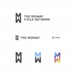
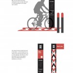
Chris: Man, I have a lot of projects that I’m super proud of, but one that pops into my mind is the Midway – A proposed cycling network for the city of Cleveland. The very first meeting was years ago at this point, and it was just a super exciting idea. Although it still has a long way to go, I was lucky enough to be there to help name it, design the identity, and help launch the awareness campaign. Below are some behind the scenes images including logo, wayfinding, and outreach graphics that were created.
Heather: Any advice for a designer that strives to be in your shoes one day?
Chris: One thing that comes to mind is when you get a project that isn’t in your comfort zone and initially feel you might not be the best for it, I would challenge you to seek out an aspect of it that you can sink your teeth into. I personally had felt for a long time that, because I was interested in exploring all different types of projects, that it would lead to a disjointed body of work, or even a vague reflection of the designer I am. But over time I’ve come to realize that a passion for a wide variety of work (illustration, identity systems, video, mascot, etc.) only serves to broaden my range. Not only that, but it helps broaden the topics I’m genuinely interested in. Using design as a gateway to new interests in life, generally, helps you grow as a person. And I gotta say, it was super vindicating when at this previous year’s WMC fest Michael Bierut made a point to drop this knowledge – “I’ve learned to be interested in as many things as possible…The work I have been really proud of is all stuff that I was really interested in. If you can be interested in as many things as possible, it will up your percentage. ”
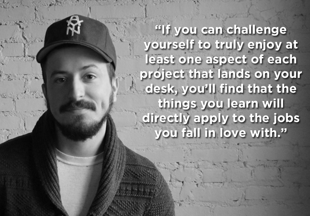
If you can challenge yourself to truly enjoy at least one aspect of each project that lands on your desk, you’ll find that the things you learn will directly apply to the jobs you fall in love with. Changing your outlook will make your work so much better. I really do believe that.
Want to work with Chris and the Go Media team on your next project? Get in touch.
How to Make Your Own PS Brushes
In this video tutorial, we teach you how to make your very own Photoshop Brushes. We create ours using coffee stains, but you can use paint, watercolors, or other fun materials you find around your studio.
Ready, set…
Now that you’ve watched this video, you’re all set to make your own. But first, pick up our Coffee Stain Brush Pack. This kit comes with the Coffee Stain Brushes we created in-house, as well as 10 bonus vector elements. You’ll also get a PDF guide. The guide gives you instruction on how to install your new brushes, as well as gives you a preview of each brush.


Reporting live from snowy Cleveland
Hey guys! We are outside Go Media studios to tell you all about this week’s releases. Read More ›
Free Valentine Vectors
Valentine’s Day is just around the corner and we just can’t help but to feel warm and fuzzy. Read More ›
We’ve gone mockup crazy, guys! Check out this week’s mockup launches, including a new tri-blend hoodie pack, as well as two pack updates. Read More ›
Arsenal Updates
Hey Everyone! We have three brand new products we’re super stoked to tell you about PLUS Bryan is out on location… somewhere?!? Read More ›
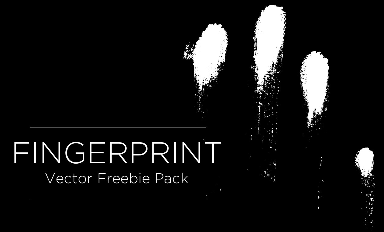
Fingerprint Vector Free
Thanks to everyone who filled out our Arsenal survey! We really appreciated your time and thoughtful suggestions. Read More ›


