
Join Cleveland’s coolest creatives for a night of fun, frivolity, and fundraising. Get an inside look at the Go Media office, rub elbows with the creative class, shop for amazing […]
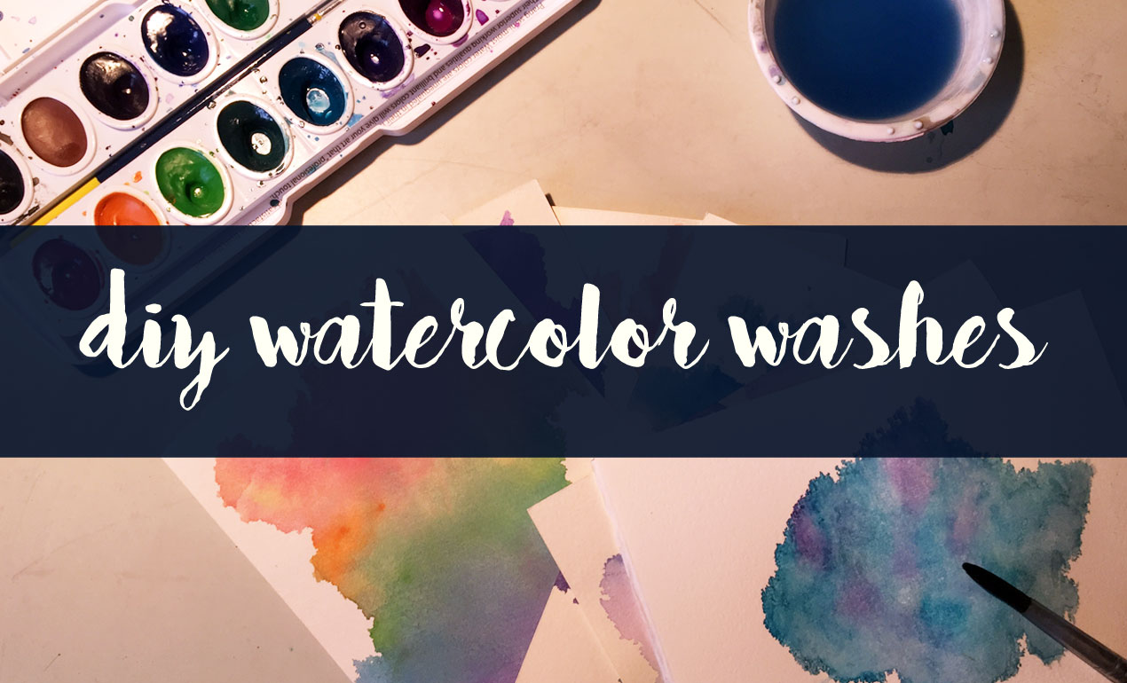
Design Tip of the Day: DIY Watercolor Washes + Freebie
In today’s Design Tip of the Day, we’re creating DIY Watercolor Washes using a fun and easy method that results in completely one of a kind, abstract elements like some […]
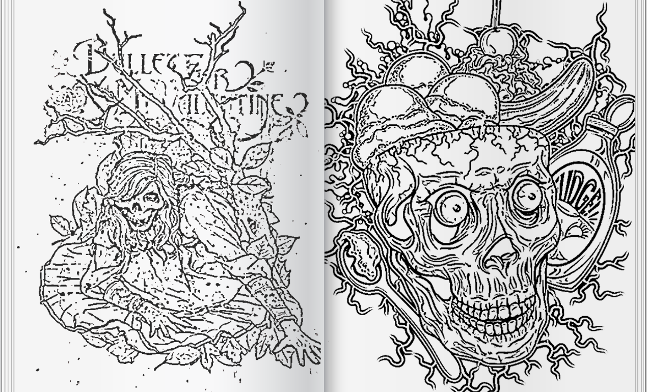
Design Tip of the Day: Creating your own Coloring Book in Photoshop
How to Create a Coloring Book in Photoshop > It’s time for the holidays! That means lots of relaxation time, including time spent curled up by the fire. If you’re […]

Download of the Day: Snowflake Brush Freebie
Free Snowflake Brush Freebie Join us every Thursday, when your friends here at the Arsenal take over the Go Media blog to share insights, tips, freebies or other fun to […]

Download of the Day: Free Snowy Overlay
Snow Overlay Freebie Join us every Thursday, when your friends here at the Arsenal take over the Go Media blog to share insights, tips, freebies or other fun to brighten […]
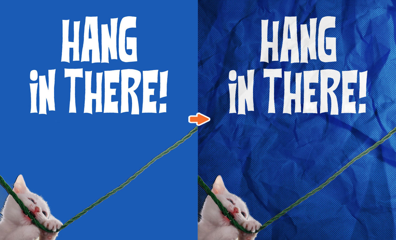
PS Basics: Pimp out your Hang in There Cat Poster with our Crumpled Paper Textures
How to Use Paper Textures in Photoshop > What’s better than the old “Hang in there” cat poster? Not much in my book. But today, we’re going to add a […]

WMC Fest 7 Talk: Wilson Revehl – Go Media’s Best Worst Year Ever
In today’s Weapons of Mass Creation talk, Co-Founder, Vice President and Chief Technology Officer of Go Media, Wilson Revehl is up to bat. After leading Cleveland’s Go Media through its […]

What Makes a Great Poster?
Great Poster Design Tips: Recently, we received an email from a Go Media friend asking a simple, yet incredibly complicated question: “What are the qualities of a good poster design?” […]
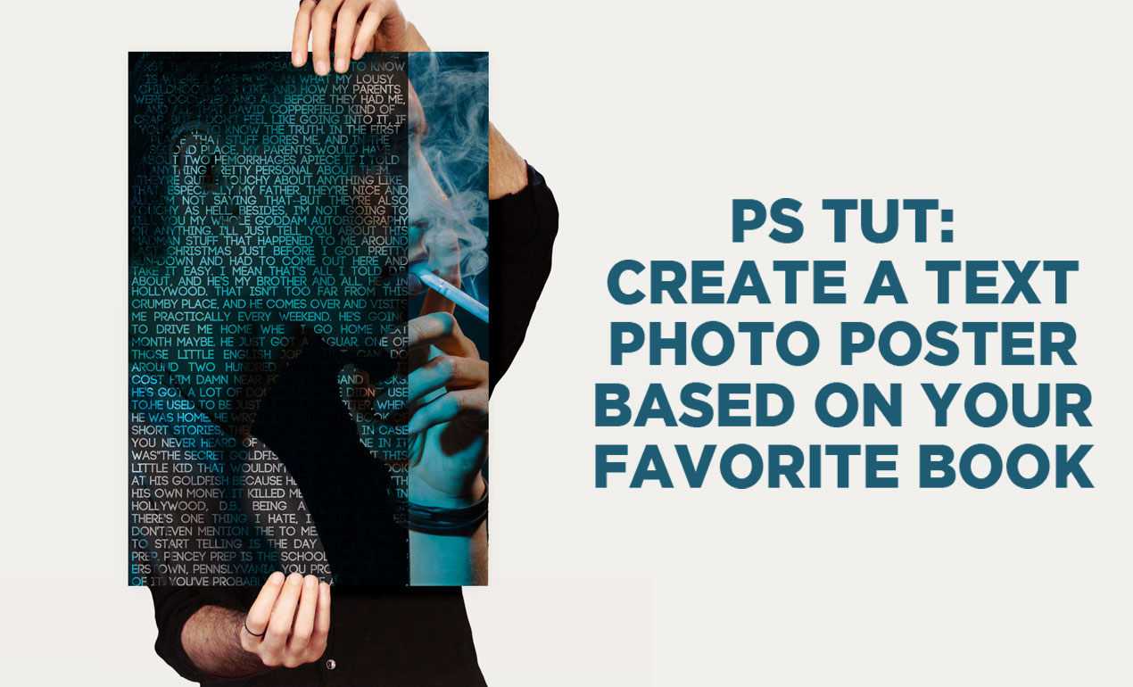
PS Tutorial: Create a text portrait poster based on your favorite book (Free mockup included)
Let’s Create a Text Portrait Poster! In today’s tutorial, we are going to be creating a text photo poster created by combining the image of our choice with related text. I’ll create […]

WMC7 Talk: Aaron Sechrist – The OKPants Code of Ethics
How to Become the Best Graphic Designer Ever >> In today’s Weapons of Mass Creation talk, Cleveland design legend and WMC Fest emcee Aaron Sechrist’s topic is, “How to Become […]

WMC Fest 7 Talk: Jay Wallace – The Stake is High
In today’s Weapons of Mass Creation Fest talk, we are treated to some quality time with Joshua “Jay” Wallace, illustrator and graphic designer for the Columbus Crew Soccer Club.
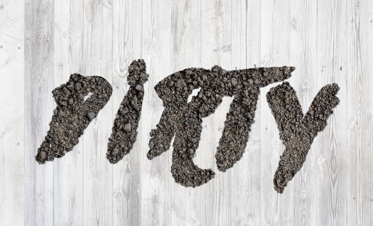
PS Tutorial: Create a Dirty Text Effect Using Photoshop
In today’s tutorial, we are using a stock image of soil to create this sweet text effect in Photoshop. Ready? Let’s go!

Podcast: How to Survive Creative Burnout with Jason Carne & Lenny Terenzi
On today’s podcast, Heather sits down with designers Jason Carne and Lenny Terenzi to talk about what happens when your passion for art and design is dampened by a stretch of […]

WMC Fest 7 Talk: Jeral Tidwell
In today’s Weapons of Mass Creation Fest 7 talk release, Jeral Tidwell talks Copyright, Analog Art, and Thinking Like a Badass.

Advice: How to Get Paid, Dealing with Bad Clients
From time to time, Go Media faithful write and ask us for advice. They want to which printer we recommend, how to bill appropriately, or how to work that pesky […]

Design Tip of the Week: Make Your Ex Disappear from a Photo in a Minute
In today’s design tip of the week, we’re going to play with making our exes disappear, as inspired by my viewing of External Sunshine of the Spotless Mind this past weekend. […]

Playful and Free Halloween Fonts
Download these Free Halloween Fonts: Happy Halloween Arsenal Army! We’ve pulled together a few free fonts we figured would get you in the mood for one of our favorite holidays ever!

The Upside Down of Frustration: A WMC Talk with Jillian Adel
A WMC Talk by Jillian Adel Today, we’re proud to release another talk from our design conference, Weapons of Mass Creation Festival 7, which happened this past August 2016, in […]
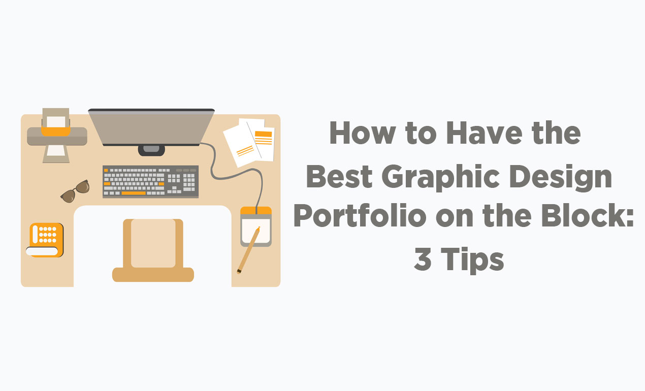
How to Have the Best Graphic Design Portfolio on the Block: 3 Tips
Graphic Design Portfolio Tips by Go Media – Hello Go Media Faithful! Hunting for your dream job? The last two weeks we’ve been discussing the resources you need to submit in […]

Design Tip of the Day: Creating Super Quick Color Palettes
How to Create Color Palettes for your Brand: Ever admire a brand that seems to have it’s color scheme on lock down, but feel helpless in regards to where to start? […]

Coffee with a Sign Painter: A WMC Talk with Sean Starr of Starr Studios
An Interview with Sign Painter Extraordinaire Today, we’re proud to release a talk from our design conference, Weapons of Mass Creation Festival 7, which happened this past August 2016, in sunny […]
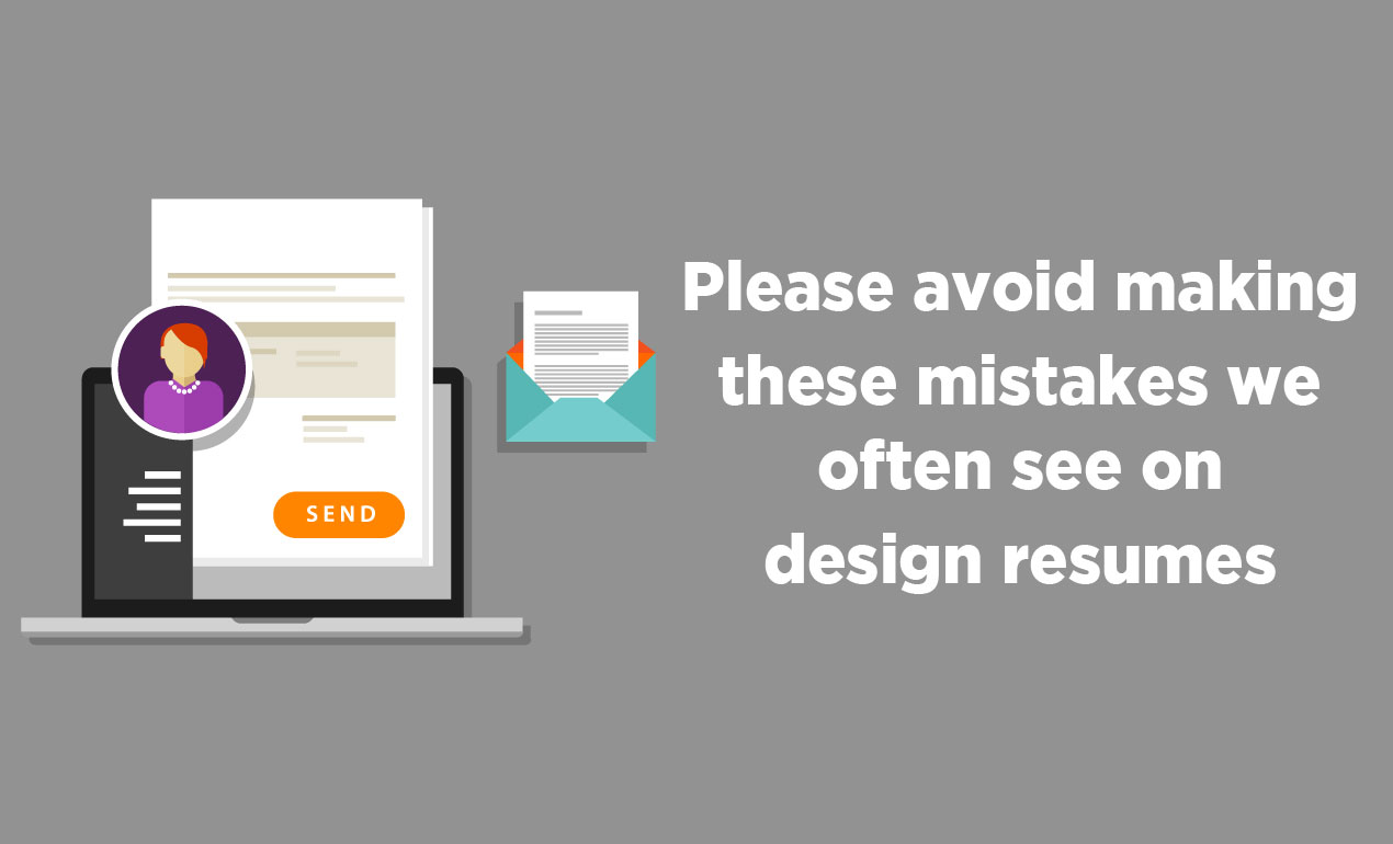
Please Avoid Making These Mistakes We Often See on Design Resumes
Mistakes on Design Resumes – Hello job seekers! We’re back to talk about what it takes to get the dream design job you’re after. Last week, we discussed, “The Number […]

How to Make Your Own Handwritten Font (in 30 minutes or less)
How to Make Your Own Handwritten Font If you’ve ever been too intimidated to make a font, please stand up!

The Magic Element to Include in the Best Graphic Design Cover Letter Ever
How to Write the Best Graphic Design Cover Letter If you want the job at the best graphic design firm ever, you have to submit the best cover letter, resume and […]
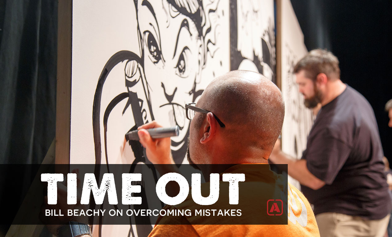
Time Out: Bill Beachy on Overcoming Mistakes
Interviews with Graphic Designers: Bill Beachy We take a moment to ask Go Media President Bill Beachy about a mistake he’s made in his business and what it taught him in the […]

Download of the Day: The Birds Scatter Brush Freebie
The Birds Scatter Brush Free Join us every Thursday, when your friends here at the Arsenal take over the Go Media blog to share insights, tips, freebies or other fun […]

Inspiration of the Day: 9/28/2016 – Kawaii Illustration and Character Design
Kawaii Illustration and Character Design Every Wednesday, we scour the web for the best in inspiration from designers killing it at their craft. Please enjoy this incredible art and join […]

Download of the Day: Abstract Grunge Vector Box Freebie
Abstract Grunge Vector Box Freebie Join us every Thursday, when your friends here at the Arsenal share insights, tips, freebies or other fun to brighten your work day. Today we’re sharing […]

Design Tip of the Day: Let’s Do the Text Warp Again with Envelope Distortion
How to Warp Text in Adobe Illustrator: Our Design Tip of the Day shows us how to use envelope distortion to warp text in pretty simple yet wicked ways. Shall […]

Download of the Day: Hand Drawn Japanese Wave Pattern
Japanese Wave Pattern Vector Free Join us every Thursday, when your friends here at the Arsenal take over the Go Media blog to share insights, tips, freebies or other fun to […]

58 Social Media Hashtags for Graphic Designers (to Start Using Today)
Hey Designers, are you making the most of hashtags on social media? If not, you can easily throw a tasteful number after each post and get some more eyes on your […]

Design Tip of the Day: How to Organize Your Design Files
How to Organize Your Design Files Design file names and folder structure are a key ingredient to your success as a graphic designer.

Download of the Day: Star Vector Pack
Free Star Vector Pack Join us every Thursday, when your friends here at the Arsenal take over the Go Media blog to share insights, tips, freebies or other fun to brighten […]
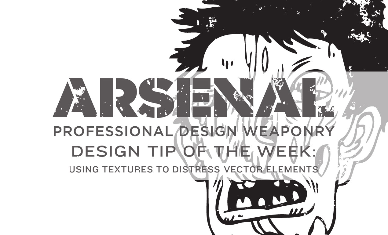
Design Tip of the Day: Using Textures to Distress Vector Elements
Today, we’ll be using Adobe Illustrator to add some gritty, grungy textures to an Arsenal vector to take it from great to greater. Ready?

From the Web: Beverage Packaging Design Inspiration
9/7/2016: Beverage Packaging Design Inspiration Every Wednesday, we’d like to scour the web for the best in inspiration from designers killing it at their craft. Please enjoy this incredible art […]
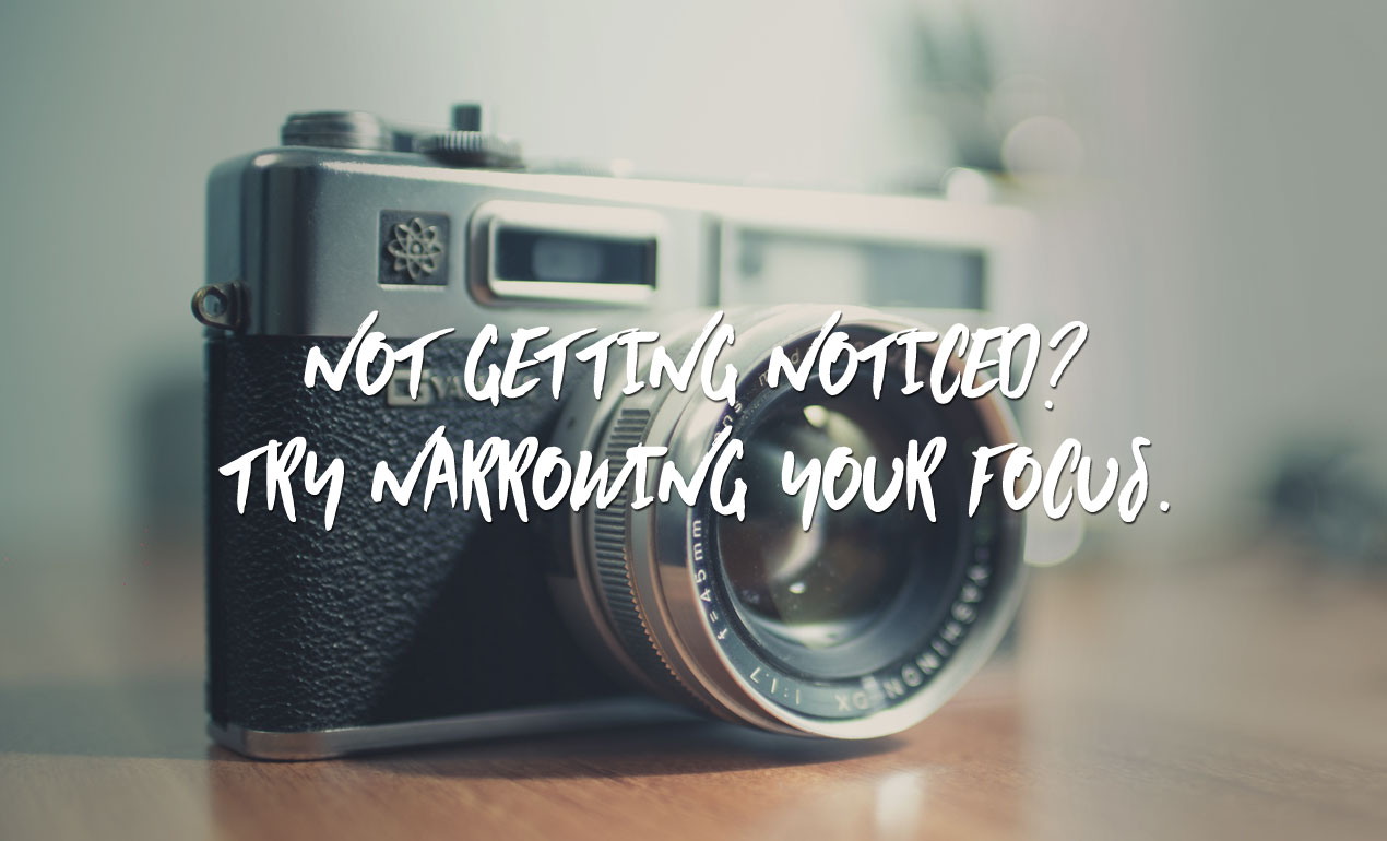
Not Getting Noticed? Narrow Your Focus.
Narrow Your Focus for More Success As entrepreneurs, we often have lofty goals. We want to be all, do all, achieve all. However, when we concentrate on fulfilling everyone’s needs, instead […]
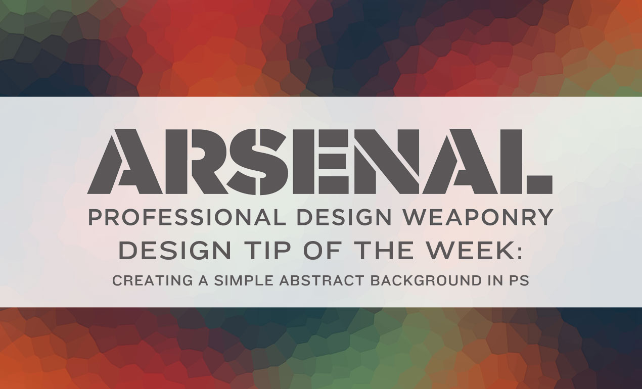
Design Tip of the Day: Creating a Simple Abstract Background in PS & Freebies
Create an Abstract Background in PS in Five Steps Today, we’ll be creating an abstract background texture using Photoshop. Let’s start by opening PS and creating a new document, sized 4235 […]

WMC Fest Talk – Oliver Barrett’s Dirty Work
In today’s Weapons of Mass Creation Fest talk, we hear from Cleveland Art Director, Illustrator and Designer Oliver Barrett.

Design Tip of the Week: Mixing Vectors & Textures to Achieve an Eerie Background
Our Design Tip of the Week combines two Arsenal product categories coming together for one hauntingly beautiful purpose. Today, we’re experimenting with Go Media vectors and textures. Are you ready?

Download of the Day: Vintage Sunburst Vectors
Download of the Day: Vintage Sunburst Vectors Join us every Thursday, when your friends here at the Arsenal take over the Go Media blog to share insights, tips, freebies or […]

Download of the Day: Free Hand Drawn Laurel Vectors
Download of the Day: Free Hand Drawn Laurel Vectors Join us every Thursday, when your friends here at the Arsenal take over the Go Media blog to share insights, tips, […]

WMC Fest Talk: Michael Cavotta’s F#@% your Function / Fuel Your Fire
In today’s Weapons of Mass Creation Fest talk, enjoy a candid conversation with headshot photographer and personal branding strategist Michael Cavotta, who shares the secret to unleashing your inner exceptionalist and […]

Design Tip of the Week: Make a Hand Drawn Pattern Brush
Join us each and every week here at the Arsenal blog, where we we’ll be sharing a design shortcut or mini-tutorial to make your life a little easier (and design […]

WMC Fest Talk: Lenny Terenzi of Hey Monkey! Design
Our next Weapons of Mass Creation Fest talk comes to us from Lenny Terenzi, long time friend of WMC Fest.

Design Tip of the Week: Changing Layer Opacity in an Instant
Today’s design tip will only take a minute or two out of your day. We’re going to show you how to quickly change layer opacity. Let’s go!
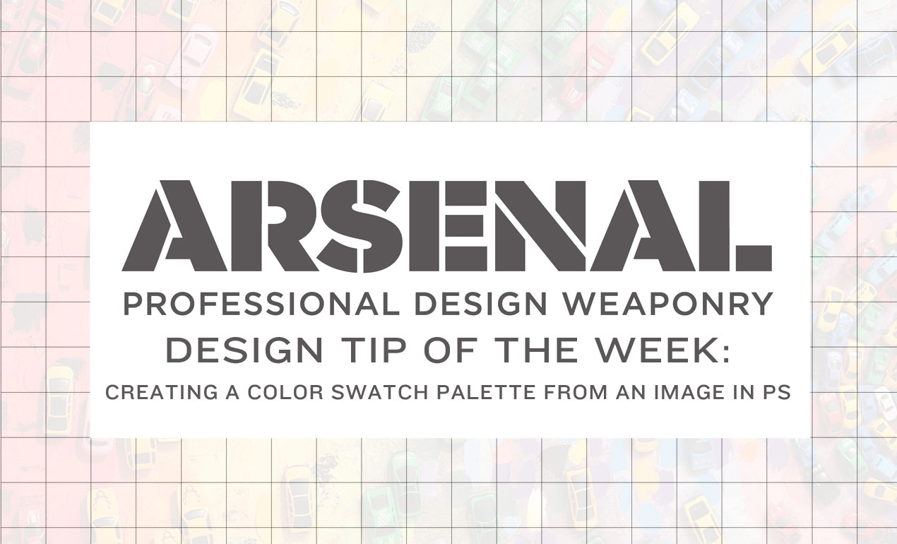
Design Tip of the Week: Creating a Color Palette for Reference in PS
Design Tip of the Week: How to Create a Color Swatch from a Photo in PS Creating a color palette before getting your hands dirty will help you work more […]

WMC7: Inspiration on Fire, all weekend long
Our fearless Weapons of Mass Creation Fest emcee, OKpants, explores what inspiration truly means in this short video.

WMC Fest Talk: Cotton Bureau – “PVNCTVS CONTRA PVNCTVM”
Cotton Bureau talks “Founding an Accidental T-Shirt Empire” Today’s Weapons of Mass Creation Fest 6 talk comes to us from Jay Fanelli and Nathan Peretic, founders of Cotton Bureau.