Dreading saving all of your artboards out as individual files upon project completion? We’re here to help.
Design Tip of the Week: Create a Seamless Pattern in PS with Go Media Vectors
Today’ll we’ll be using Adobe Photoshop to create a seamless pattern. We’ll be using the Tattooesque Elements Vector Pack by Arsenal Artist Jeremy Child. Download it now and join us!

What’s New at Go Media’s Arsenal? Ep. 11: 7.11.2016
Hey Arsenal Fans! It’s Heather and Bryan back with you again with an update about this week’s releases!

40+ Inspirational Alternative Movie Posters Worth Checking Out
There’s so much great work on the web, but it’s hard to take it all in. Today, we’re doing our best to appreciate just a small slice of it. Here […]

Design Tip of the Week: Use Simple Animation to Make a Jib-Jab Style Video of You and Your Bestie
My niece and nephew are obsessed with Jib Jab! They spend hours creating silly videos with our family playing the role of ice skating stars, hula dancers and Justin Bieber.

WMC Fest Talk: “Here’s to the Crazy Ones” – by Wilfred Krenn
Our next WMC Fest talk comes to us from Saint Louis Psychotherapist and Startup Therapie founder Wilfred Krenn.
Create a Paint Splash Effect on your Boss’s Face in 4 Steps using this Free Paint Splash Effect Photoshop Action
Today we’re creating this sweet paint splash effect using our Paint Splatters Vector Pack, recently released here on our Arsenal. Here’s what you’ll need for today’s tutorial: Photoshop Download: Paint Splash […]

What’s New at Go Media’s Arsenal? Ep. 10: 6.28.2016
How do you attend the midwest’s premier design conference (ours…the amazing WMC Fest) for 50% off? Heather and Bryan are chatting about that, as well as what else is new […]

Inspiration: Cleveland Cavs Final 2016 Designs that Keep the Fire in our Bellies
Located here in the heart of Cleveland, we can’t help but to be huge fans of the Cleveland Cavaliers. Sunday, June 19th was a momentous day for our entire city. […]

Video: Creating a Multi-Layered Creative Business with Erika Durham of Cleveland’s Canopy Collective
Today, the Arsenal is sitting down with musician and entreprenuer, Erika Durham, founder of multi-layered Cleveland business Canopy Collective.

Survey + $5 Credit: Which Mockup Templates Do You Want?
Which mockups do you want? Arsenal customers, we want to hear from you! We feel like going on a mockup-template-making spree and need your suggestions so that we can pack […]

WMC Fest Talk – Swappin’ Seats by Mike Jones
WMC Fest Talk – Swappin’ Seats by Mike Jones Our next exclusive Weapons of Mass Creation Fest talk comes to us from Creative South founder, Serve Studios owner and all-over […]

Kumar Arora: Tips on Finding New Ideas
Cleveland’s Kumar Arora is an entrepreneur, designer, marketer and investor behind many notable startups and brands.

Meet a Painter Master: Borislav Mitkov
Borislav Mitkov’s got our attention. Freelance artist and Senior Concept Artist for Ubisoft Entertainment, Mitkov has experience working on such game design projects as “Star Wars Galaxies,” “Tom Clancy’s H.A.W.X” […]

Designer Face Off – Joseph Alessio vs Carlos Basabe
In this edition of Designer Face Off, we pit typographic illustrator and animator Joseph Alessio versus freelance illustrator Carlos Basabe. If you’re a fan of our design conference Weapons of […]

Last Call for Stickers!
It’s Sticker Month! If you’re an Arsenal Member or if you decide to subscribe before midnight on 5/31, you’re in luck! We’re partnering with Rocky from Slap! Stickers, a monthly […]
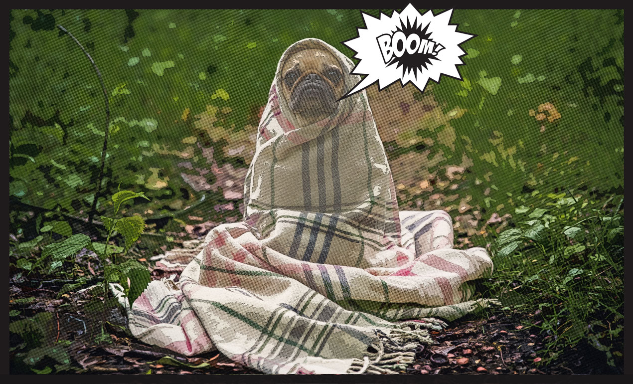
PS Tutorial: Make your dog into the comic book hero he was meant to be (and free layer style)
Is your dog a super hero? Then follow along with our quick 10 step tutorial to turn the little guy or gal into a super pup! All you need is Photoshop […]

WMC Talk: JP Boneyard – Constructive Defiance
JP Boneyard is a man who wears many hats. He’s a designer, front-end developer, printmaker & the visionary behind the National Poster Retrospecticus.

Video: Building a Successful Photography Studio with James Douglas of James Douglas Studio
Today, we’re sitting down with Cleveland photographer James Douglas Shields of James Douglas Studio to talk about dream clients, his one-of-a-kind style, his aversion to unbridled “photo-shopping,” and crediting your photographer.

Happiness is having Stefan Sagmeister speak at WMC7
Have you guys seen the trailer for Stefan Sagmeister’s The Happy Film? We’ve been watching it on repeat since it premiered, even more giddily since learning Stefan is speaking at […]

How to Become a Successful Etsy Seller
Etsy is a beautiful playground of handmade accessories, jewelry, tools and vintage goods. Many makers have found incredible success selling their wares there.

Win Unlimited WMC Fest 7 Workshops!
Enter to win unlimited design workshops at Go Media’s Weapons of Mass Creation Fest 7, the design conference coming to Cleveland this August 5 – 7!

WMC Talk: Debbie Millman – “On Rejection”
We were absolutely honored to have design legend Debbie Millman as a speaker at our design conference, Weapons of Mass Creation Fest 6. Debbie is a writer, educator, artist, brand […]

Speed Drawing Video: Jetpacks and Rollerskates WMC7 Graphic Tee
You guys are going to completely lose your minds over this year’s Weapons of Mass Creation Fest graphic art tee, created by the one and only Blake Stevenson – aka Jetpacks […]

Creating & Selling Top Design Resources with Rob Brink of Brink Design Co.
Today, we sit down with Rob Brink of Brink Design Co. You may recognize Rob’s best-selling PS and AI textures and brushes from sites like the Arsenal and Creative Market, […]

Freebie: Crumpled Blk Paper Textures
Free Black Paper Textures Here are eight free paper textures just for you!
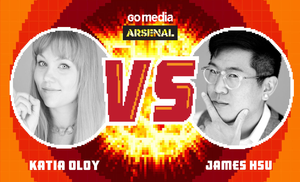
Designer Face Off: Katia Oloy vs James Hsu
In this version of Designer Face Off, we pit illustrator/concept artist Katia Oloy against designer/art director James Hsu. What makes this face off twice as fun is that these two are not […]

How to Use Our Vectors: Creating a Repeating Pattern in AI
Hey Arsenal Fans! Today we’ll be creating a repeating pattern using Vector Set 25, just released on our Arsenal.

Just Got Some Negative Feedback? Here’s How to Turn It Into a Positive.
If there is one thing we can fortunately joke about among our fellow designers, it’s the negative feedback we receive from our clients.

WMC Fest Talk: Antonio Garcia – Life in Beta
Antonio Garcia: A WMC Fest Talk We were absolutely honored to have designer Antonio Garcia as a speaker at our design conference, Weapons of Mass Creation Fest, this past summer.

These Disney Princess Illustrations Will Motivate You to Make Your Own Magic
Our newest video tutorial release is a extraordinary journey through the thoughts of illustrator Katia Oloy, Senior Concept Artist at Scopely and former art direction team member for Disney’s It’s […]

An Intimate Interview with Cleveland’s Hottest Artist
We were lucky enough to grab a couple moments with Cleveland’s hottest underground artist, Ben Sakai, last week.

How to Properly Invoice for Your Graphic Design Work
How to Invoice for Graphic Design Work (the Go Media Way) Invoicing for graphic design work is just one of the many processes we have to sort out when starting our […]

Temporary Graphic Designer Needed!
Go Media is slammed with work and in immediate need of a junior designer to help with our current work load. This is an entry-level position with entry level pay. […]
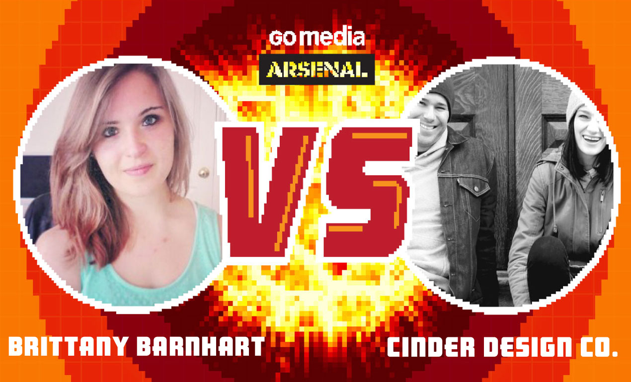
Designer Face Off: Brittany Barnhart vs Cinder Design Co.
Graphic Design Challenges: Designer Face Off In this version of Designer Face Off, we pit designer Brittany Barnhart of Just Curious Co. versus Michael Rivette and Christina Sharp of Cinder […]

Tutorial: Creating Watercolor Brushes in AI
How to Make Watercolor Brushes in Illustrator If you’re like us, you’ve got art laying all around the studio just begging to be used in unique and wonderful ways. Today, […]

What’s New at Go Media’s Arsenal? Ep. 9: 3.16.2016
Hey Arsenal Fans! We’ve got some great new releases for you this week! Check out our video for a quick debrief, including what you’ll get if you subscribe to our […]

Design Firm Makeover: Lesson 5 – Common Mistakes
Common Mistakes Graphic Designers Make It’s Bill from Go Media again with your favorite 30 Day Design Firm Makeover Course. Last time we talked about making money. In today’s lesson we’re going to […]

Design Firm Makeover: Lesson 4 – Making Money
Hello, hope you’re doing well! Last time we talked about promoting yourself and generating traffic and leads. In today’s lesson we’re going to talk about converting all that into sales!

Design Firm Makeover: Lesson 3 – Promoting Yourself
How to Promote Yourself as a Graphic Designer Hello! We hope you are receiving valuable lessons and getting ideas on how to improve your design firm.

What’s New at Go Media’s Arsenal? Ep. 9: 3.9.2016
This week on the Arsenal, we’re geeking over Michael Bierut, some incredibly dynamic textures and an EDM poster tutorial by our favorite frenchman.

Video: Michael Bierut “How to use graphic design to get from the corner of Granger Road and West 132nd Street in Garfield Heights to the corner of Fifth Avenue and 25th Street in New York City in only 50 years.”
Michael Bierut: A WMC Fest Talk We were absolutely honored to have design legend Michael Bierut as a speaker at our design conference, Weapons of Mass Creation Fest, this past […]

Design Firm Makeover: Lesson 2 – Your Services
Hello, it’s Bill from Go Media again with our 30 Day Design Firm Makeover Course. I am really excited for today’s lesson!

Design Firm Makeover: Lesson 1
Hey Arsenal Subscribers! We’d like to welcome you to our 30 Day Design Firm Makeover Course. Over the next month and a half you will receive valuable lessons and quick tips on […]

8 Essential Steps You Need to Take When Creating an Outstanding Design Portfolio
Graphic Design Portfolio Tips An outstanding online portfolio is a must for any creative. Believe us, it’s true. When popping open emails from those applying for graphic design positions here […]

3 Questions to Ask Yourself When Building a Strong Brand Presence
How to Build a Brand What is your brand? Who is your brand? And why should we care? Developing a brand is more than just your logo. A brand represents everything […]

What’s New at Go Media’s Arsenal? Ep. 8: 2.25.2016
This Week on the Arsenal… We’re so excited about this week’s releases that we’re shouting from the rooftops of Go Media’s headquarters!

Insights with an Art Director
Insights with an Art Director Chris Comella, Go Media’s Art Director, has come a long way with the company. A member of the staff for eight of its 13 years […]