
How to Make Your Own PS Brushes In this video tutorial, we teach you how to make your very own Photoshop Brushes. We create ours using coffee stains, but you […]

Tutorial: Making Totally Tubular Glitch Effects in PS (plus 4 Free TV Glitch Textures just for YOU)
TV Glitch Effects: Makin’ Em in PS (& Free TV Glitch Textures, Too!) So guys, we’re kind of obsessed with these tv glitch textures we’ve been seeing around town lately.

What’s New at Go Media’s Arsenal? Ep. 7: 2.10.2016
Reporting live from snowy Cleveland Hey guys! We are outside Go Media studios to tell you all about this week’s releases.

Thoughts Behind a Rebrand: Project Runway & Yellowcake Shop’s Valerie Mayen
Project Runway All Stars Season 5 & Yellowcake Shop’s Valerie Mayen We sat down with Project Runway All Stars Season 5’s Valerie Mayen to talk about the rebrand of her […]

We Heart You: Download our Valentine’s Vector Freebie
Free Valentine Vectors Valentine’s Day is just around the corner and we just can’t help but to feel warm and fuzzy.

What’s New at Go Media’s Arsenal? Ep. 6: 2.3.2016
We’ve gone mockup crazy, guys! Check out this week’s mockup launches, including a new tri-blend hoodie pack, as well as two pack updates.

Video: Why I’m an Asshole
A WMC Fest Talk by Jude Goergen While examining a journey of risk and questionable decisions, self-taught designer and entrepreneur Jude Goergen scrutinizes his ongoing quest to do everything while […]

What’s New at Go Media’s Arsenal? Ep. 5: 1.27.2016
Arsenal Updates Hey Everyone! We have three brand new products we’re super stoked to tell you about PLUS Bryan is out on location… somewhere?!?

Video How To: Using Halftone Brushes for Adobe Illustrator
How to Use Halftone Brushes for Illustrator We are so excited to have just released The Artifex Forge’s Halftone Brushes and Bonus Patterns onto the Arsenal.

What’s New at Go Media’s Arsenal? Ep. 4: 1.19.2016
Arsenal Updates Hey! It’s Heather and Bryan! You won’t want to miss this week’s Arsenal update, so press play inside!
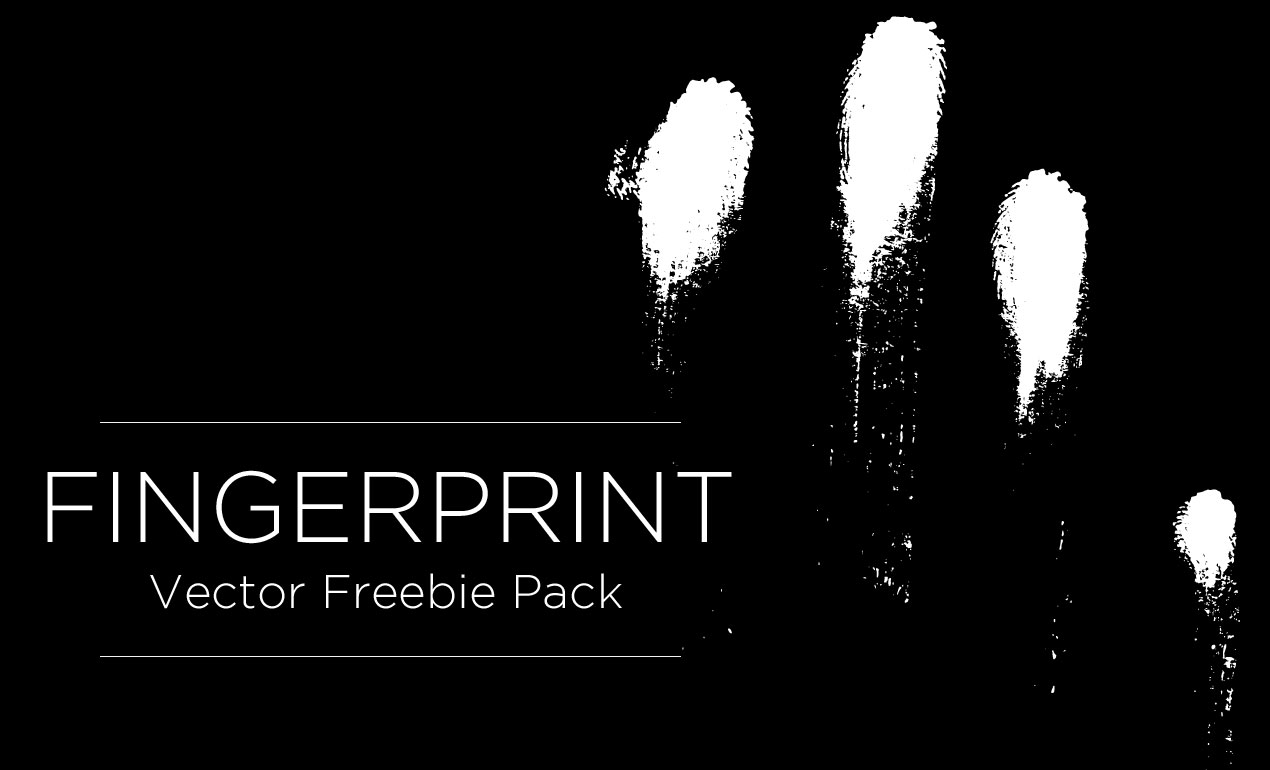
Vintage Arsenal Freebie: Fingerprints
Fingerprint Vector Free Thanks to everyone who filled out our Arsenal survey! We really appreciated your time and thoughtful suggestions.

10 Things You Didn’t Know About Bill Beachy
10 Things You Didn’t Know About Bill Beachy Last week, we asked you what you were dying to know about our faithful leader, Go Media President and Designer, Bill Beachy.
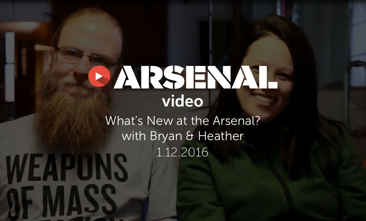
What’s New at Go Media’s Arsenal? Ep. 3: 1.12.2016
Arsenal Updates Hey Arsenal Fans! It’s Heather and Bryan, back with the latest Arsenal news for you.

Designing Your Network
Networking Tips for Graphic Designers Introducing Guest Blogger Wesley Hoffman of Treehouse Networkshop “It’s not what you know, it’s who you know,” is something we’ve all heard a million times […]

Creators. Doers. Makers. Videos Series – Episode 3: Michael Cavotta
Inspirational Photographers: The WMC Fest Creators. Doers. Makers. Series highlights Michael Cavotta Our new video series highlights remarkable makers and designers that inspire and motivate us to create greatness. Episode Three […]
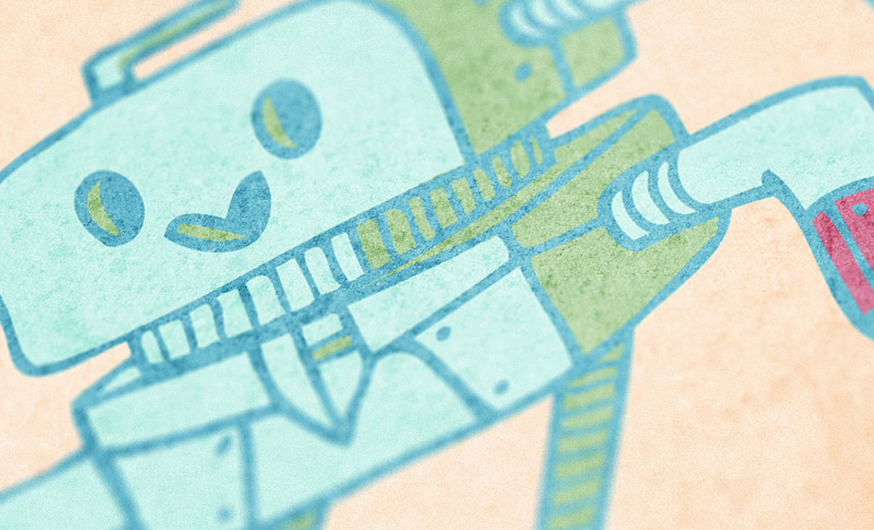
Tutorial: How to Create a Children’s Book Cover with Justin Will’s Hand Drawn Sci-Fi Vector Pack (*Freebies Inside)
How to Create a Children’s Book Cover Hello, dear Arsenal Fan! It’s Simon on this end of the keyboard for a new tutorial.

What’s New at Go Media’s Arsenal? Ep. 2: 1.6.2016
Arsenal Updates Happy 2016 Arsenal Fans! We’ve just launched a new Maternity Mockup Pack, Motorcycle Helmet Mockup, Canvas Texture Pack & more.

Video: Sharing Deodorant – Designers and Developers Working Better Together
A WMC Fest Talk: Designer and Developer Collaboration What happens when designers and developers collaborate? Hint…it’s magical.

What’s New at Go Media’s Arsenal? Ep. 1: 12.30.2015
What’s New on the Arsenal? Well, we’re here to fill you in! We’re talking our new Camo Texture Pack, Michael Bierut, SWAG and more! Listen in and please comment below telling us what you want to see on the Arsenal in the new year 🙂
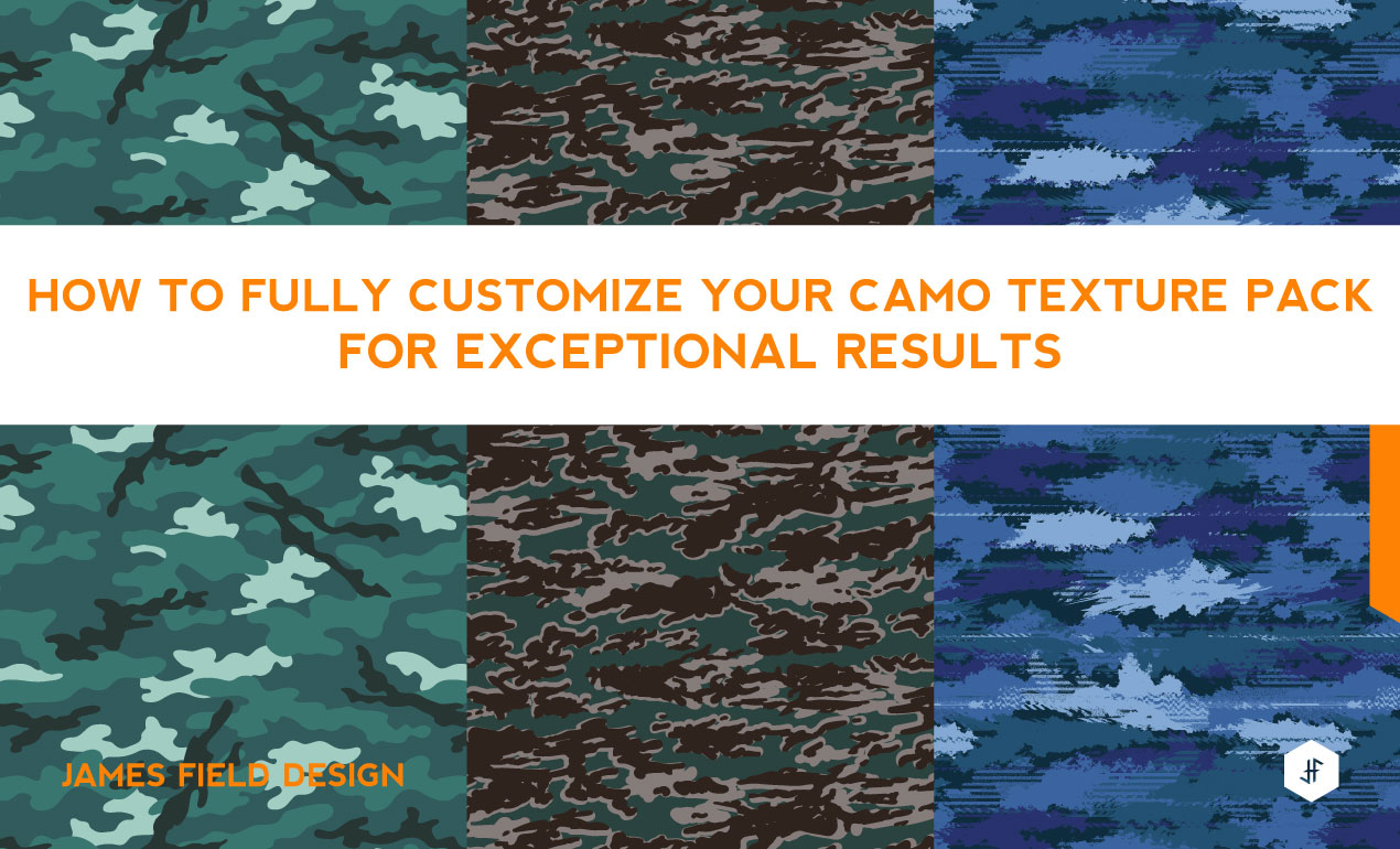
How to Fully Customize Your Camo Texture Pack for Exceptional Results
Hi, I’m James Field, a freelance designer specializing in graphics for sports-fashion apparel. I have created a Trend Camos Texture Pack based on recent research into upcoming and current design
trends and increasing requests from clients.

Twenty Seven Actionable Ways to Up Your Game, Increase Your Exposure and Expand Your Audience
Whether you are a freelancer or head of an advertising agency, there is always an opportunity to gain more exposure for your personal brand, your products and services. Here are 27 ways we think may help you

Creators. Doers. Makers. Videos Series – Episode 2: Michael Bierut
Our new video series highlights remarkable makers and designers that inspire and motivate us to create greatness. Episode Two puts the spotlight on Michael Bierut, a featured speaker at the best creative conference of the summer, Go Media’s Weapons of Mass Creation Fest (2015).

Podcast: Designing for Sports Teams and Leagues with Todd Radom
Sports Branding Podcast with Todd Radom In this edition of the Go Media Podcast, we sit down with Todd Radom to talk about his extensive experience designing for the sports industry.

Video: Michael Rivette & Christina Sharp at WMC Fest 6
A WMC Fest Talk: Changing our Stars This candid talk, presented by Michael Rivette and Christina Sharp, was captured live at Go Media’s design conference, Weapons of Mass Creation Festival 6. […]

Read these 12 Quotes on Creating the Authentic Work You Were Born to Do
Quotes on Authenticity, Creativity, and Kicking Ass… Sometimes we all need that extra boost to inspire our work. Here are some of our favorite quotes on art, creativity, and authenticity. May […]

Designer Face Off: Aaron Sechrist vs Oliver Barrett
The Battle Is On! Welcome to Designer Face Off, a series created here at Go Media’s Arsenal. Designer Face Off brings your favorite designers, creators and entrepreneurs together like never before. […]

Enplug’s Entrepreneurial Journey: Zach Spitulski Spills Secrets to his Success
By being named one of Inc. Magazine’s 30 Coolest Entrepreneurs under 30, Zach Spitulski (Enplug) has been grouped with the likes of Mark Zuckerberg, Elizabeth Holmes of Theranos, Hayley Barna […]

Building a brutalist conference poster with Jason Carne’s Texture Lot One (Free Poster Mockup included)
Introduction Hello there! It’s Simon on this end of the keyboard. I’m very happy to make my return to the Zine with a poster design tutorial, that will explore the […]

Creators. Doers. Makers. Videos Series – Episode 1: Danielle Evans
The WMC Fest Creators. Doers. Makers. Series Our new video series highlights remarkable makers and designers that inspire and motivate us to create greatness. This week we put the spotlight on […]

Video: Go Media’s Arsenal – Behind the Scenes
Welcome to the New Arsenal! The Arsenal began back in 2006 and has always prided itself on being the best library of design elements on earth.

Designer Face Off: Two Arms Inc. versus DKNG Studios
The Battle Is On! Welcome to Designer Face Off, a new series created here at Go Media’s Arsenal.

How to Make Sure You Get Paid for Your Work
Hacked By Shade